
Trudging along with my previews of the Good Design Awards, we approach the New Frontier category (not really sure what that means) and the Poster & Campaign category.
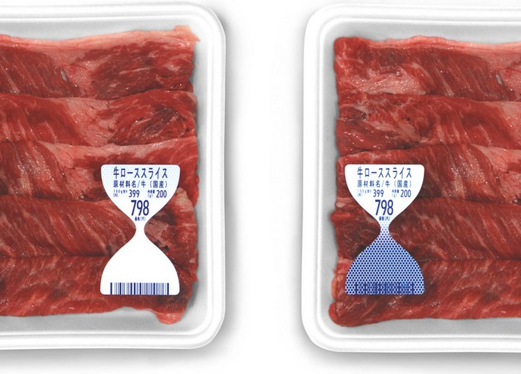
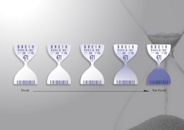
Title: Fresh Label
Designer: TO-GENKYO
This was a very clever design that tracks a foods expiration date using a universally accepted visual. Over the last year or so Japan had been struck by a number of scandals involving food companies tampering with expiration dates. The new design keeps people honest by changing colors based on the level of ammonia the food emits as it ages. After it has passed its expiration date the barcode is no longer readable, making it impossible to sell.
Title: The Hall of Fame Calendar
Designer: Word Shop
For: Misawa Home
Continuing a 21-year tradition, Misawa Home’s corporate calendar adopts a theme each year of famous individuals (artists, architects, musicians, etc.) and devotes 1 month to 1 individual. They then scan a database of handwritten archives extracting numbers and letters to create a calendar. Each month you are encouraged to delve into that person’s history and learn something you never knew. For 2009 they decided to devote the entire calendar to Natsume Soseki, perhaps the best known novelist in Japan.
Title: Truths only kids can see
Designer: Dentsu
For: Kadokawa Tsubasa (a maker of kids books)
Lenticular printing is a very common technology often used in ads that morph as you walk by them. But by simply rotating the printing from horizontal to vertical you create a banner that varies depending on the person’s height. This way they succeeded in creating an ad that only kids can read. In a country where enormous pressure is place on kids to perform well on test scores, the company wanted to convey a message to kids that they are their own beings. They don’t have to listen to everything adults tell them. The message on the banner reads, “If you listen to everything the boring adults tell you, you will turn into a boring adult.” Subversive yet cute!
Related:


November 18, 2009 at 5:20 pm
this description is incorrect in a couple of key ways: 1) what allows the message to be seen has nothing to do with age (kids v adults) but the viewing angle of the person looking at it, i.e., a combination of their height and distance from the poster. So shorter adults would see the message, where tall children would not. Plus, the farther away you are from the print the less height is a factor. 2) Lenticular printing is not “very common.” There are actually only a few companies that specialize in lenticular printing.
having said all of that, the project is very cool, and is a fun use of lenticular.
November 18, 2009 at 1:20 pm
this description is incorrect in a couple of key ways: 1) what allows the message to be seen has nothing to do with age (kids v adults) but the viewing angle of the person looking at it, i.e., a combination of their height and distance from the poster. So shorter adults would see the message, where tall children would not. Plus, the farther away you are from the print the less height is a factor. 2) Lenticular printing is not “very common.” There are actually only a few companies that specialize in lenticular printing.
having said all of that, the project is very cool, and is a fun use of lenticular.