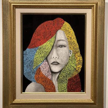
The Cross-pollination of Fine Art & Architecture
(These series of posts originally ran between: 4/14/08 ~ 4/22/08)
As promised last Friday, this week I’ll be posting about recent convergences that I’ve noticed between the genres of fine art and architecture (and interior design). Traditionally, there has always been a clear line between these disciplines, with fine art maintaining a certain arrogance or pretentiousness against the others. But recently, a few notable works, by notable artists, have begun to blur these boundaries, creating a free-for-all orgy of cross-pollination. I’m not promising a conclusion because, frankly, I don’t know why this is happening, or what the ramifications will be. But perhaps by the end of the week I’ll have a better idea. SO, let’s take a look at the work!
————————————————–
Exhibition at Maison Hermès, Tokyo
Feb 8, 2008 ~ May 1, 2008


Images courtesy of Tokyo Art Beat
NY-based artist Sze is widely known for her site-specific installations. In her most recent work in the grand exhibition space on the 8th floor of the Hermès store in Tokyo, Sze uses common consumer objects – everything from lamps to pillows to cardboard boxes, thread, sheets of paper, chemistry sets, humidifiers and toy cranes – to create a giant standing sculpture. The objects, piled high toward the ceiling, toy with our sense of fear and stability. Precarious as it appears, the structure reassures us (does it?) with it’s numerous suspension ropes that invoke images of grand engineering feats such as bridges and skyscrapers. Also at play are the many scattered objects on the floor that guide our eyes to the main structure. It almost looks like a sprawling urban city.
The next work I’d like to examine in my series on the convergence of fine art and architecture, is one that has been quite prominent in the media and I’m sure many of you have seen pictures.
————————————————–
Take your time
Coming to Moma April 20–June 30, 2008
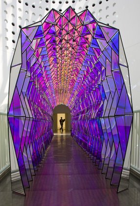
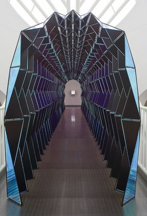

images courtesy of olafureliasson.net
Having originated at the San Francisco Museum of Modern Art, Eliasson’s retrospective is now headed to Moma. And if anyone is in the area, I have a feeling it will definitely be worth the trip (and the hefty cover charge). Eliasson’s curiosity about space and environment has led much of his work to take on architectural and interior design components. In fact, on numerous occasions, he has collaborated with architect Kjetil Thorsen (co-founder of Snohetta) on projects such as the Serpentine Gallery Pavilion 2007 and the New National Opera House in Oslo.
————————————————–
For those of you joining me mid-week, I’m in the process of examining a recent phenomenon in which the boundaries between fine art, architecture, and interior design have begun to blur. We looked at work by Sarah Sze and Olafur Eliasson and today is the 3rd installment! Woo-hoo!!
Jim Lambie
ZOBOP!
Jim Lambie has recently returned to MoMa for the exhibition, “Color Chart: Reinventing Color, 1950 to Today” (going on through May 12, 2008). The images, however, are from previous installations. As you can see, interiors are an actual media that the artist works with, covering their floors with colorful vinyl tape and, in the process, revitalizing the space with color and energy. There is an ornamenting aspect to his work, which is probably why it equates so well to interior design.


Images courtesy of Moma and the National Gallery
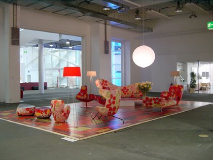
This is the perfect example of a crossover between fine art and interior design. Because it was actually implemented in the interior of an apartment. Below is an image of a Gramercy apartment that belongs to Tim Nye of the Nyehaus Gallery. Looking to purchase a piece of art by Jim Lambie, and at the same time attempting to gut-renovate his apartment, Nye came up with the perfect solution that achieved both goals!

Image courtesy of floto+warner
————————————————–
Tadashi Kawamata
“Walkway” (February 9 – April 14, 2008)
Tadashi Kawamata’s most recent show at the Museum of Contemporary Art Tokyo was groundbreaking…at least I thought so. His work is the perfect example of what I have been talking about all week long!
Kawamata’s work has always been derived from architectural concepts, such as the flow of people within a space. In previous works he has often created additions to already existing structures. However, there is a deconstructive aspect about this work, including his most recent piece, “Walkway.” The crudely constructed walls and paths reminds one of a hastily built evacuation area; a space that one might find in a site of a natural disaster.
“Walkway” – 2007 (image courtesy of on the table)
I guess what’s so cool about this piece is that architecture is reduced to it’s most simplest form, yet performing it’s most essential task; creating direction and compartments for people to come and go.
(images courtesy of The Centre for Contemporary Art)
————————————————–
Wow, I can’t believe it’s already Friday. I wanted to conclude this series in 1 week but I’ve been so busy that I’ve only had time for 1 post per day. New Yorkers have been enjoying gorgeous weather for the last 2 days, and it’s supposed to continue into the weekend. I truly hope the same applies to all of you! Have a splendid weekend and please check back next week as I continue my series!
Tatzu Nishi
“Chandelier” (2007)
(Images courtesy of Blum & Poe)
(Image courtesy of Stuart Whipps)
To finish off this week, I’d like to show the work of Japanese artist (based out of Germany) Tatzu Nishi. Here is an artist who, I feel, has made some great advancements in converging the boundaries between fine art and architecture, using one to play off the other in a complimentary show of design. Over the span of his career, Nishi has become renowned for incorporating public architecture and industrial design (anything from public benches to monuments) into his work.
In “Chandelier,” Nishi inverts 5 street lamps, creating an unexpected sculpture out of objects that we are so used to seeing – so in fact that we often don’t even see them – and placing them in a new, sometimes humorous, light.
I was reviewing this ongoing series on fine art and architecture/interior design, and I decided there were 2 more artists that I wanted to show you. So I plan to finish up either today or tomorrow!
————————————————–
“The Colored Screens” (2007)
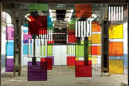
Image courtesy of Bortolami Dayan
It was quite a switch from the minimalist paintings that we had become accustomed to seeing from French artist Daniel Buren. Nonetheless, it was still in line with his site-specific installations, which he originally became known for. For his most recent show, Buren installed 48 plexiglass squares under New York’s high-line railway. More so than his other site-specific installations, “The Colored Screens” seemed more designy. I thought it was interesting that these kinds screens, an airy way of dividing a room into two, were displayed in way that seemingly has no functional purpose. Perhaps that obscurity was intentional?
————————————————–
To conclude my series on intersections between fine art and architecture/interior design, I would like to show the work of artist Michael Lin, who was born in Tokyo but is based in Taipei. In an interview Lin once said, “My work has moved away from the idea of a painting as an object. I’m more interested in creating a painting as a space to occupy.”
Lin conquers his spaces by adorning them with blown-up versions of traditional Taiwanese floral motifs. He then invites the viewers to interact with his pieces – much like one would in their own room – by sitting, sleeping and walking on them.
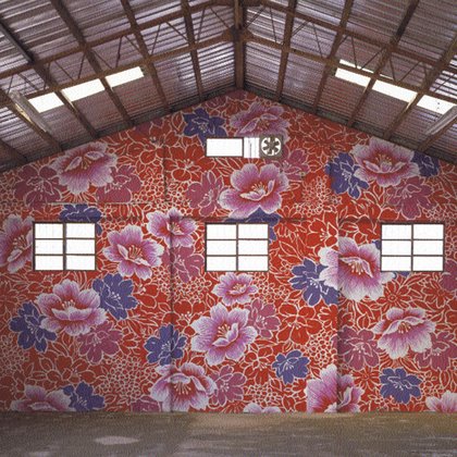
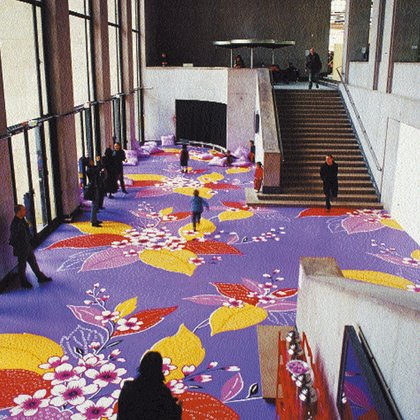
Images courtesy of Galerie Tanit
I felt that Lin’s work was super appropriate to show in my last post of the series because it is sort of a culmination of what I have been seeing, and what I have been trying to show my readers. Recently there has definitely been a shift in the proximity between fine art and architecture/interior design. Perhaps artists realized a new means of reaching out and communicating to more people. Or perhaps it was an inevitable change, what with interior design becoming more and more visible in the media.


Leave a Reply