“ao to aka” (“blue and red”) by Haruka Aramaki
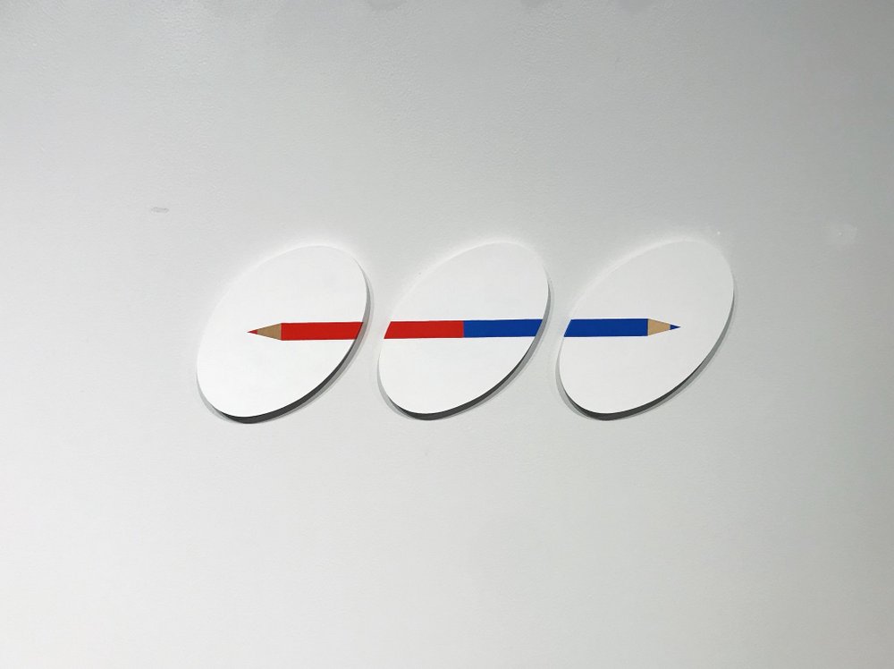
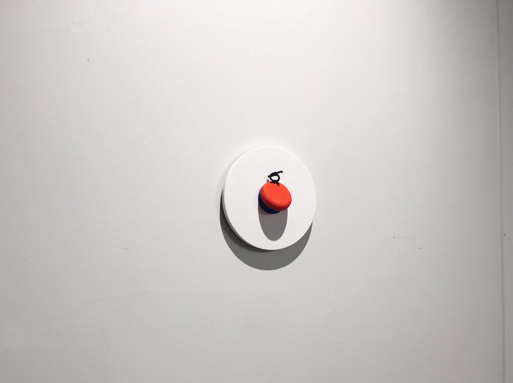
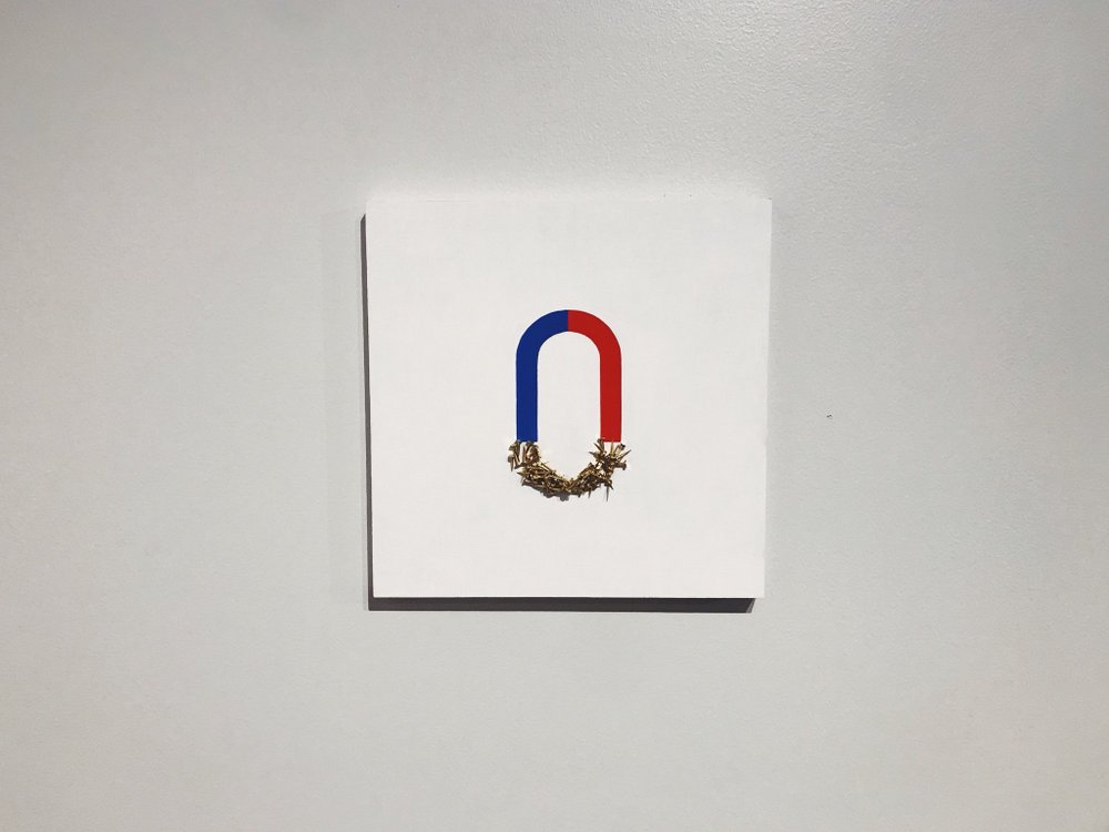
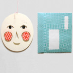
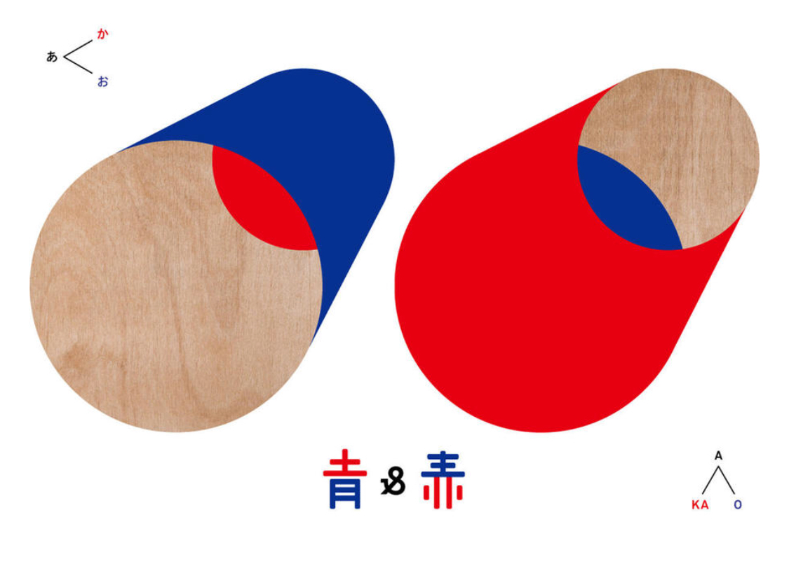
We were in Tokyo recently and one of the most enjoyable exhibitions was this show of blue and red graphic artworks by designer Haruka Aramaki. Composed of predominantly blue and red – “I feel a neutral stance from this combination” says the designer – various wooden panels line the walls of a small gallery in Tokyo. They’re accompanied by a small number of 3D sculptures too.
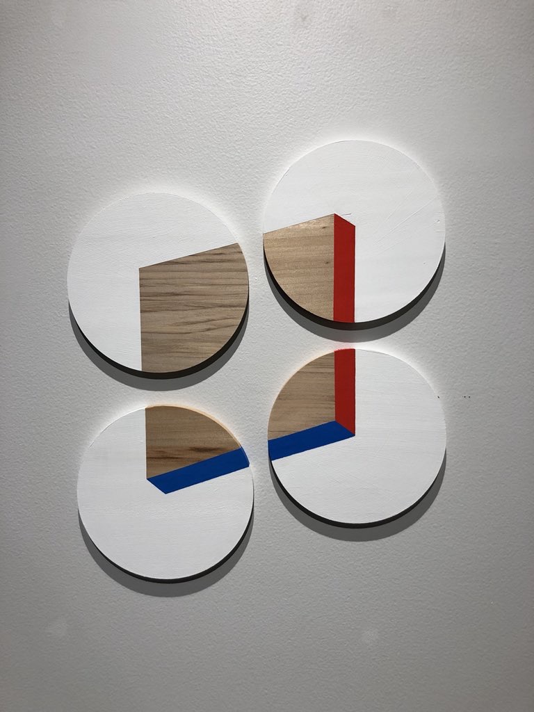
Aramaki’s work might best be described as visualizing the in-between of two and three-dimensional. By using a neutral color palette of primarily red and blue, viewers are able to appreciate the works simply for their graphic beauty, rather than trying to imbue them with any sort of meaning. However, when all these works are assembled into a single space, one can’t help but consider how color effects our perception, and how meaning can so easily be attached to color.
Haruka Aramaki’s “ao to aka” (“blue and red”) is on view through March 6, 2018 at aiima gallery on the 8th floor of the Shibuya Hikarie department store.