Soy sauce has become one of Japan’s most-significant culinary exports. But perhaps just as iconic as the condiment itself is the stylish bottle designed by Kenji Ekuan in 1961. Ekuan passed away in 2015 at the age of 85 but his design lives on. Not only did it go on to receive numerous design awards but it has become a hallmark symbol of the company itself and remixed by others. Here, we take a look at some gorgeous advertisements created for Kikkoman that incorporate the glass bottle.
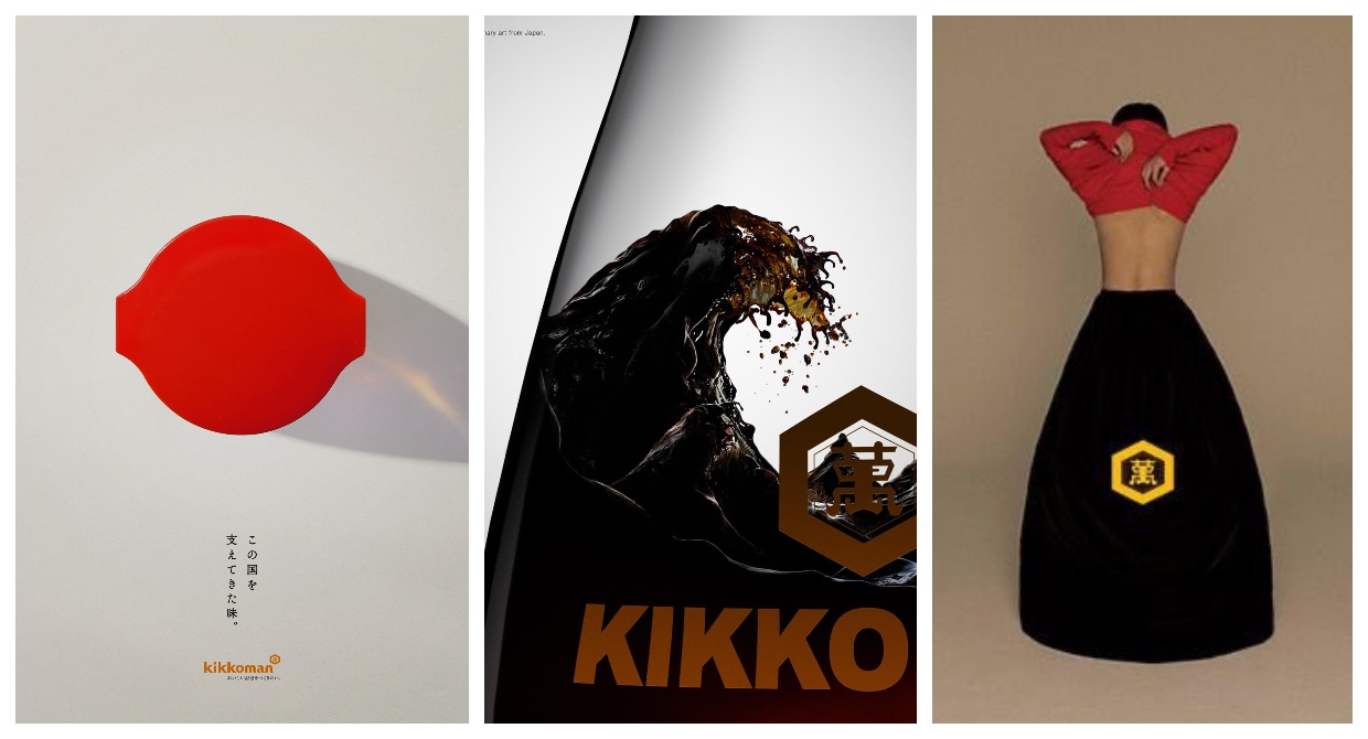
graphic designer Shun Takeuchi pays homage to the Japanese flag by capturing an aerial view of the soy sauce bottle. The tagline reads この国を支えてきた味 (the flavor that has supported this country)
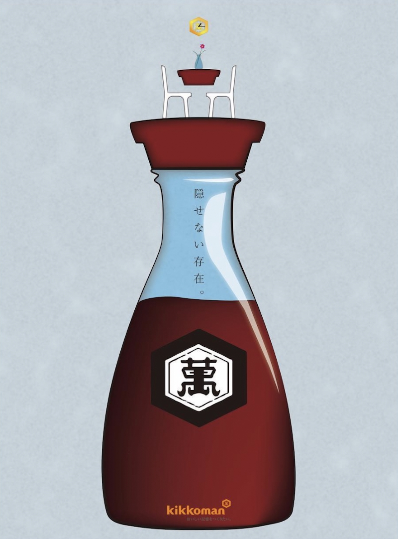
A powerful image that conjures up the soy sauce bottle through color and form. Created by Maho Kudo from ad agency Dentsu

Zürich-based creative agency Freundliche Grüsse created this advert ahead of the 2020 Tokyo Olympics
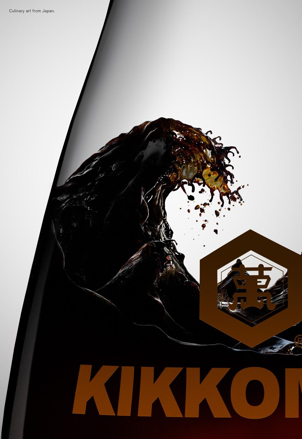
Berlin-based ad agency Scholz & Friends created this image of soy sauce in a bottle inspired by ukiyo-e artist Hokusai’s iconic “Great Wave”
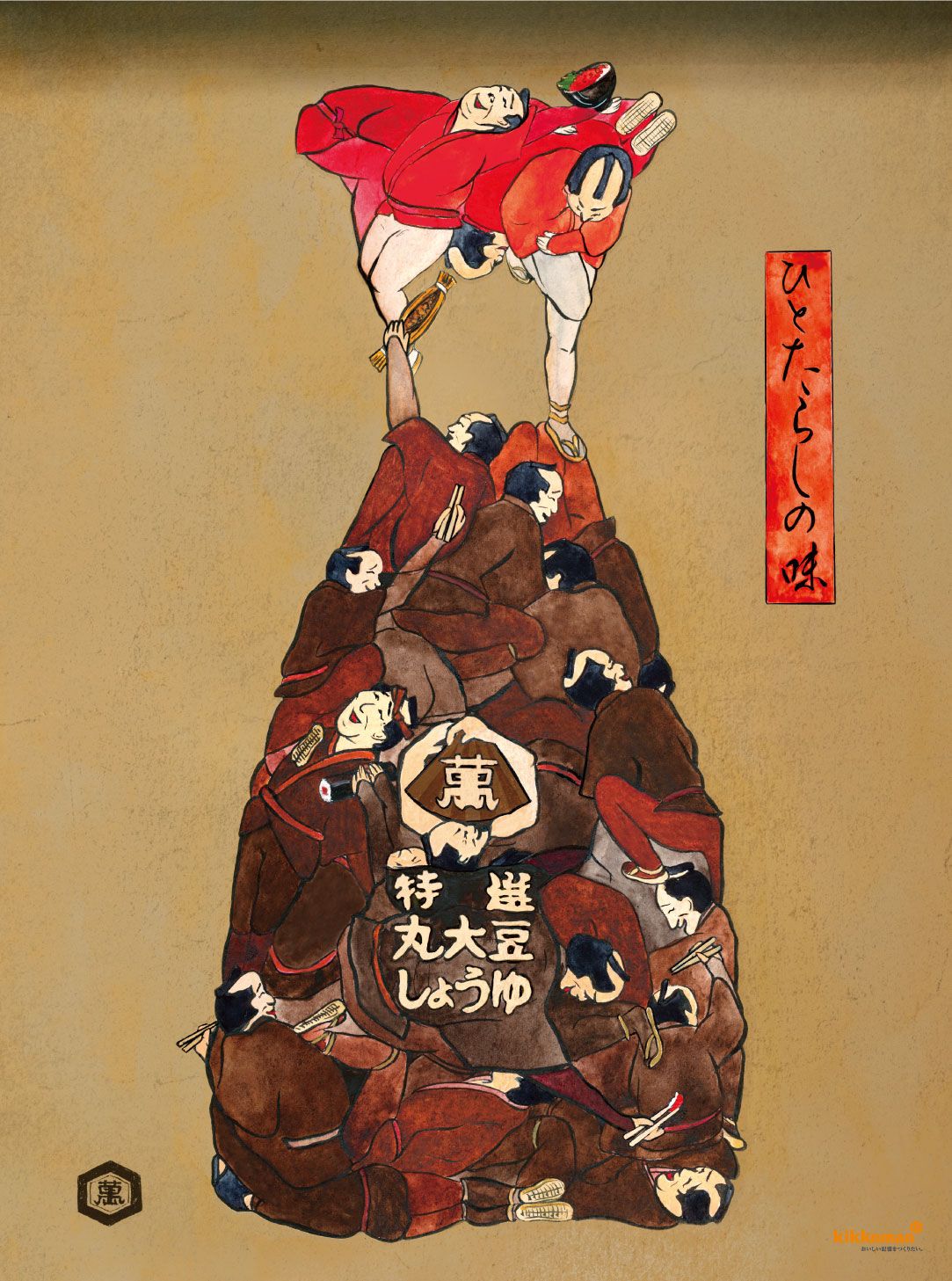
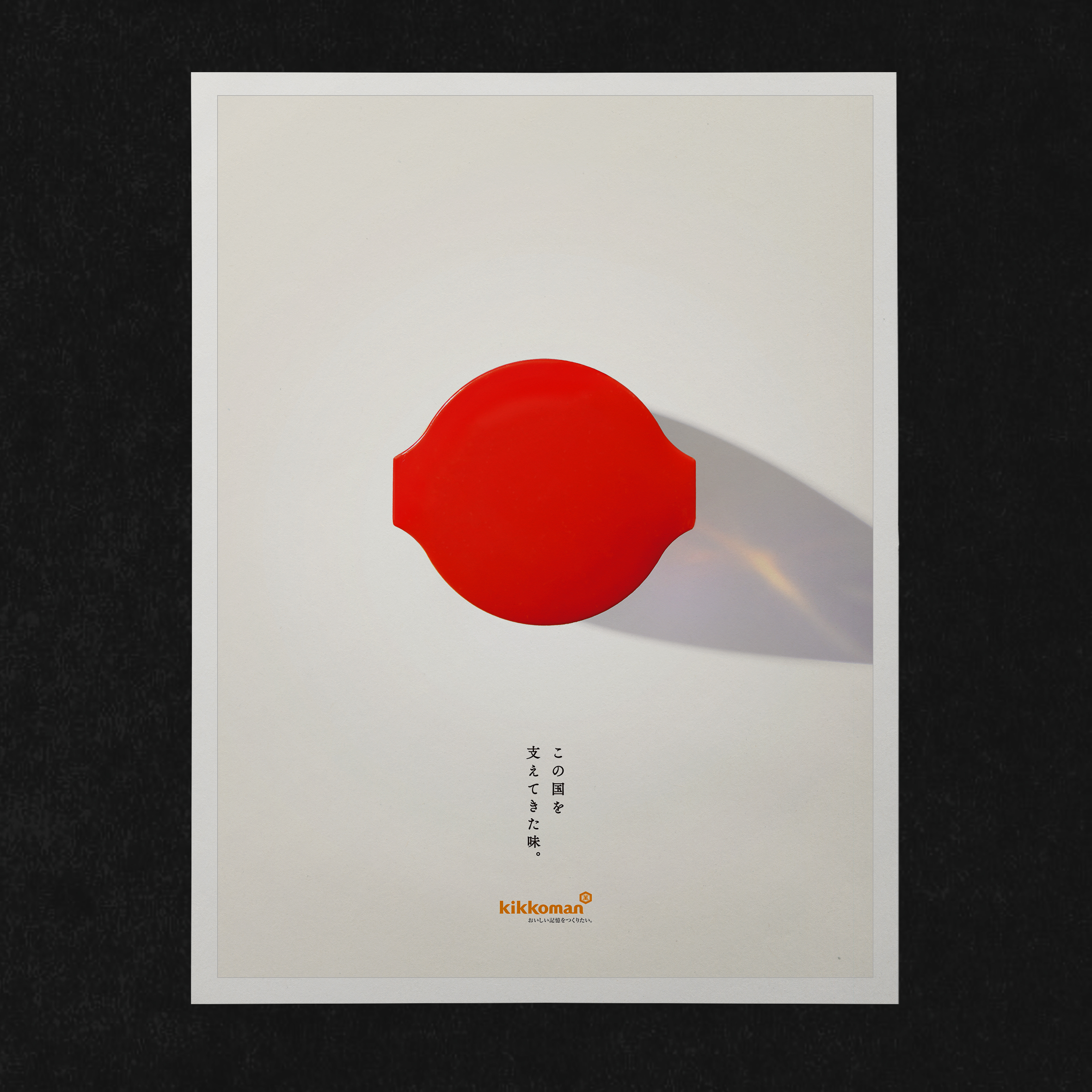
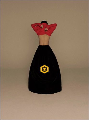
Copywriter Eimi Iida and designer Hiroko Nagano collaborated on this image, inspired by ukiyo-e artist Kuniyoshi Utagawa’s humorous use of bodies to form images.
Created by Susumu Design, this image puts the soy sauce bottle at the center of the dining table


March 28, 2022 at 7:53 pm
These are marvellous images. Are they collated in a book, by any chance?
March 29, 2022 at 10:54 am
Glad you liked them! Not part of a book, unfortunately, but that would be a wonderful thing to have.