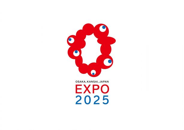
Today the Japan Association for the 2025 World Exposition revealed their logo choice for the 2025 Osaka Expo. A red, looping creature made up of 5 googly eyes was selected out of over 5000 entries, which were then narrowed down to five. The selection, while seemingly odd and has spurred online shock, is an obvious one in our opinion and is a great design that will come to be remembered for ages to come.
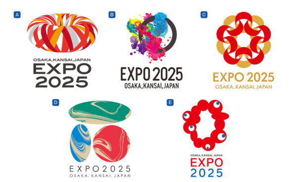
When the 5 finalists were revealed in early August there were colorful splotches of ink, radial ribbons, and gradients of mixed paint. They were all pretty at first sight but there was one that was clearly in a category all by itself. It was alive — parasitic, even — and resisted any easy characterization. It looked like it was eyeing the other choices, ready to devour them. This googly-eyed creature would go on to be selected: a brave decision that has given birth to unique and memorable character.

When reflecting on the past the decision was an obvious one. Osaka has always been a heterogeneous jumble of characters and personalities that’s perhaps best reflected in their decision to ask artist Taro Okamoto (the “Picasso of Japan”) to construct a symbol for the 1970 Expo. Okamoto responded with his monumental “Tower of the Sun.”
The new logo for the 2025 Expo was designed by a team led by graphic designer Tamotsu Shimada, who borrowed elements of the 1970 Expo and re-imagined them as chain of DNA. The ambiguous form and all its many cells are breathing, moving and dancing. It’s a design that will surely breath life into the Expo.








August 25, 2020 at 11:55 pm
As an outsider I never understood that sculpture. Seeing it for the first time when I moved to Osaka confused me even more. After living in Osaka for a year it made complete sense.
Osaka is nothing if not unique and this logo reflects that perfectly. Nice choice!
August 26, 2020 at 4:16 am
I support the choice among all the finalists when other four look…just good but, I’m afraid, boring. The selected one is weird, disturbing yet catchy and vigorous. Would I buy a tote bag with the logo? Yes, for sure!!!
By the way, there have been already loads of artwork referring to the logo design. Someone even said that there can be a venue which is dedicated to show all those art pieces in the Expo!
August 30, 2020 at 3:49 pm
Is it not a sly nod to takoyaki? That’s what I want it to be.
August 30, 2020 at 4:21 pm
I worked at the Canadian Pavilion at Expo70. I like the new logo because it reminds me of Expo70. That is a nice touch.
September 23, 2020 at 10:56 am
The reason why Saya no Uta has become a trend keyword in Japan