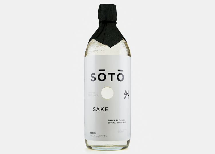
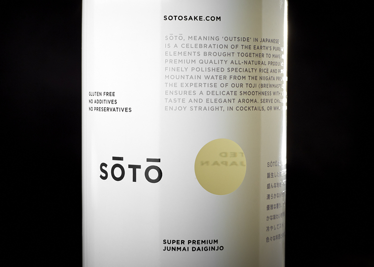
“Soto,” meaning ‘outside’ in Japanese, is a new premium sake that’s been developed for a western audience
Faced with flat-lining domestic demand for their Sake, Japanese breweries have been increasingly looking for opportunities overseas to grow as their own population shrinks. And some breweries are turning to graphic designers to help rebrand and create a more appealing, more impactful product for those who find sake esoteric and inaccessible.
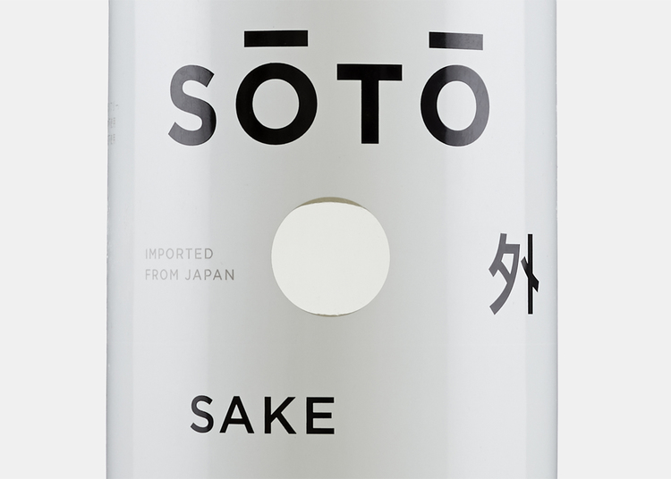
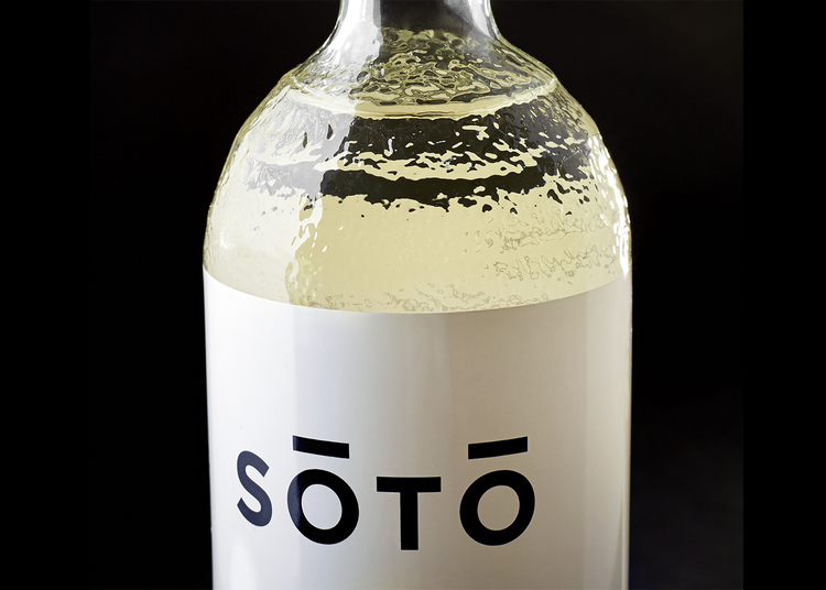
Japanese sake packaging has always been characterized by fluid, stylized calligraphy that decorates the bottle’s label. But several breweries are experimenting with a more minimal look: one, they believe, will be more attractive to non-Japanese. “The name SOTO means ‘outside’ in Japanese,” says NY-based designer Joe Doucet, who was asked to help develop a new brand of sake suited for a western audience. “We wanted to invert the obvious interpretation of this by creating fully opaque 360º silkscreened label with a hole through both sides of the bottle which allows you to see the outside world thru the spirit.”
Doucet created a highly eye-catching design that incorporates “the beautiful contradictions of Japan:” traditional vs. new; order vs. chaos. The result is an arresting product that stands out from other sake. (Although we’re not quite sure why the macrons were place over the name so that it reads SŌTŌ, instead of SOTO.)
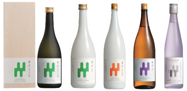
A series of Ichishima Sake Brewery sake whose label was redesigned for a western audience
Kenji Ichishima, the 7th generation President of Ichishima Sake Brewery, also believes that a redesign has helped his brewery become more globally recognized. When speaking to an overseas client Ichishima recalls being told, “we don’t understand what’s written on the label.” Taking this feedback to heart, Ichishima was convinced that for foreigners who don’t understand Kanji, the calligraphic name was simply a symbol. And one that was hard to relate to.
Ichishima decided to call up a friend: the New York-based Japanese designer Etsumi Imamura. Together they came up with a complete rebranding for their sake, which incorporates a graphic logo that replaced the company’s calligraphic name. Ichishima attributes the redesign to a significant growth in sales, not only in the West but in Asia, and even his home country of Japan. In response, the company is now producing their graphic logo on bottles for domestic consumption as well. The label is important, he adds, but for sake to become widely accepted it also has to taste good.
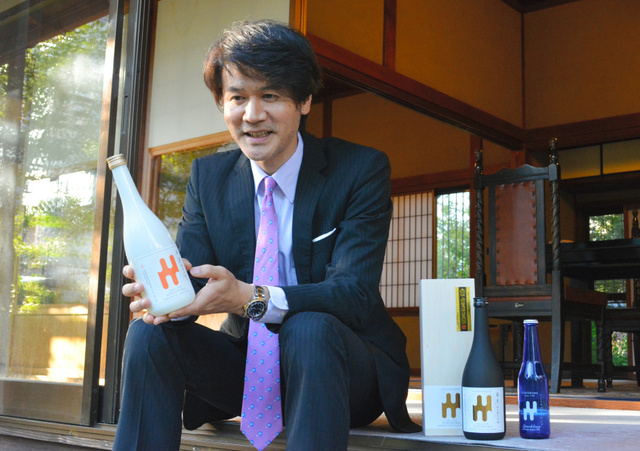
Presedent Ichimasa holding a bottle of his rebranded sake | photo courtesy Asahi Shimbun


October 21, 2015 at 8:40 am
Very beautiful, laconic and profound design but wait! Part of this logo (ŌTŌ) looks like a dog’s muzzle, isnt’t it?)
November 15, 2015 at 7:54 pm
To me, the marks over the Os look like eyebrows, the hole a mouth, and the black wrap over the top a topknot hairstyle such as a Sumo wrestler might wear!