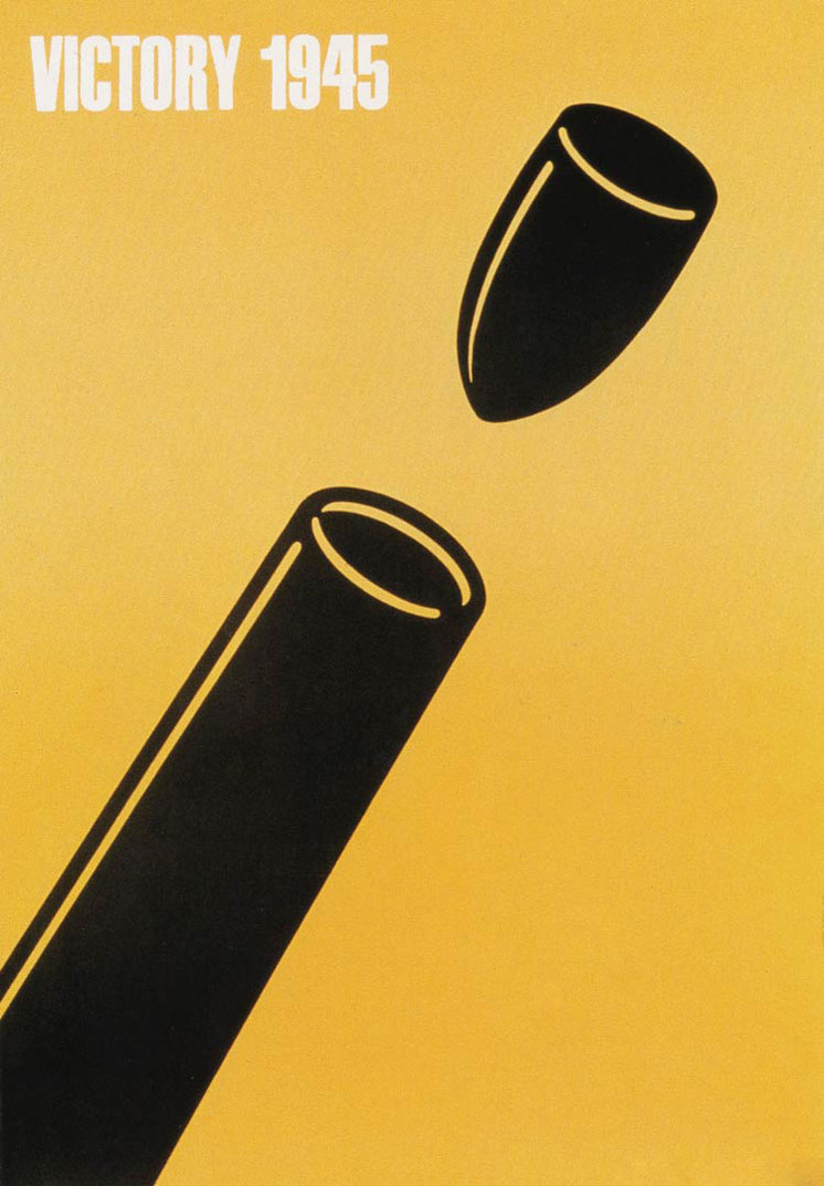
“Victory 1945”, one Fukuda’s best-known works, features a projectile heading straight at the opening of the barrel of a cannon
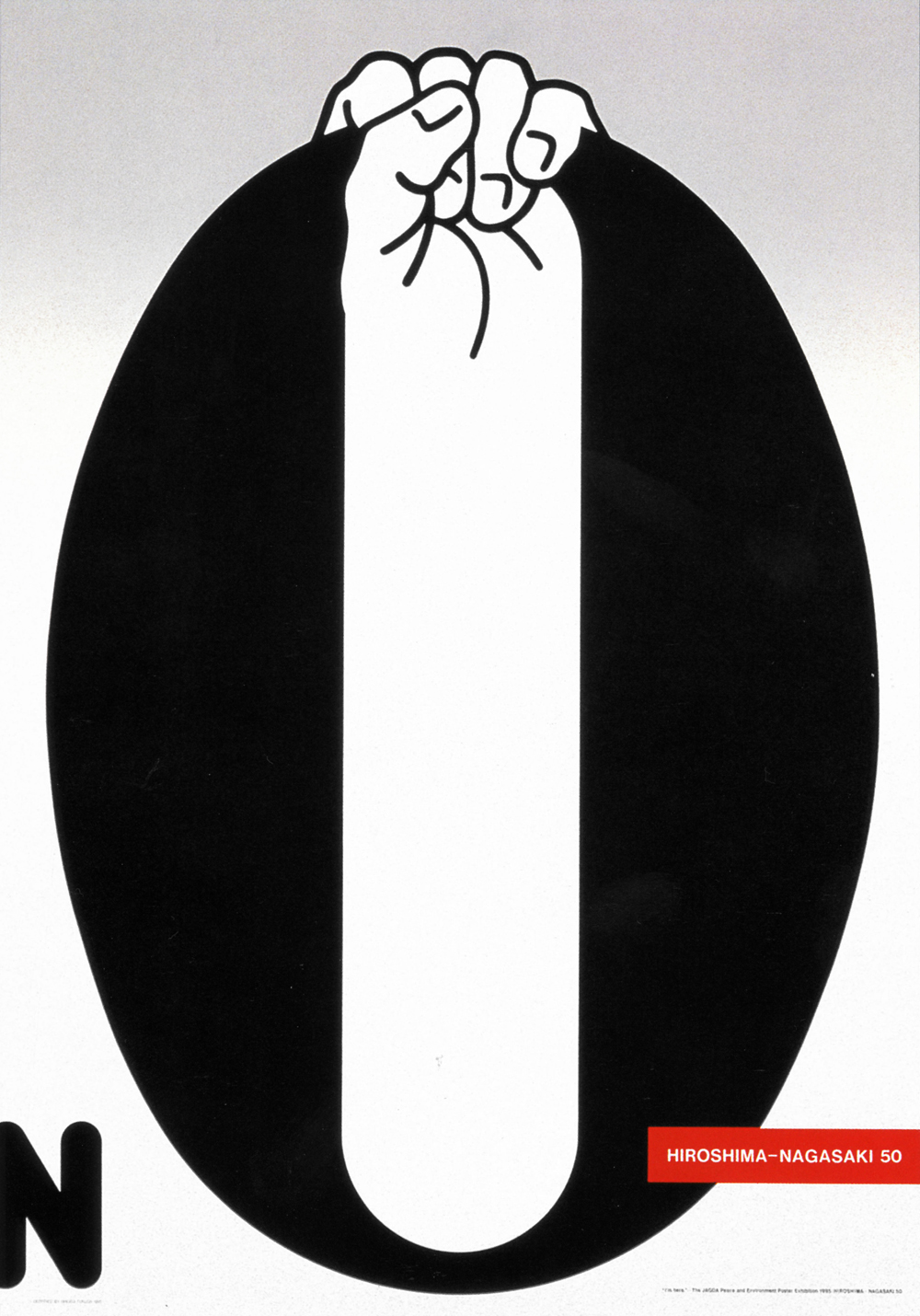
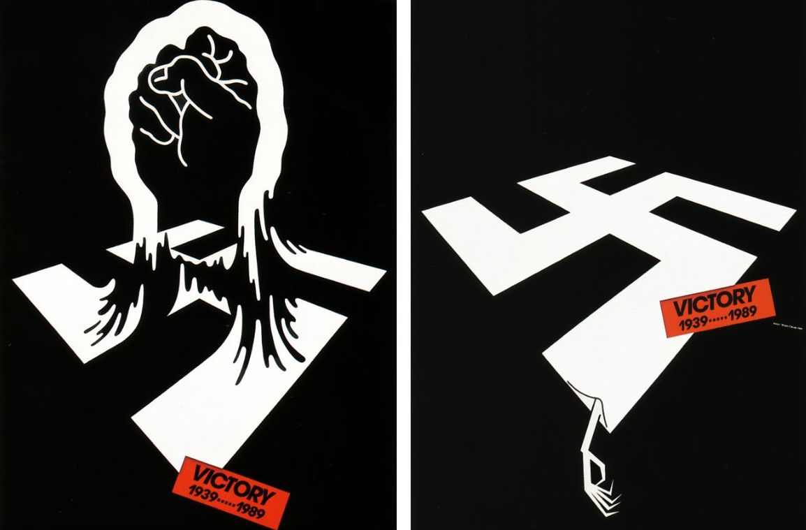
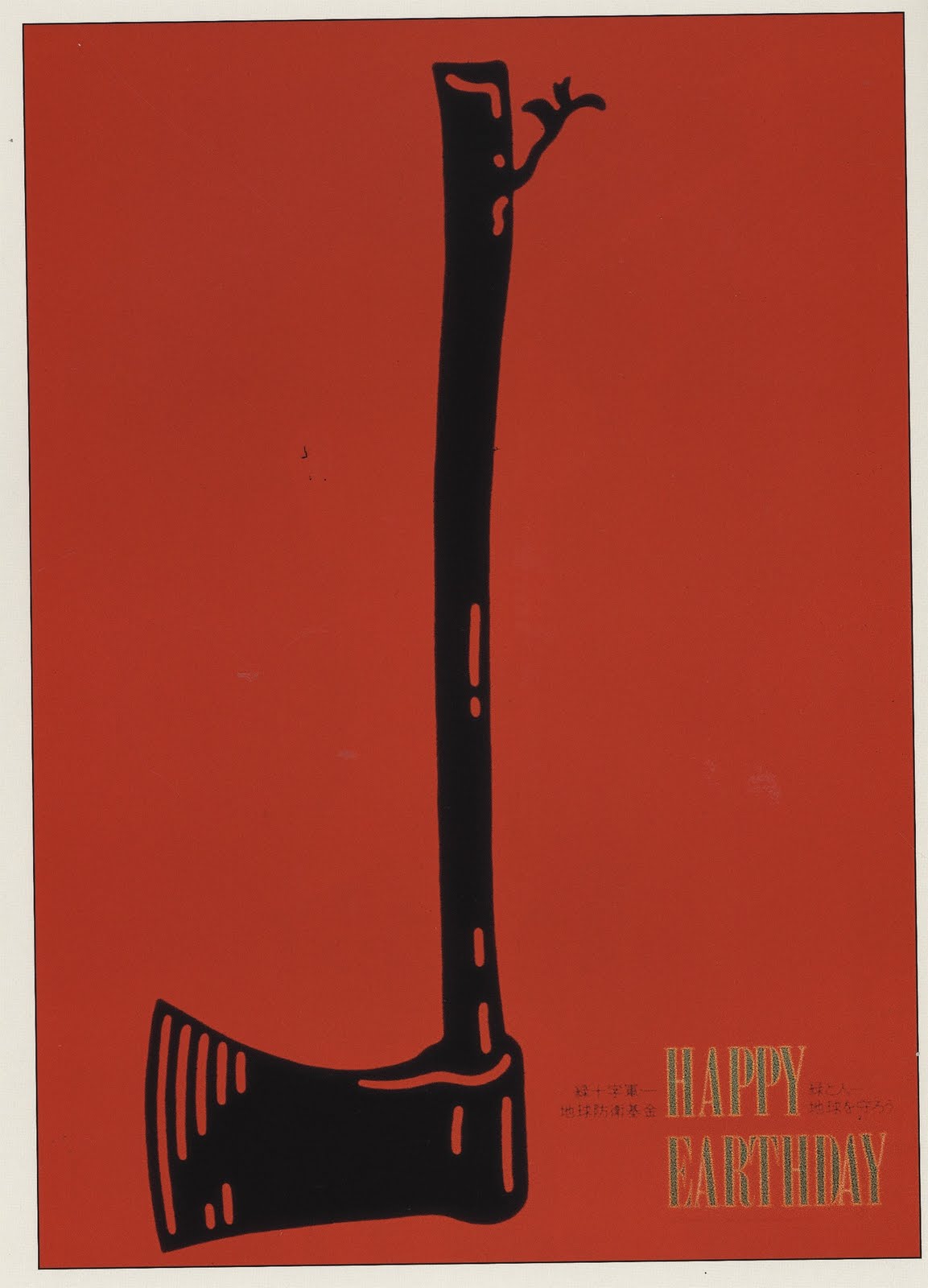
If Shigeo Fukuda were alive today, I wonder what he would say; what he would make. The Japanese influential graphic designer – he passed away in 2009 – used minimal graphics to voice antiwar and environmental advocacy messages. Perhaps the most well-known, or the one that stands out most to me, is “Victory 1945,” showing a projectile artillery shell heading straight for the opening of the cannon barrel. It was this type of visually humorous yet elusive style that made Fukuda’s posters so powerful.
Although Fukuda had a few commercial clients like UCC Ueshima Coffee, the majority of his work was devoted to social and cultural concerns. He “was known for acerbic antiwar and environmental advocacy posters,” wrote design writer Steven Heller, “that distilled complex concepts into compelling images of logo-simplicity.” He did a lot of work for Amnesty International, one of the more memorable a poster showing a drawing of a clenched fist interwoven with barbed wire.
In times like this, when Japan prepares to take a step towards a dark path, the presence, or lack thereof, of people like Shigeo Fukuda becomes especially pronounced.
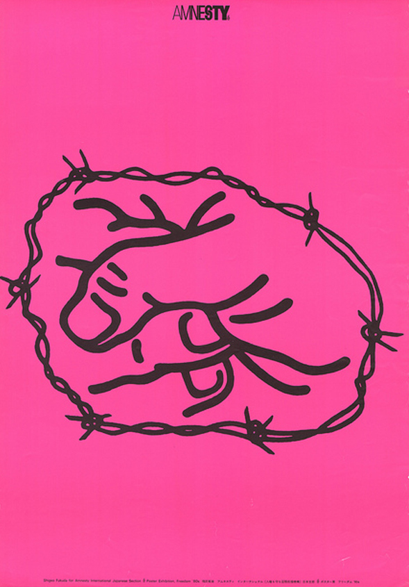
a poster for Amnesty International showing a drawing of a clenched fist interwoven with barbed wire.
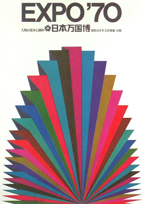
An example of his cultural work is shown above. The official poster for the 1970 World’s Fair in Osaka.
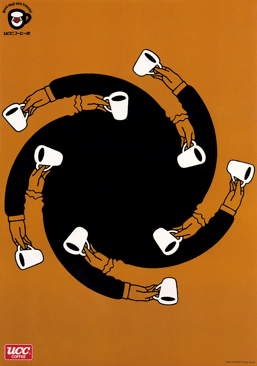
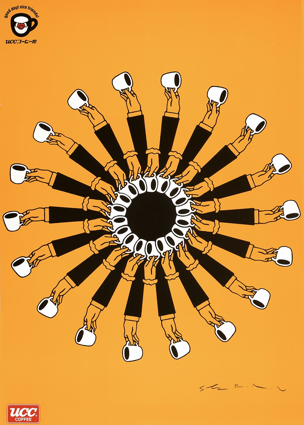
Fukuda did, of course, have a few commercial clients. One of them was UCC Ueshima Coffee, for which he designed these playful, repetitive ads. He once told Idea Magazine that “I believe that in design, 30 percent dignity, 20 percent beauty and 50 percent absurdity are necessary.”







July 18, 2015 at 2:08 pm
I’ve been looking for this guy, but someone found him for me!