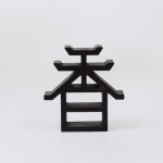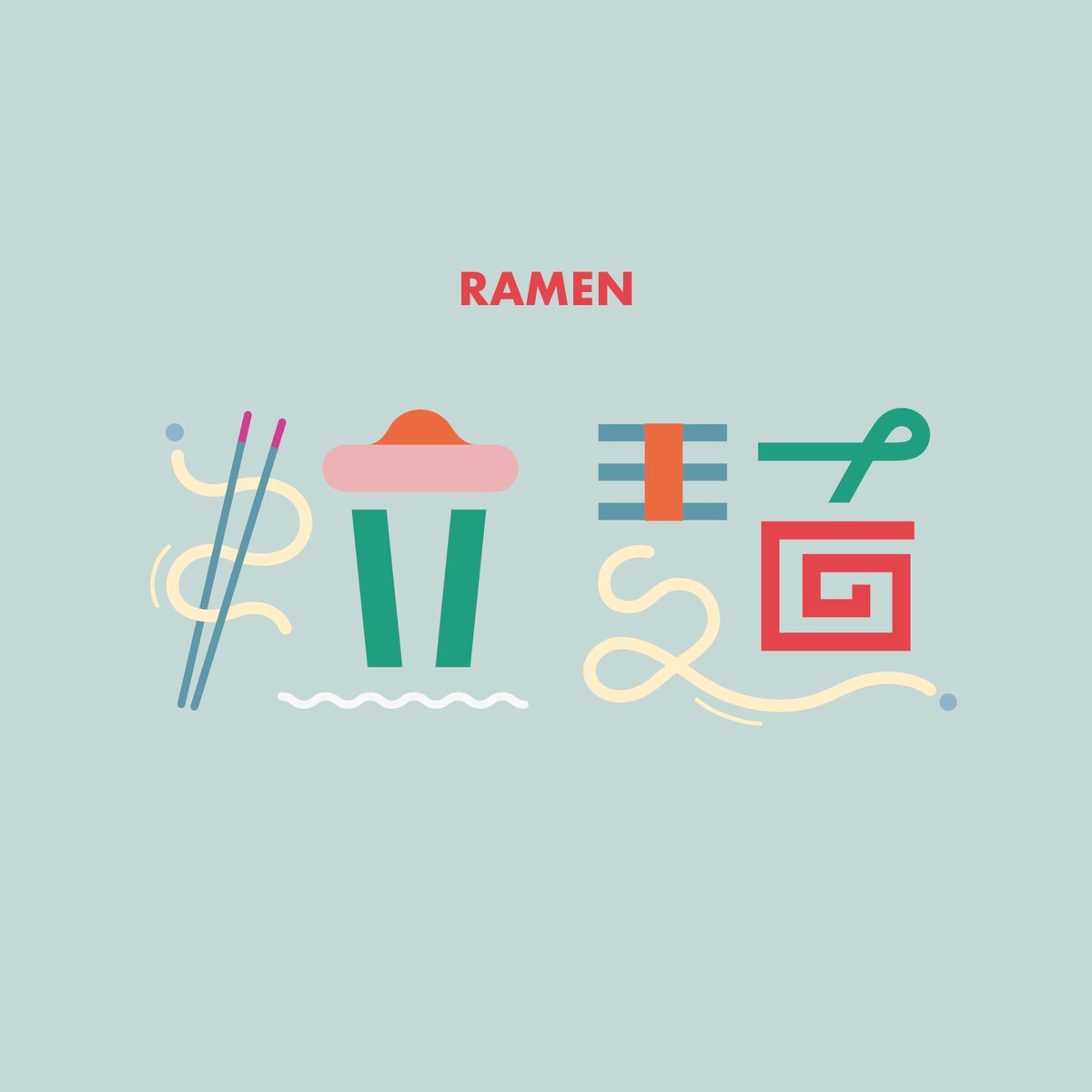
everyone’s favorite ramen noodles, written traditionally as 拉麺
A Japanese web designer and typographer who simply goes by the name ‘Nozaki’ creates beautiful, pictorial Japanese typography that can sometimes walk a thin line between recognizable and unrecognizable. The phrases that are used are sometimes seasonal, sometimes random but in either case, Nozaki renders them with pictorial style that is enjoyable even if you can’t read Japanese.
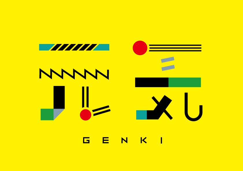
looking at this makes me feel genki (元気) or, energetic
Japanese, like many languages, has different writing styles that have evolved, in part, due to their historic tradition of calligraphy, or shodo. Aside from normal printform styles, there are various gyousho and sousho styles that combine and simplify strokes, sometimes to the point of recognition. This tradition has allowed for further experimentation in Japanese typography, which often incorporates imagery from the actual meaning of that kanji.
Nozaki, a recent graduate from Aichi Prefectural University of the Arts, builds on this tradition of experimentation by creating highly graphic kanji that incorporate elements of color, geometry and, of course, style. You can see a lot more of Nozaki’s work right here.
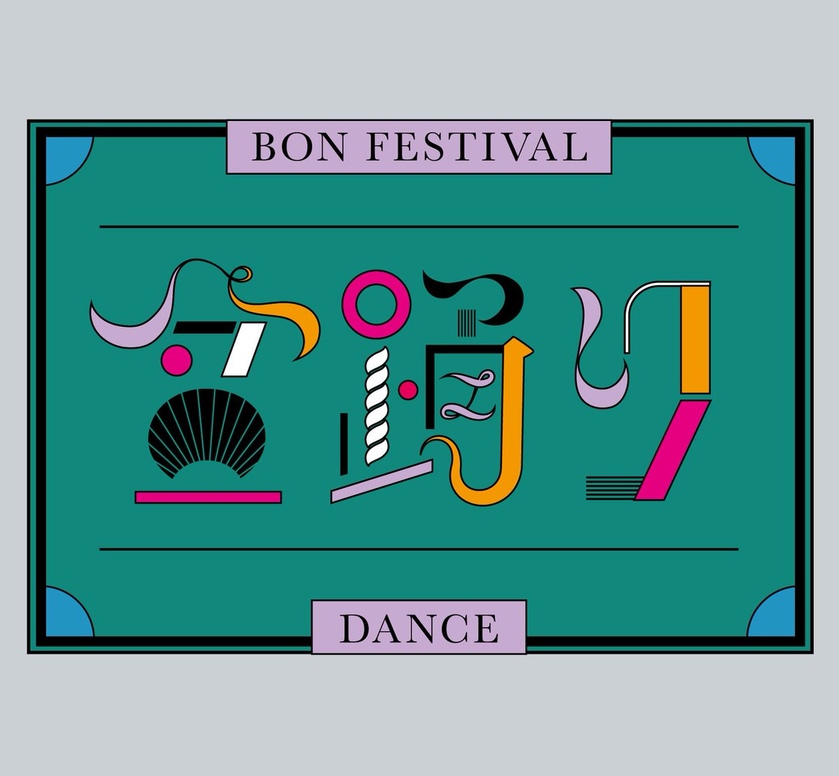
you can almost sense the movement in these characters for bon-odori (盆踊り), the traditional summer dance festival

poor cell phone reception (電波悪い) is the worst
who wants to go watch an eiga (映画) or, movie?
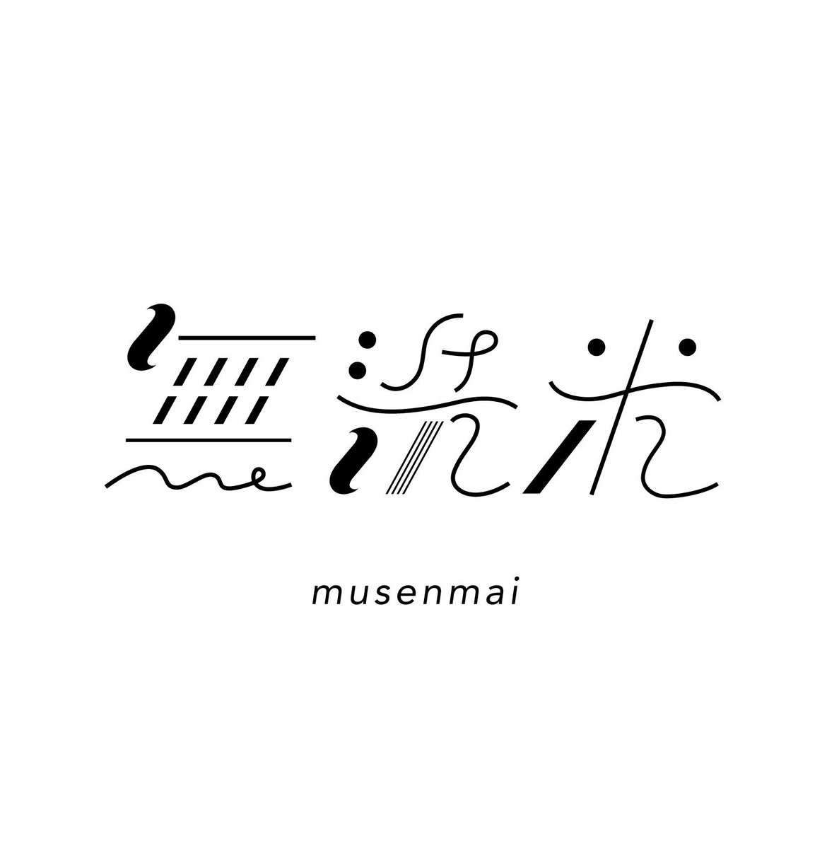
when I’m feeling lazy I buy musenmai (無洗米) or, pre-washed rice
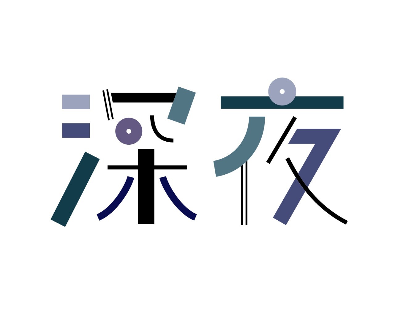
if you’re reading this in shinya (深夜) or, midnight, go to sleep