The inherent problem in designing Japanese fonts is the sheer quantity of characters – 50,000 compared to 26 for their latin counterpart – and the labor involved. This perhaps justifies why many Japanese fonts are so expensive. But there are a few free fonts out there. Below are a mix of Japan-influenced roman fonts and actual Japanese fonts.
If you’re interested in Japanese typography check out this great primer (Part I and Part II) by Chris Palmieri. Although it was published a while ago, the content is still wholly relevant.
Koushiki Typeface
A solid font that is free and comes with very few restrictions. It was designed by graphic designer Atsushi Kawakami and was just released on Jan 5, 2012. And with an English interface downloading it couldn’t be easier.
")
Dot Colon Typefaces
An assortment of fonts by web designer Sora Sagano. Interface is in Japanese but if you click on the font you want and scroll down, the large blue button on the right is the download button.
")
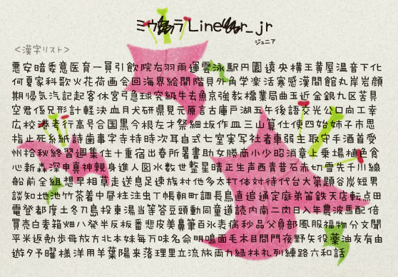
Miura Liner Jr.
This is a cute handwriting font. Although the Miura font family is not free, Mop Studio has released a free version called Miura Liner Jr. The caveat is that it only contains 450 kanji characters (click for full list), enough for some basic writing but probably not enough for that dissertation you’re working on. The Japanese interface is a bit difficult to navigate so here are the download links for Mac and Windows.
")
M+ IPA
The M+ fonts are quite beautiful. They’re free and feature proportional and fixed-halfwidth Latin, as well as fixed-fullwidth Japanese. Here is the English interface when you can download from.
")
")
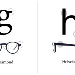
AXIS font
The AXIS font is not free. Actually it’s quite expensive (20,000 yen for a single weight) but it’s worth the investment if you’re going to be doing a lot of work in Japanese.

Source: W3Q


