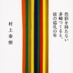
Haruki Murakami’s “Kishidancho Goroshi” | all photos courtesy Ayumi Yamamoto / Casa Brutus
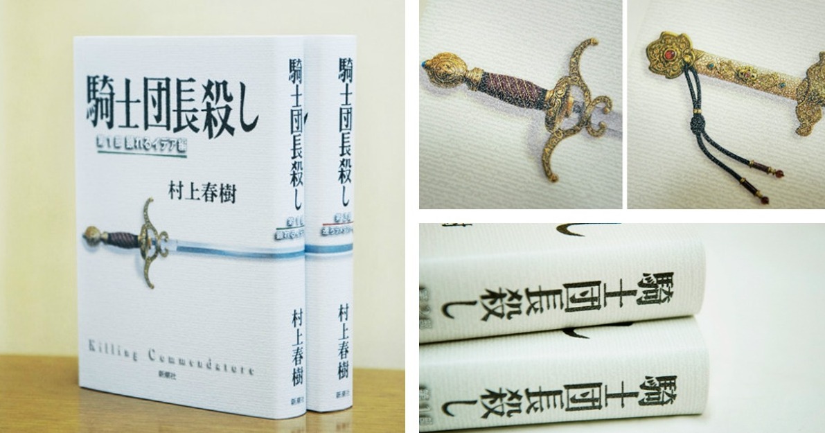
On February 24 Haruki Murakami released his latest novel titled “Kishidancho Goroshi.” Published in two 500-page volumes and given the English title “Killing Commendatore,” it’s Murakami’s first “full-fledged” work in seven years since he put out the 1Q84 (but the author has published several shorter works in the interim). Responding to a call from Murakami, long-time collaborator and book cover designer Chihiro Takahashi came out of retirement to create the latest covers. (Don’t worry, there are no spoilers)
In an interview with Casa Brutus, Chihiro Takahashi, who worked as the in-house book cover designer at publisher Shinchosha for many years and oversaw the design for other Murakami titles like 1Q84 and The Wind-Up Bird Chronicle, shares some insights into how the book cover for “Kishidancho Goroshi” came together.
Takahashi had retired in 2014 but agreed to work on the book after a request from Murakami. He received the manuscript for Murakami’s latest novel in October of 2016 and began working on the design 4 months ahead of publication. Takahashi says that he typically doesn’t consult with the author and instead decides on the overall design before revealing it and making slight adjustments. “But with Haruki it’s a bit special.” Takahashi went to Murakami for the first suggestion “because I think Haruki-san already has an image in his head for the cover as he is writing.”
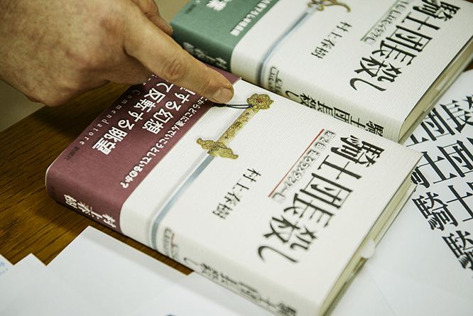
“Kishidancho Goroshi” was published in two volumes
One major difference between the original Japanese and the English translation (which probably won’t come for a few years) is that the Japanese version is published in 2 volumes (1Q84 was published in 3 volumes) and the cover is designed with distinguishing variations. Based on Murakami’s guidance, a simple sword illustration was created to grace both covers.
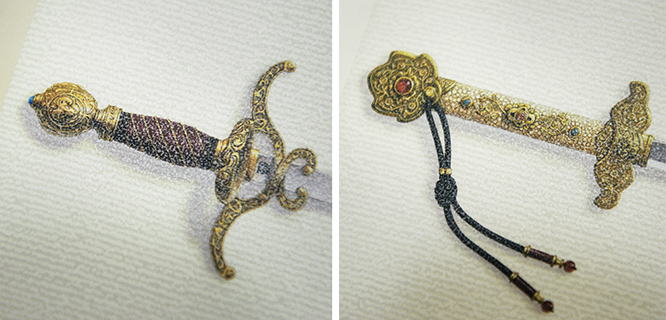
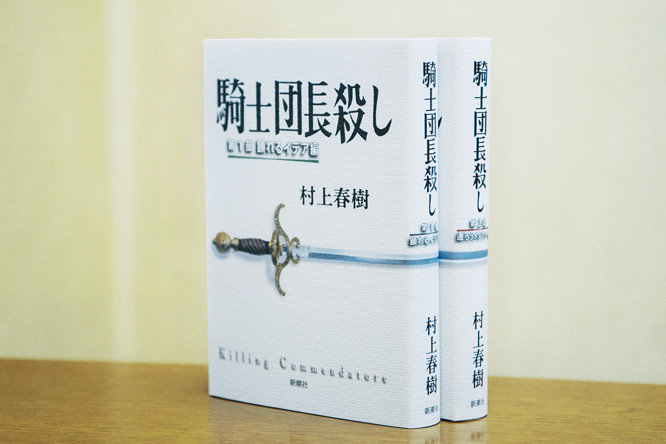
Two different swords were created by illustrator Chikatsu Takeo, who included a sheep’s head crest in the Western sword
They were created by illustrator Chikatsu Takeo, who used a western-looking sword for volume 1 and a Japanese-looking sword for volume 2. Both swords are imaginary but the western-sword is loosely based on swords used during the Crusades, as well as narrower fencing swords. The Japanese sword is based on swords from the Asuka period (AD 592 – 710). Takeo created the swords without ever reading the manuscript but had the idea to include a sheep’s head crest in the Western sword because “Haruki Murakami makes me think of sheep.” The author found this amusing and went along with it.

5 out of the 6 characters in the title are kanji, creating a pointy and angular feel
The main title was a push and pull between a type and handwritten look. Because 5 out of the 6 characters are kanji it was going to have a very angular feel so Murakami wanted it to be more nuanced. But a fully handwritten font would make it too soft so they agreed on a modified font that was based on mincho-type. At the very last minute Murakami had the idea to slant the kanji 殺 (“to kill”). So they cut out just that character and played around with different angles. Finally, Murakami picked an angle that he liked and they taped the paper down with scotch tape so that they could replicate it. “Murakami seems to really enjoy the process of book-making,” noted Takahashi.
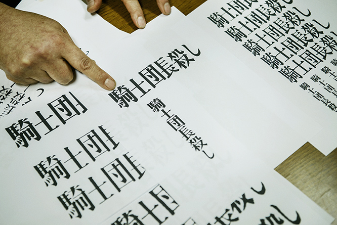
the impactful title had to be nuanced, which is why they went with a modified mincho-type
You’ll notice other handprints by Takahashi when you open the book. The pastedown in volume one is done in a forest-green tone. In volume two it’s a shade of reddish brown. This visualizes the storytelling, which begins in the season of new green and progresses through autumn and winter.
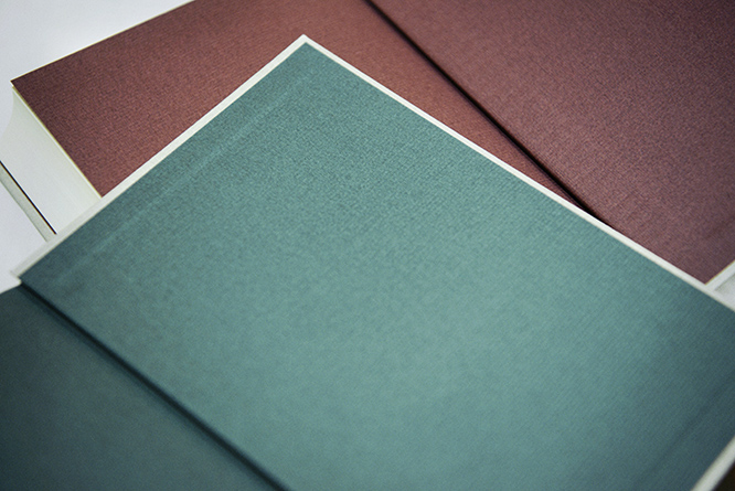
the pastedowns in volume one and volume two visualize the storytelling
Takahashi also came up with the chapter decorations. Taking his cue from a painting of a square, a triangle and a circle created by the Japanese monk Sengai Gibon (1750 – 1837), the book designer came up with an art deco-inspired motif.
No date for the novel’s translation has been announced yet but it will likely be at least 2 year if not more. But English reviews should start popping up here and there within the next few weeks.
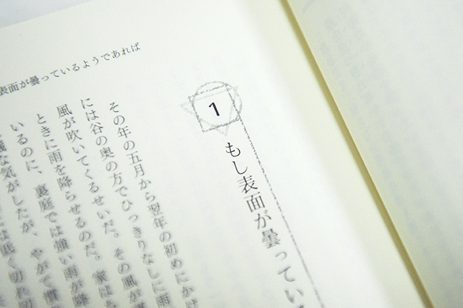
Takahashi’s mysterious motif decorates the chapter headings
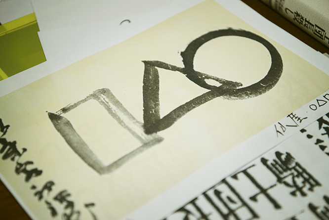
it was based on the Edo-period painting by Japanese monk Sengai Gibon


March 6, 2017 at 9:30 pm
Thanks. Very interesting article on the design of the new Murakami book. Too bad we non-Japanese readers will have to wait so long for the book in English! I hope the publisher will emulate the Japanese version’s design, including that amazing cover!