all photos by Akihiro Yoshida
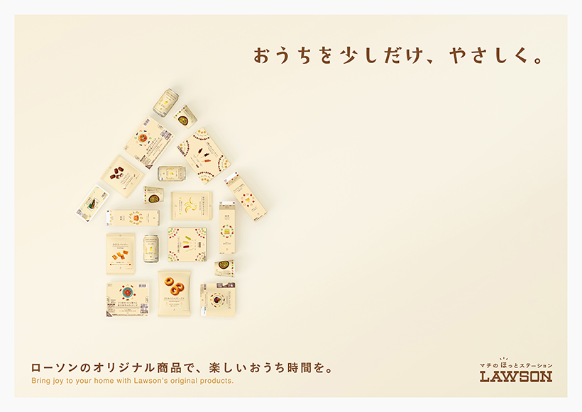
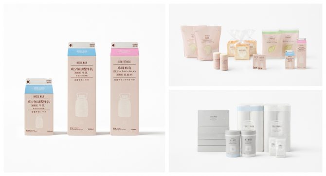
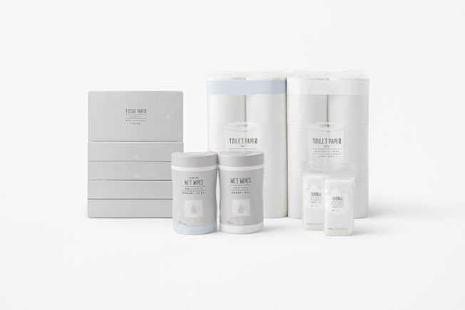
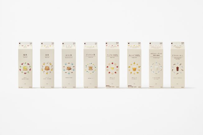
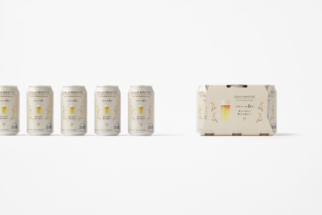
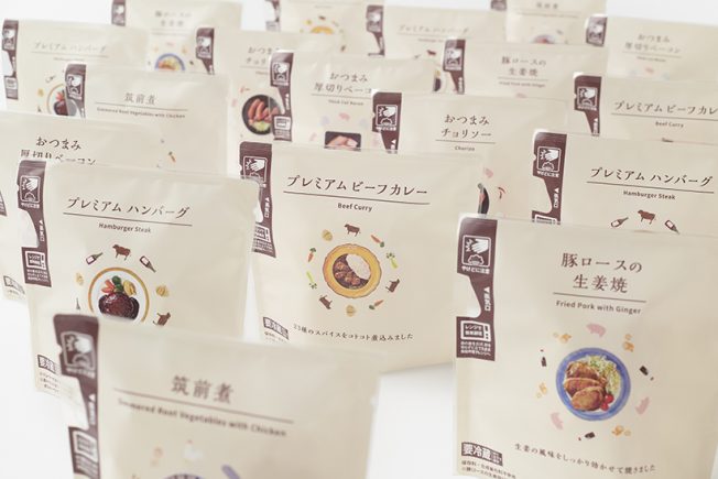
If you’ve paid a visit to Lawson lately you may have noticed something different along the aisles of tightly packed milk, breads, juices, toothbrushes, toilet paper and anything else you may or may not have stopped by to pick up. Japan’s 3rd largest convenience store chain recently hired design firm Nendo to rebrand the packaging on over 700 private label products.
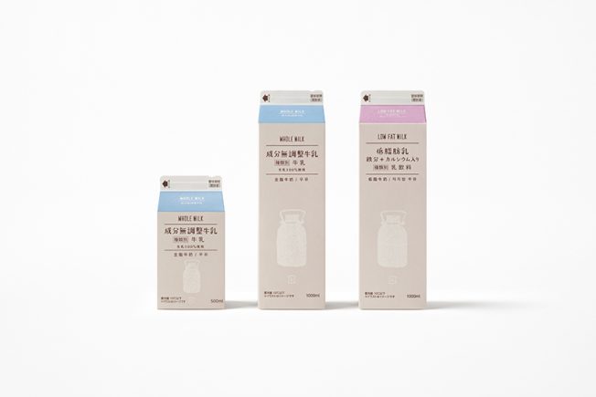
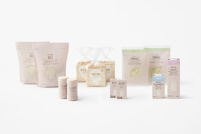
The new designs have been rolling out at franchises across Japan over the last several weeks, to the delight of the design-conscious. The packaging design is unified across all categories with foods in beige and household goods in gray. Silhouette illustrations indicate the contents, reinforced with product names in four languages: Japanese, English, Chinese, and Korean. No more mistaking human treats for doggy treats!
However, some shoppers have not been happy with the rebranding and have taken to social media to voice their frustrations. The main criticism appears to be that the packaging is not immediately recognizable, and requires close observation to discern, for example, which is low-fat and which is whole milk.
The rebranding gets a thumbs up from us though. We don’t find the labels hard to read at all. The minimal and stylish packaging is a step towards a more MUJI-esque feel, which we love. And the cozy font and hand-drawn illustrations in favor of large product photography helps create a softer look that adds a bit of joy and comfort to the overall experience.
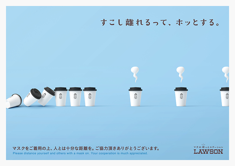
We also like these social distancing awareness posters below that were created alongside the rebranding!