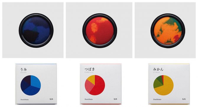
Times have been difficult for Japan’s hanko, a personal signature tool that dates back centuries. Technology has been rendering the system obsolete and a work-from-home environment triggered by the global pandemic has only accelerated this phase-out. But it’s a beautiful tradition. And in order to rethink the hanko’s place in modern society, stationery company Shachihata has released a new line of hanko ink, normally just red or black, in beautiful, lush colors inspired by nature.
The new line of hanko ink was actually born from a design contest that the stationery company hosted last year in order to solicit ideas from the public. Designer Satoru Utashiro sent in his idea for a new line of hanko ink called watashi no iro, or “my colors,” which ended up winning first prize. In fact, the company was impressed enough to commercialize the product, which just went on sale July 1.
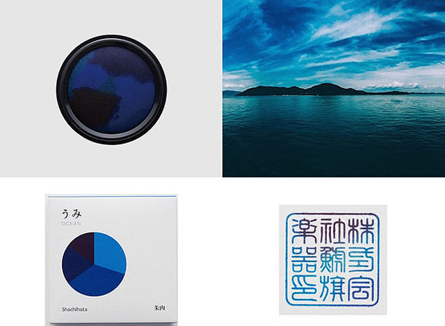
Watashi no iro comes in 5 different colors, each inspired by a type of nature that is very familiar to Japan: ocean, citrus, nishikigoi (or koi fish), forest and camelia flowers.

Hanko ink is known as shuniku (朱肉) in Japan and was has traditionally been the auspicious color of vermilion.
But by substituting it with a gradient palette, hanko stamps are rendered in different colors depending on which area of the pad they absorb ink from.
The company decided to test the market with their new line of hanko ink by only producing 20 quantities of each color, which predictably sold out almost immediately. Hopefully the strong response will be enough to convince them to produce more.










July 23, 2020 at 10:01 am
I love it!
Do you thin these can be used for official paperwork, such as city office and university applications? Or just for fun, such as artwork?
July 28, 2020 at 2:31 pm
Love it! Want it!
package design is great too.
need to see my spending habit…