the original presentation for “Nameless Paints”
The names we assign to colors are restrictive and only serve to impede our minds. The water that comes out of a faucet isn’t “blue.” Leaves on the trees can be “green” but they can be so much more. In Japan there’s even the absurd hada-iro (skin color), a peachy color that’s so wrong I’m not even going to begin. But now a young designer duo wants to change the way kids learn about color. They’ve created a set of “Nameless Paints” whose colors are simply identified by just that – their color.
 “By not assigning names to the colors we want to expand the definition of what a color can be, and the various shades they can create by mixing them,” explains Yusuke Imai. Together with Ayami Moteki they form the design duo Ima Moteki.
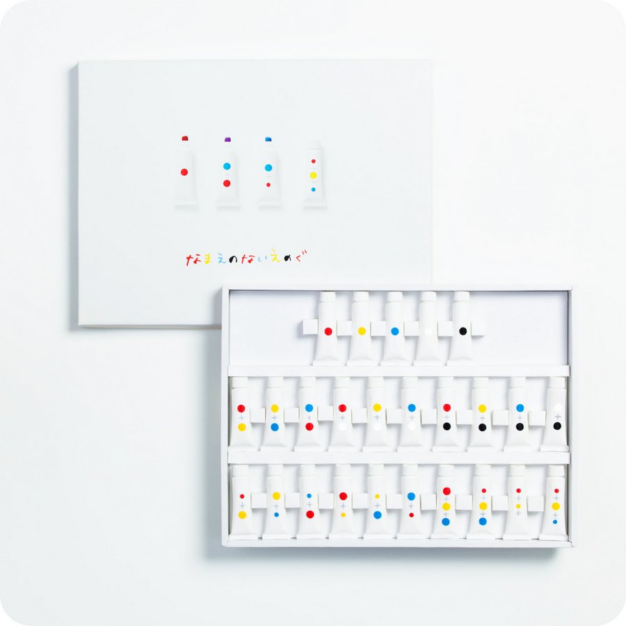
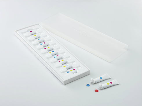
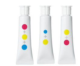
Instead of names, each tube in the 10-color paint set is identified by one or more circles of color. For tubes with more than one circle, the size of the circle indicates the proportion of paint that were mixed to create the resulting color. It’s a radical new way of getting kids to intuitively understand color and remove the preconceptions that names like “green” and “blue” create.
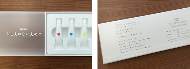
the top and bottom packaging design for the final product. It will go on sale next month.
The set of “Nameless Paints” were originally part of the 2012 Kokuyo Design Awards, one of the most interesting design awards in Japan that’s helped commercialize simple yet groundbreaking products like the kadokeshi eraser or the infinite canvas roll table.
Kokuyo’s stationary brand Campus spent the last 3 years working with the designer duo to refine their concept and eventually bring it to market.

the designer duo that created “Nameless Paints”


September 26, 2015 at 10:47 am
Nice design, but I’m pretty sure that, developmentally speaking, it’s a pretty absurd concept. Intellectual laziness can’t be swept under the rug by blaming it on the ability to identify hues. Kids are much smarter than this.
September 26, 2015 at 9:18 pm
pinkbunnlebath is just sorry his name won’t mean the same thing any more. He’s worried what uninhibited minds may call his pretty pink. Lol bro you obviously don’t even think outside of the nice little box you were squeezed into. This idea is brilliant because as it was once said “a rose is a rose is a rose, AND BY ANY OTHER NAME WOULD STILL BE A ROSE” but you may not get that either. Brilliant idea for minds that have not been forced into thinking a particular way this will lead to unbound creativity, no doubt(:
September 27, 2015 at 5:09 am
Visually intriguing but verbally this would really cause a lot of issues; ultimately a name will be needed. Try communicating which – if only to get more of one – or more, tubes…
Colour names will be required at some point – hence why we name things in the first place…
September 27, 2015 at 7:40 am
I like the concept as far as learning how to use color. There is something about the idea that sounds lazy and absurd.
September 27, 2015 at 12:12 pm
My 4 year old daughter loves to paint and do puzzles – she will easy this up! 🙂
September 27, 2015 at 1:14 pm
WHy not? It’s worth trying. In a classroom situaution names will get used anyway as we use small muth noises to communicate. Though perhapa an art teacher could take the approach of a the French teacher that refuses to speak any English, and insist that the children point to the colour they mean or want? It could be fun.
Later on in development of painting I would think that the specific uses of particular pigments may become an issue? There are some exceptionally useful pigments for instance that mix very well and produce reliably beautiful results together, whereas their cheaper generic substitutes often look like exactly the same hue, until you try mixing them and get…mud. I don’t suppose this matters at all if you are painting on a computer though.
September 27, 2015 at 1:14 pm
Love this! Nobody knows how little ones with no preconceived knowledge will handle this, but to open minds to think for themselves with original thought is a goal that I hope this world is headed. This is a great start.
September 27, 2015 at 2:15 pm
Love this idea! I can’t believe people think this would contribute to intellectual laziness! Looking at each one I had to think about the outcome of the color combination to work out which color it was… it’s breaking the paints down to their basic colors which then requires thought to combine them again… it gets kids THINKING!!! It teaches them about color combining… labeling them with a name is the lazy way to do it! Brilliant idea!
September 27, 2015 at 2:38 pm
It’s an interesting idea and I like that it will help learn how shades are made. However at some point a kid is going to need to ask their playmate to pass them the purple.
September 27, 2015 at 8:03 pm
This is meant to impress people who already know basic color theory. Parents and teachers can label paints temporarily this way as a form of assessment for students once they understand the basics. If young learners lack the elementary knowledge, how are they expected to understand “color” using this type of labels?
September 28, 2015 at 3:37 am
How can it be lazy? It’s encouraging you to actually LOOK: something people like me have spent their whole long lives NOT doing.
September 28, 2015 at 10:00 am
I wonder if the people that had to THINK about it though communicated in their head with color names, or how did you manage to do that, this color blob and that color blob makes this blob? Neat. It’s the same exact concept but confusing to kids. Might as well as not introduce their classmates with names, just student and student, and student. If you mix this student with that student you get this kind of result. I feel it just gets rid of a necessary communication step. I am an artists, and an art major and this is still just whatever to me.
September 28, 2015 at 12:50 pm
I think its a wonderful idea. I like the intuitiveness. Fabulous way for beginners to get a feel for and understand color relationships. A way to build color sensitivity.
I agree with Gill’s comments. The design forces you to Look / Think/ Concentrate / Analyze / Predict.
September 28, 2015 at 2:46 pm
Are they coming to the United States, I could use some. I have trouble with color combinations, I’m in my 40’s
September 28, 2015 at 10:44 pm
I’m ok with the product, but it’s mission perplexes me… “eliminate the preconceived notions of the word blue or green”? Those are words of a language. Language in its fundamental state is founded on preconceived notions. It’s how both parties understand the meaning of the other’s glorified sound effects and know that when I say “cat” we are both thinking of the furry thing on 4 legs that meows…
September 29, 2015 at 2:51 pm
so they’re all the same colors except they labeled the tubes with pictures instead of words….I’m failing to see what’s creative about this.
September 29, 2015 at 10:43 pm
I can see using something like this in an art education setting or a parent and child. Using it to teach that all other colors are combinations of the 3 primary colors. It would become frustrating to try to discribe the results of mixing A+A+B+C+C= strong yellowish bluish redish red=maroon?
October 3, 2015 at 5:22 pm
There’s nothing lazy about this. This is a fantastic way to introduce color theory. A lot of learning about painting, at least representationally, is actually unlearning a previous idea. To never call something by a name, but to approach it from the visual components that precede language shortcut to the part of the brain that needs to learn the idea – not the words for the ideas. The words will inevitably come later, but only when necessary.
I would improve upon this is to not have a printed color label, but swatches of the actual paint upon each tube.
Later on in painting education it will become evident that there are multiple pigments that produce similar looking colors that behave differently, whether by tone, texture, finish or transparency, all important, I’ve always fantasized about relabeling all of my paint tubes with the international pigment code (PG7 for Phthalo Green, PR101 for Mars Red, PW1 for Lead White, etc) in order to further remove myself from my assumptions about what the name of a color means in order to learn better about the reality of the chemical from which it is made. It would also address the problem of certain paints that have mixtures of pigments to produce one color.
The reason why eliminating preconceived notions about words is important in making representational art is this: Ask a child to draw a “cat” and they will draw a *symbol* for a cat — they’ll draw four legs, a tail, and a ears and maybe even write in “meow” in a speech bubble. To ask someone to draw a very accurate representation of the three-dimensional animal over there in the corner upon this two-dimensional surface is a very different question — one that a technically “good” artist is addressing. In order to learn how to do the latter, you must begin to unlearn the former. The names of things are attached to that.
October 6, 2015 at 8:49 am
Has any of you ever used paints based on their labeled name?