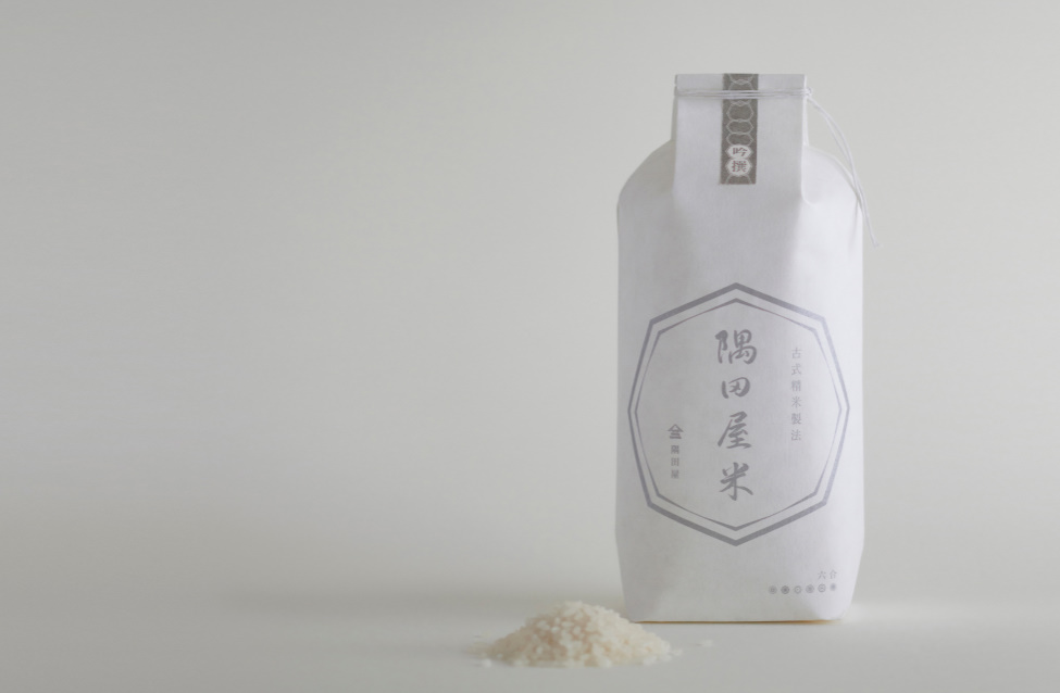
 photos by matsubacyoku | click to enlarge
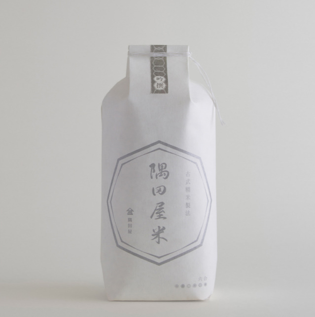
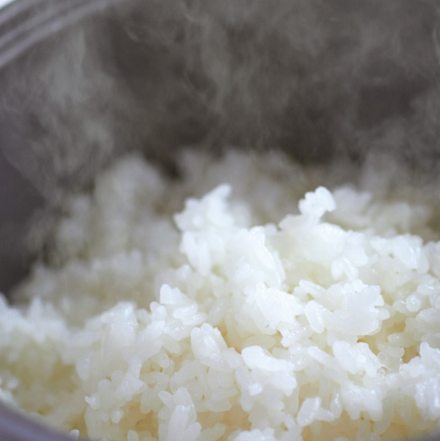
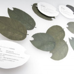
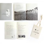
What a great campaign for rice, the quintessential staple of the Japanese diet. With over a 100-year history, the Tokyo-based rice merchant Sumidaya recently underwent a major facelift with art direction courtesy of Eding:Post. The minimal design manages to capture the essence of rice, a symbol of purity, that also plays a major (yet subdued) role on the dining table.
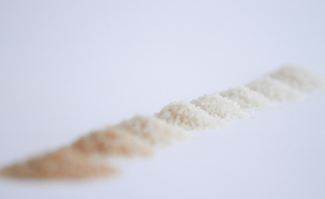
One important characteristic of Sumidaya rice is that each year, depending on the type of crop that is produced, a specific blend is created that best emphasizes the distinct tones of the rice that was harvested. The new rice goes on sale March 2012.
Just looking at these images makes me hungry! Check out our other stories on Eding:Post

Source: Eding:Post


January 4, 2012 at 1:34 am
Love the minimalistic and pure approach to the packaging design. I like that this feel and look also is visible on their website.
January 10, 2012 at 5:28 pm
Reminds me of this Wolfgang Laib installation I saw in Chicago last month: http://www.artandeducation.net/announcement/school-of-the-art-institute-of-chicago-saic-presents-wolfgang-laib-unlimited-ocean/