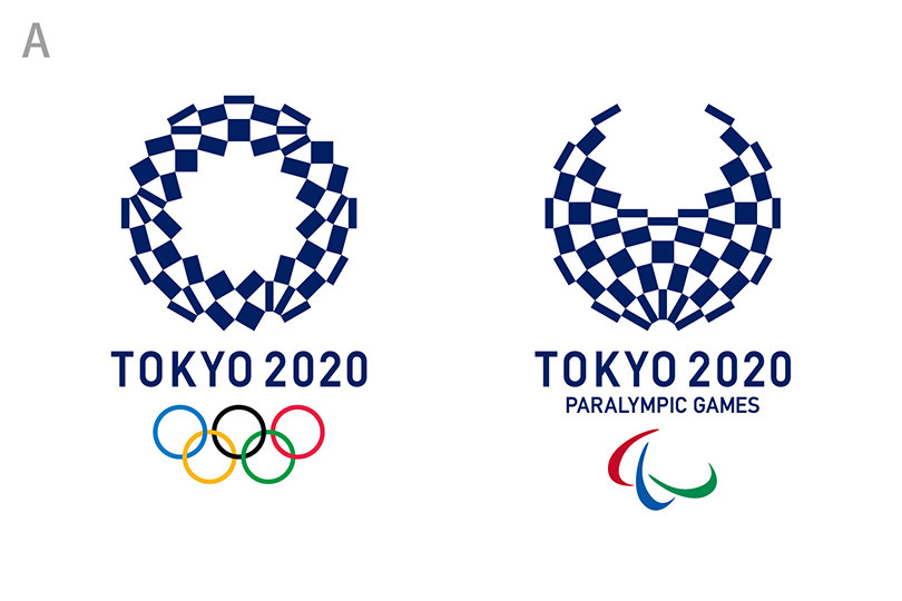
Update: On 4/25/16 the olympics committee decided to go with idea A, the harmonized checkered emblem.
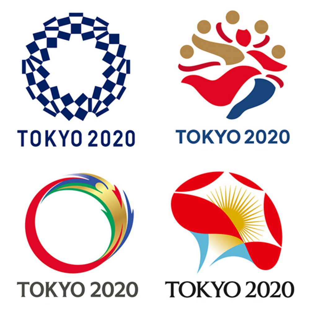
After sifting through over 14,000 designs submitted in a public call for entries for Tokyo’s 2020 Olympics logo, the committee has revealed 4 outstanding designs that have been shortlisted. Kenjiro Sano’s original logo was withdrawn last year after a controversial plagiarism scandal so the committee has been very cautious, noting that each design has been vetted for originality and selected in consultation with design and trademark professionals. The creators of each design have been masked and the committee is asking the public to help them decide, because no one wants to take responsibility for making a decision.
A. Harmonized checkered emblem
I think this is our favorite. Classic, timeless and very Japanese. It references ichimatsu moyo, a checkered pattern that became popular during the Edo period. Expressed in the traditional Japanese color of indigo blue, the pattern “expresses a refined elegance and sophistication that exemplifies Japan.”
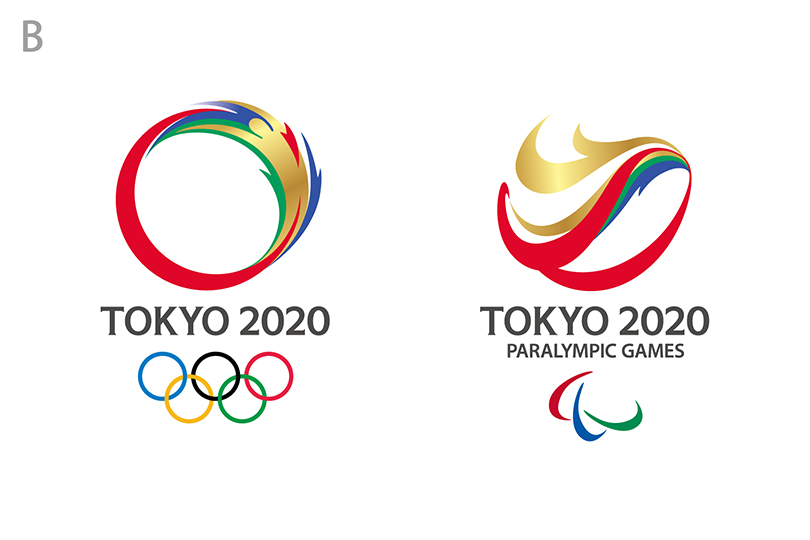
B. Connecting Circle, Expanding Harmony
We’re calling this one “Donald Trump’s Hair.”
“This design expresses the connection between the dynamism of the athletes and the joy of the spectators, and the expansion of peace and harmony throughout the world,” notes the committee.
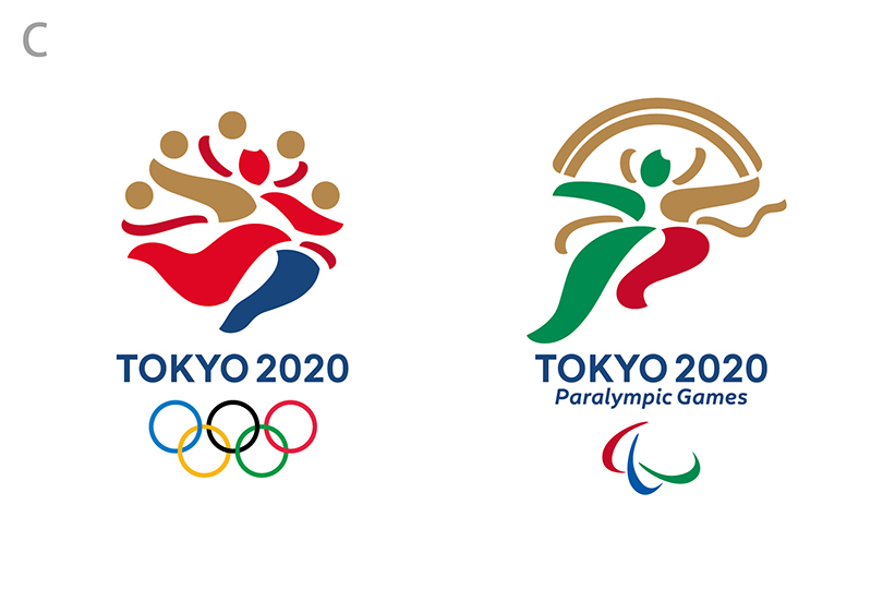
C. Surpassing One’s Personal Best
C isn’t bad, but there’s nothing really special about it that stands out to us. They were inspired by the Wind God and Thunder God “and seek to convey dynamic movement at the instant an athlete breaks the tape on the finish line.”
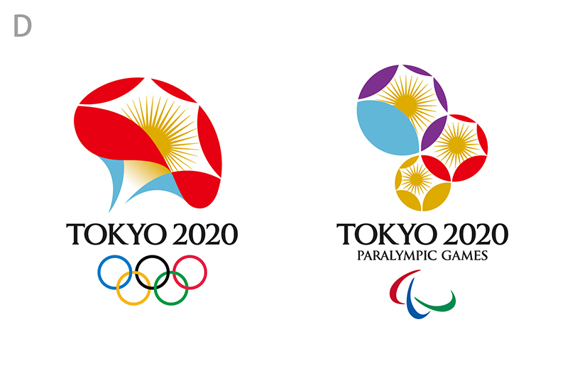
D. Flowering of Emotions
This may be our 2nd favorite, although we immediately thought “mushroom,” rather than the intended “morning glory.” But now that we see the flower it’s a nice symbol of facing up towards the sky to greet the new day. “The process of the flower growing and eventually returning to seed conveys the sense of expectation for the Games and succession to the next generation,” notes the committee.
It seems like everything from the new stadium to the logo has been plagued (ie mismanaged) from that start. And for the record, we think it’s a bad idea to conduct public calls for entries for logos like these, essentially turning the process into a circus. Let’s just hope these new logos break the curse and the Tokyo 2020 Olympics can progress from here.


April 8, 2016 at 11:56 am
I don’t mind the ‘harmonized checker’ pattern on its own but how
will it translate as a cohesive visual identity?
Kenya Hara’s brilliant proposal answered all the criteria imo,
April 8, 2016 at 12:25 pm
Eman – Agreed! We loved Kenya Hara’s proposal!
April 8, 2016 at 5:41 pm
I love the flower one. The flower reminds me of how peaceful, beautiful and serene Japan can be. They are all nice but the flower is my favorite.
April 9, 2016 at 8:07 pm
B looks good but I’d fill in the circle completely or at least somewhat.
April 11, 2016 at 12:06 am
Sano’s logo much better.
A period.
April 12, 2016 at 12:54 pm
MIC – I completely agree.