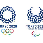
In exactly 5 years – on July 24, 2020 – the Tokyo Olympics will open. So today the committee unveiled the official Tokyo 2020 emblems for the Olympic and Paralympic Games. We were happy to see that the emblems were designed by Kenjiro Sano, a graphic designer who we’ve championed on the blog for quite some time.
Sano was chosen from an open call for submissions in which a total of 104 designers (4 of which were from overseas) submitted proposals.
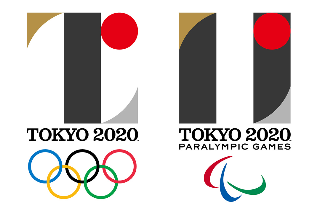
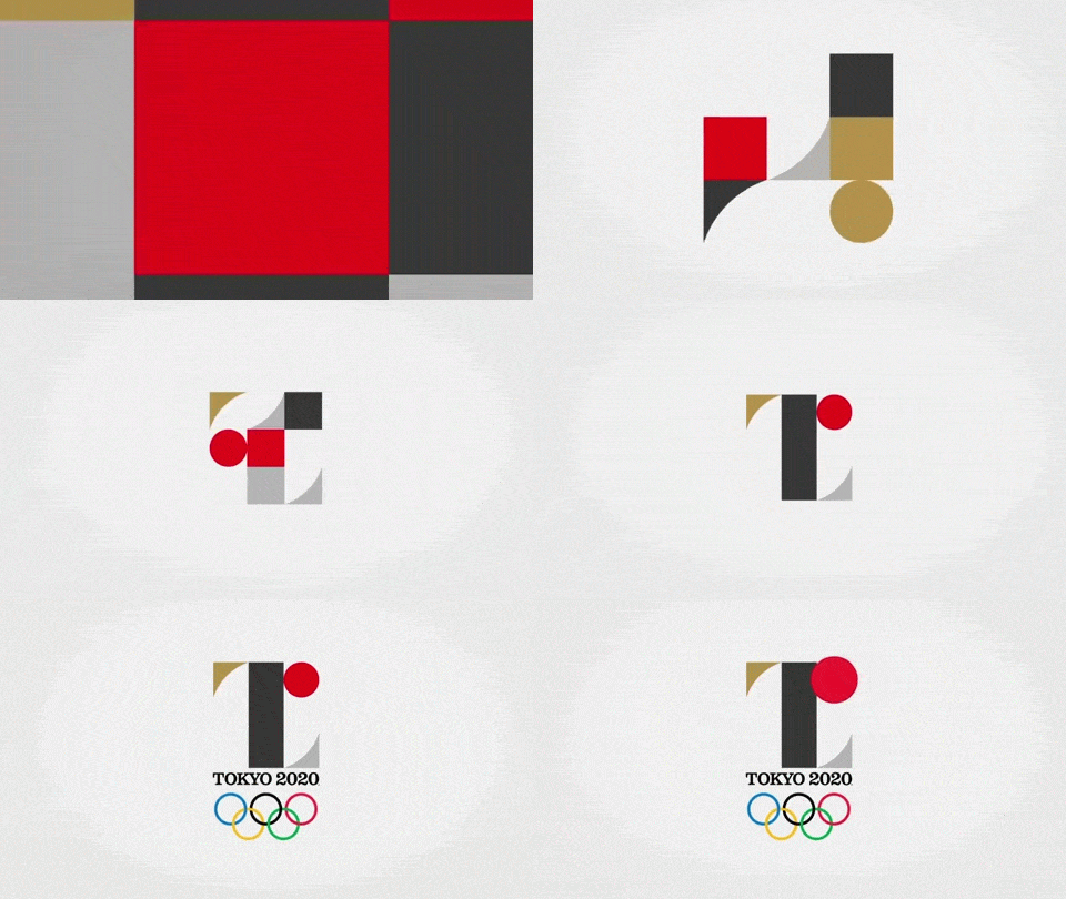
The emblems are characterized by modern, abstract representations of the letter T. The symbolic letter stands for Team – “When the world comes together for Tokyo 2020, we will experience the joy of uniting as one team.” It also stands for Tomorrow – “for a better world and a brighter future.” And of course it also is the first letter of the host city: Tokyo.
We love the shapes and colors and our overall first impressions is pretty great. It’s incredibly difficult to design for the future but this artwork seems pretty timeless.
The black color of the central column represents diversity, the combination of all colours. The shape of the circle represents an inclusive world in which everyone accepts each other. The red of the circle represents the power of every beating heart. These elements combine to create the emblems of both the Olympic and Paralympic Games.
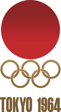 The selection committee was headed by graphic designer Kazumasa Nagai, who noted that the previous Tokyo Olympics in 1964 were represented by a simple yet powerful emblem designed by Yusaku Kamekura (left image).
A large round sun at the top dominated the composition. Beneath it were the five-ringed symbol of the Olympic Games with simply “TOKYO 1964” below it. However, its sculptural quality was impactful and meaningful and Nagai believes that Sano’s 2020 design will have the same effect on Japan and the rest of the world.
[UPDATE] Sano’s desgin has been scrapped after allegations of plagiarism.












July 24, 2015 at 12:11 pm
Wow, both are amazing! They compliment each other really well. Great job!
July 24, 2015 at 1:06 pm
Not mad on the typeface. It doesn’t contrast enough with the shapes in the logo.
However…
the logo itself is fantastic. Classically Japanese from color to shape and timeless to boot. Whereas London’s was meaningless and risky solely because of its pointlessness, this is daring in its refusal to follow trends and instead create a style for itself. Instead of corporate/government junk design Tokyo is getting a logo that could represent uniquely for years to come and I think that’s fantastic.
July 24, 2015 at 5:05 pm
Without the text and the Olympic rings I’d be hard-pressed to identify what the logo represents. It reminds me of an exercise for a 2-D design class.
July 24, 2015 at 10:51 pm
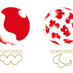
I would be curious what 7 L and II stood for…
There’s really nothing “Olympic” in either design, unless The Rising Sun motif could be construed as the “O” of Olympic.
I also have mixed feelings about the “broken circles” for the Para-Olympics. I’ll have to think about that a bit more.
As far as overall design quality, I’d say this is only slightly above Freshman level. I can see where some artiste may have talked up the parallel circles and subliminal cohesion, but when you look at it you just don’t see “OLYMPICS”. Neither do you see anything intrinsically Japanese, except for the Rising Sun. They didn’t even complete the vague reference to gold, silver and bronze. (It also lacks balance, but that’s a pet peeve of mine others might not object to.)
It disappoints.
July 25, 2015 at 10:47 am
This one will stand out as a strong identity far beyond 2020. Nice work!
August 11, 2015 at 10:02 am
Well, seems no one here has read the news about the bad rap this 2020 Tokyo Olympic Games is been having:
Tokyo 2020 Olympic Bid Already Getting Bad Press for Logo Ripoff
http://www.adweek.com/prnewser/tokyo-2020-olympic-bid-already-getting-bad-press-for-logo-ripoff/117000
2020 Tokyo Olympics hit by new controversy
http://www.usatoday.com/story/sports/olympics/2015/07/31/tokyo-2020-olympics-logo-belgium-flap/30928879/
From a professional standpoint, this logo doesn’t cut the mustard: too plain, dull color palette… I mean, it’s THE OLYMPICS man! put some life into the logo at least with a good color scheme.
The only thing that makes sense is the red circle, other than that all I see is
border-radius:100px 0 0 0andborder-radius: 0 0 100px 0;August 11, 2015 at 12:14 pm
@Ricardo – this post was written on 7/24, the day the logo was revealed. We did address the accusations in a later post: in short, we think they are unfounded.
August 11, 2015 at 1:56 pm
@Johnny, mind sharing the link to that post?
Well, we can’t deny that the 2020 Tokyo Olympic Games logo is an exact replica of the Théâtre de Liège logo.