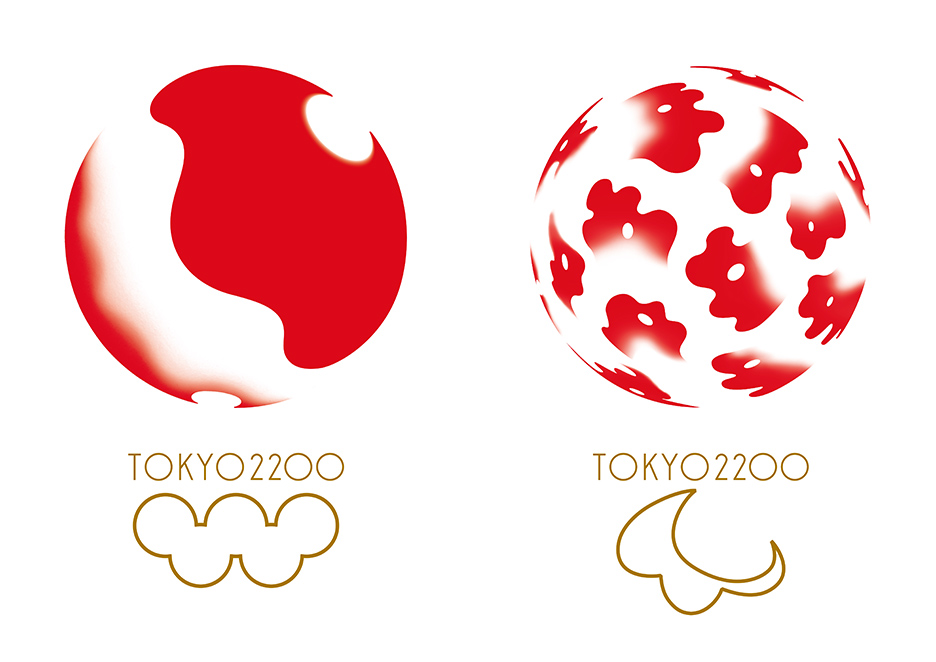
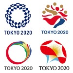
Kenya Hara’s proposal for the 2020 Tokyo Olympics logo. The rings of the Olympics symbol and and Tokyo 2020 have been obscured to avoid copyright claims
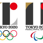
In September the Tokyo 2020 Olympics Committee announced that they would scrap Kenjiro Sano’s logo amid plagiarism claims and redo the entire process. But when they did that they also effectively scrapped the other 103 proposals, each created by professionals who spent a decent amount of time and resources perfecting their concept.
Now, renowned designer and one of the foremost faces of Japanese design, Kenya Hara, is speaking out. And in doing so, he has released his proposal from the Hara Design Institute.
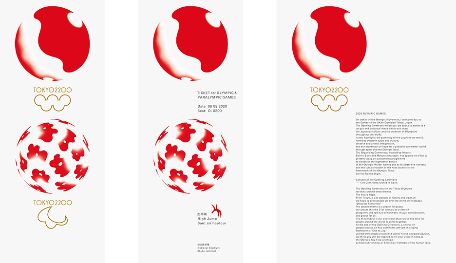
from left to right: a sample banner, ticket and distribution materials
“Removing the curtain from the design competition will help graphic design become more widely understood,” says Kenya Hara, explaining why he decided to publish his team’s proposal. “It will serve as a valuable resource in contemplating our future Olympics logo.” He notes that the Olympics symbol and “Tokyo 2020” have been obscured so as to avoid any copyright claims.
Hara’s proposal is one that symbolizes “our planet making great strides,” “a beating heart” and the “summit.” The two planetary logos reference the sun, the moon and an arena where humans can transcend any bickering and come together for the great games.
(all quotes translated from Japanese to English by the author)
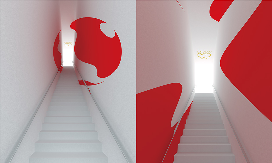
this rendering imagines the metamorphosis of the logo onto facilities and arenas
In today’s world of design planning it’s no longer sufficient to simply come up with a beautiful logo. Various applications and forms of communication must also be considered. And in that sense, Hara’s design team has created a remarkable proposal that adaptable to various needs.
But in a surprising and rather confounding decision, the Olympics committee has opened up the new round of proposals to the public, allowing anyone over 18 to submit their idea. They’re accepting entries through December 7, 2015. The competition will undoubtedly bulge into a marathon with thousands of runners. We stand with designer Kenya Hara in hopes that this next race, whatever it turns out to be, is more transparent.
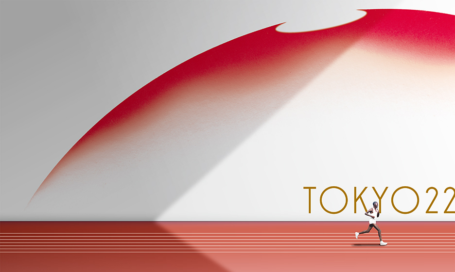
what the visuals might look like when applied to an arena
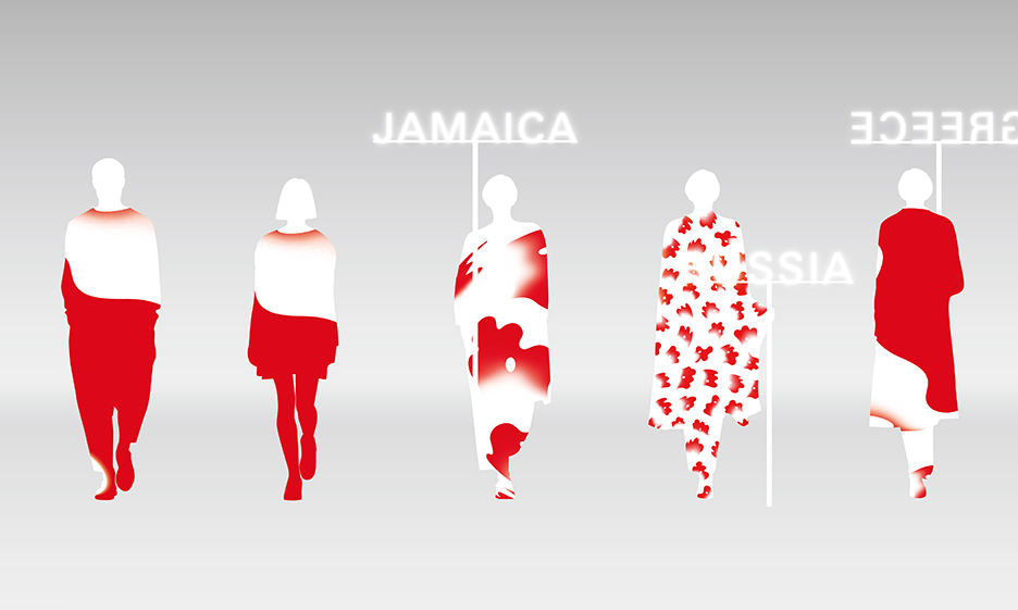
the logo applied to costumes and gear
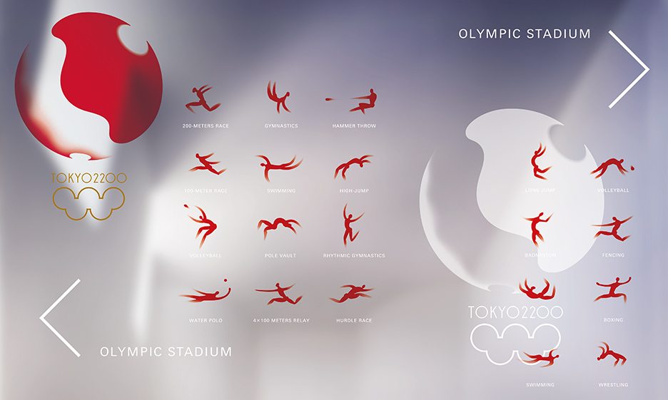
the logo applied to on-screen graphics and infographics
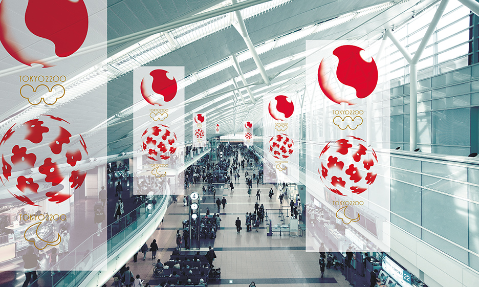
the logo imagined in public spaces
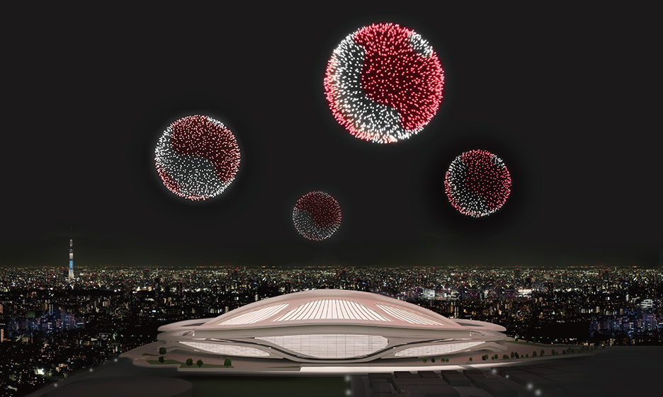
the designers even imagined their logo as a series of fireworks for the opening ceremony


November 3, 2015 at 2:22 am
Nice concept! Shouldn’t it be ‘Tokyo 2020’ instead of ‘Tokyo 2200’?
November 3, 2015 at 11:25 am
@clement – I was wondering that too until i re-read the article
“the Olympics symbol and “Tokyo 2020” have been obscured so as to avoid any copyright claims.”
November 3, 2015 at 11:33 am
That image you labeled as an infographic is not an infographic. It is an example of the iconography used for the different events. Plz take more care when writing about design, thnx.
November 3, 2015 at 7:44 pm
B – the designer had labelled the image as an infographic so I’m going with what he said.
November 7, 2015 at 2:07 am
IMOP, I like element of design and how to apply it. But I don’t like the logo.