The 2016 Good Design Award results were announced recently with awards going to over 1000 entries in several different categories. But the coveted Grand Award of Japan’s most well-known design award, given to just 1 entry, was announced today. Last year the winner was a personal mobility chair and the year before that it was a robotic arm. This year, the grand prize went to a world map.
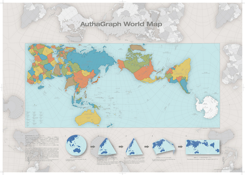
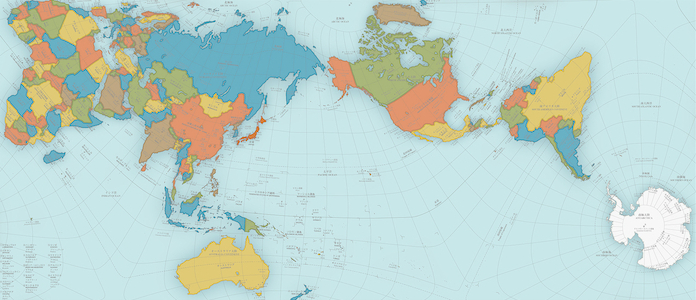
But the map of the world has been around for hundreds of years. So what’s so special about this map? To begin, Tokyo-based architect and artist Hajime Narukawa has a problem with our current map and he’s been working for years to try and fix it. In 1569 geographer Gerardus Mercator revealed his world map and, to this day, it’s the generally accepted image we have of this planet. But it has major flaws in that it dramatically distorts the sizes of Antarctica and Greenland.
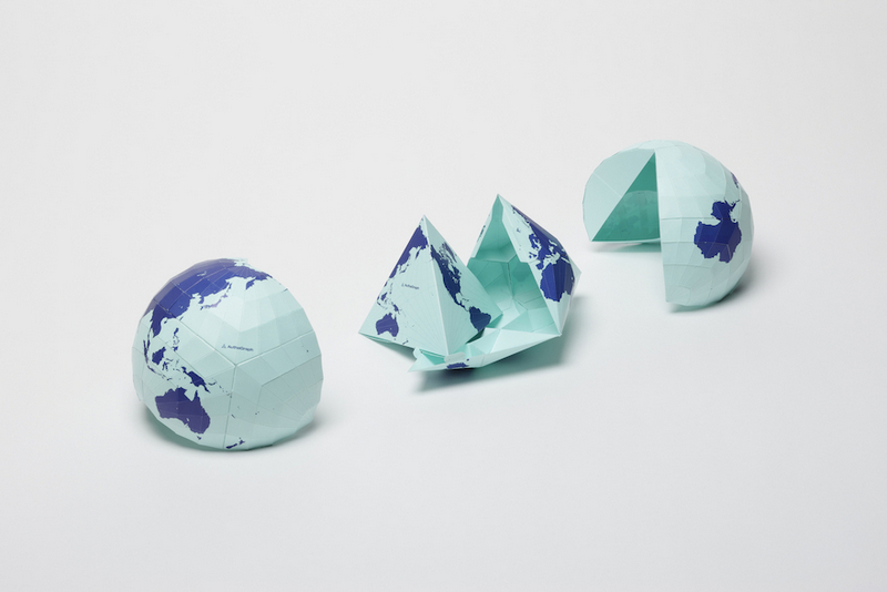
Narukawa developed a map projection method called AuthaGraph (and founded a company of the same name in 2009) which aims to create maps that represent all land masses and seas as accurately as possible. Narukawa points out that in the past, his map probably wasn’t as relevant. A large bulk of the 20th century was dominated by an emphasis on East and West relations. But with issues like climate change, melting glaciers in Greenland and territorial sea claims, it’s time we establish a new view of the world: one that equally perceives all interests of our planet.
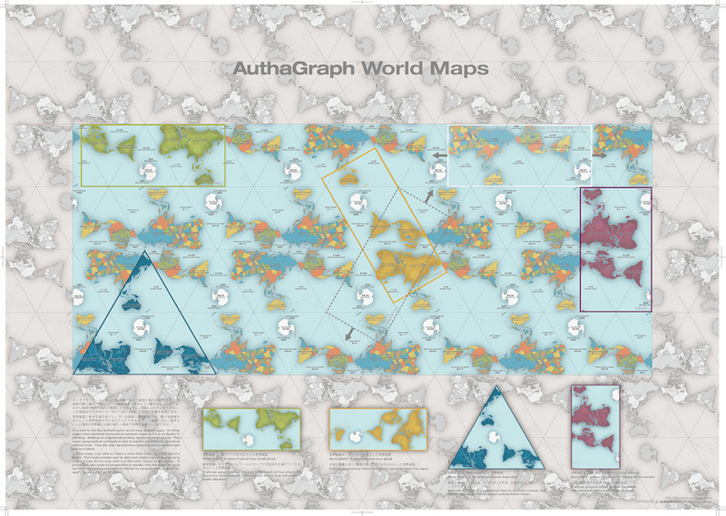
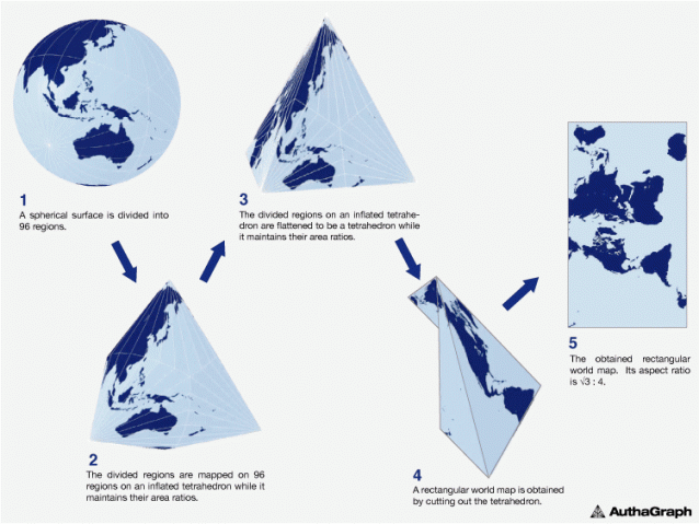
AuthaGraph not only faithfully represents all oceans and continents, but the map can be tessellated just like an MC Escher painting. Much in the same way that we can traverse the planet without ever coming to an end, “the AuthaGraphic world map provides an advanced precise perspective of our planet.”
Go here to find out where you can purchase posters and globes based on the AuthaGraph project. There’s an online shop that carries them too.


October 29, 2016 at 10:43 am
Inspired by Bucky Fuller no doubt
https://en.wikipedia.org/wiki/Dymaxion_map
October 29, 2016 at 10:53 am
Purchase globes? The globe looks the same no matter what map projection is under discussion.
October 29, 2016 at 1:06 pm
Buckminster Fuller was there, done that ( in the ’40) https://en.wikipedia.org/wiki/Dymaxion_map
October 29, 2016 at 4:50 pm
Narukawa was definitely influenced by Fuller. In fact, he studied him extensively at the Shibaura Institute of Technology. Narukawa built on Fuller’s Dymaxion Map, identifying its biggest flaw to be its irregular shape that, among other things, breaks up ocean areas.
November 1, 2016 at 4:35 pm
Yes, you are all correct he was inspired by Dymaxion Map. He talks about the design (and mentions that projection) in the TEDx talk https://www.youtube.com/watch?v=YsQtLASlDKE
November 1, 2016 at 8:07 pm
Mind blown ;0
very cool
November 2, 2016 at 7:06 pm
How do you purchase a map? the link is broken
November 2, 2016 at 10:51 pm
“But with issues like climate change, melting glaciers in Greenland and territorial sea claims, it’s time we establish a new view of the world: one that equally perceives all interests of our planet.”
Yep, gotta get that virtue signaling in there.
November 2, 2016 at 11:10 pm
How could I buy a copy???!
November 3, 2016 at 8:13 am
Here’s the link he gives from his own website to buy a copy http://www.alexcious.com/products/detail150.html#tab-sub2
November 3, 2016 at 8:31 am
Interesting. Like any projection, it does some things better than others. It shows the continents in a nicely compact form, and the only place that appears badly distorted is Brazil. OTOH, the oceans are badly distorted. Bo it is significantly better than the Mercator projection at answering “How big is that landmass” but worse at “How far apart are those continents, and what is the path between them.”
November 3, 2016 at 11:59 am
There’s a reason Mercator is used for seagoing navigation. Not a bad map if you don’t care too much about Brazil
November 3, 2016 at 3:38 pm
So basically they just pealed off the outer layer of a globe and made it flat.
November 4, 2016 at 7:37 am
West Australia’s looking quite engorged, too.
November 4, 2016 at 11:45 am
Why is it so hard to project a sphere into a rectangle? Seems like basic geometry to me…
November 5, 2016 at 1:23 pm
Excellent way of Explaining
November 6, 2016 at 1:55 pm
This map fails to fulfill 2 basic user requirements of a map:
– At a glance tell relative latitudes and longitudes of difference locales.
– At a glance tell approximate relative distances between different locales.
The first requirement can be partially overcome by following the intricate and unnecessarily complex grid
The second requirement is not so lucky. On this map New Zealand is roughly equidistant to the UK and Antarctica.
This map serve a decent TP when printed on the right paper. Hats off to Mercator!
November 7, 2016 at 4:31 am
Great work and interesting.
It looks like Anamorphic Maps …
https://www.maps4office.com/world-map-population-estimates-2100/