unless otherwise noted, all photos courtesy Kashiwa Sato
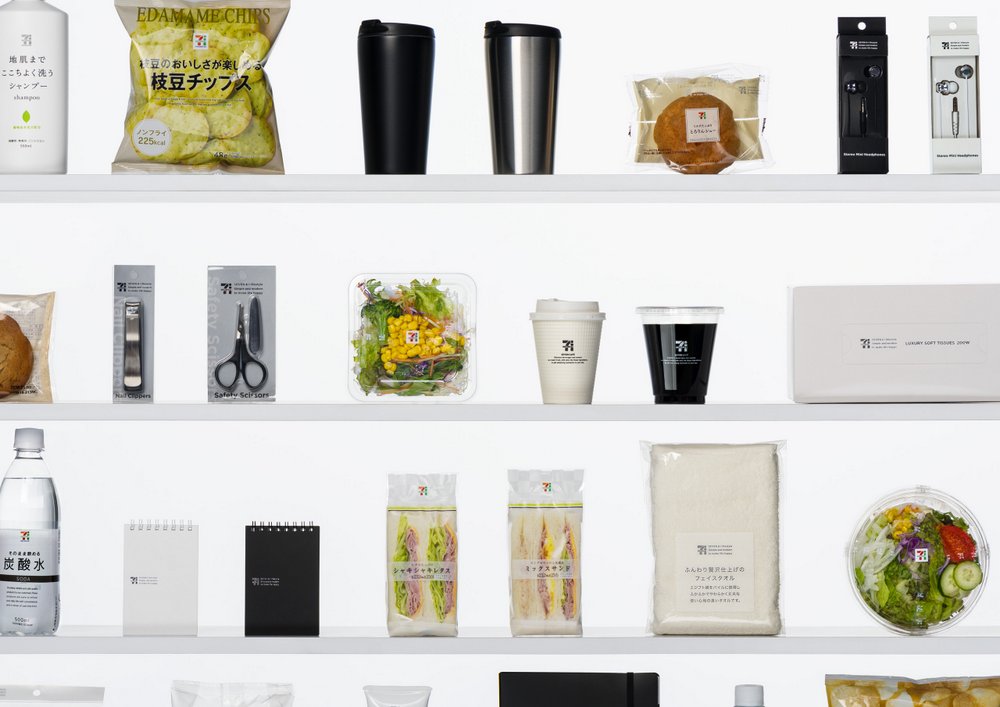
In 2010, Creative Director Kashiwa Sato embarked on an ambitious project to rebrand 7-Eleven Japan. In doing so, Sato developed a design strategy for Japan’s largest chain of convenient stores (conbini) and deployed, what he calls, “iconic branding.” It’s the same approach he’s used for other high-profile clients like Uniqlo and NTT Docomo but the essence is to identify a core message and then design an icon that conveys that message across barriers.
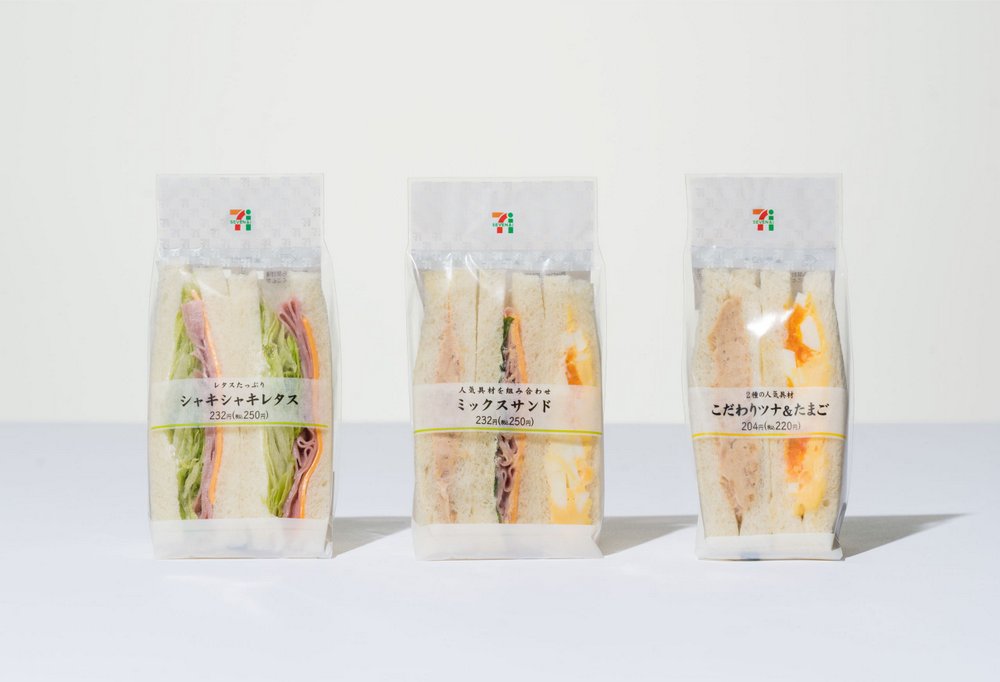
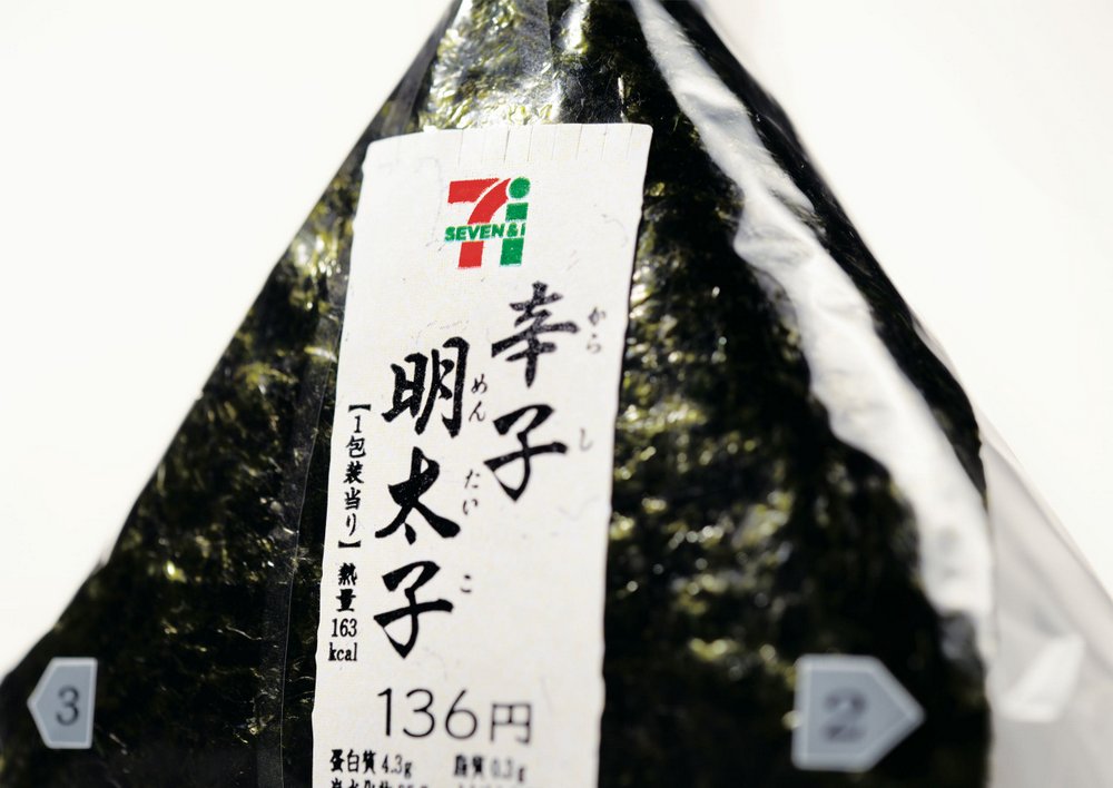
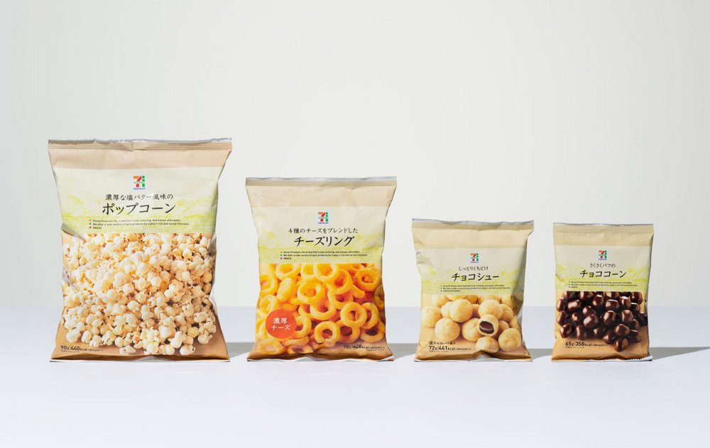
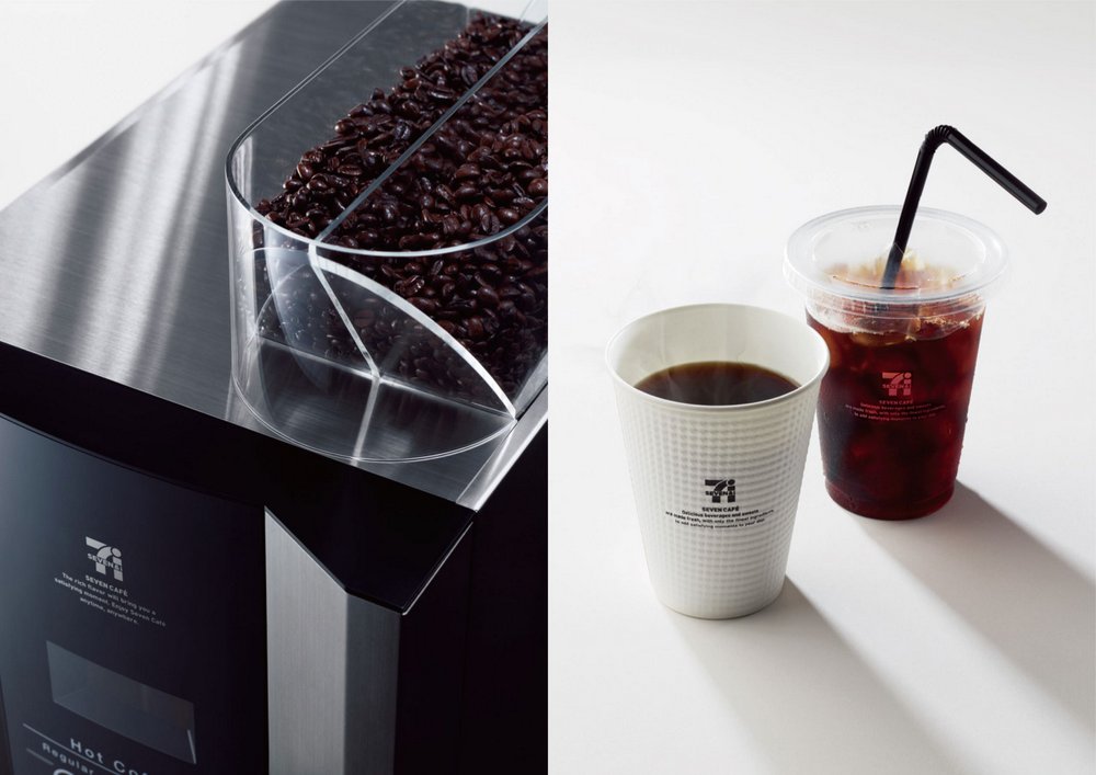
As part of the rebranding, Kashiwa redesigned more than 1700 items, a daunting task by any measure. And there was a rollout of various phases, such as the private brands that came in the 2nd year, followed by the “Seven Café” coffee stand in the 3rd year. According to the designer, his initiative resulted in record sales. The Seven Café also created a social phenomenon and catapulted 7-Eleven to the positions of top coffee seller in Japan within a year.
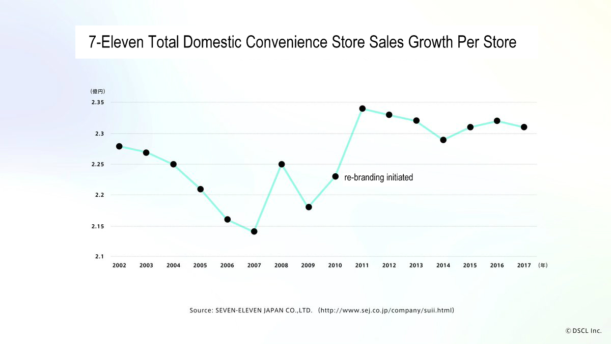
It’s hard to quantify the value of rebranding strategies, but long-term case studies such as this serve to further solidify the value of design. Researcher and designer Motoki Hirano made an attempt to quantify the data by looking at sales data that the company publishes. The first chart below shows an elevated trajectory of sales when compared to pre-rebranding and post-rebranding periods. And even if you look at sales growth per store, there’s a big gap up in sales after they rebranded.
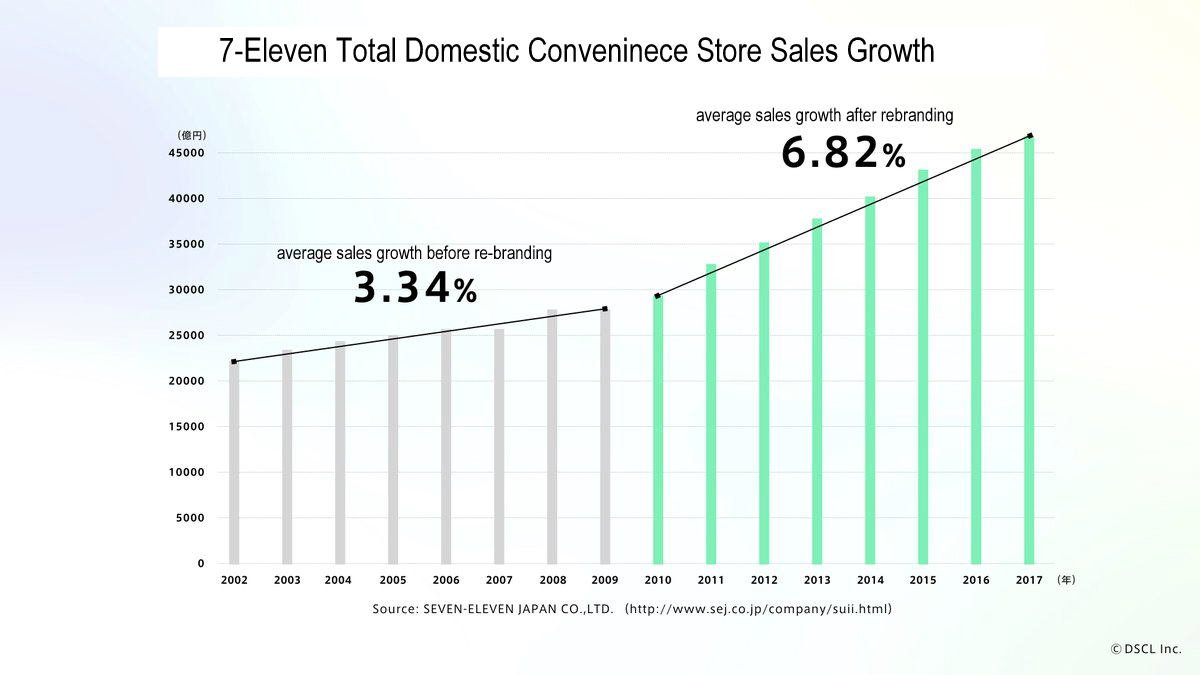
charts created by Hotoki Hirano


June 18, 2018 at 7:24 pm
Looks just like Muji branding, and they’ve been doing that for years!