The Kokuyo Design Awards 2009 were just announced yesterday! In case you were wondering, the Kokuyo Design Awards is one of the largest and most anticipated design competitions in Japan. Hosted by stationary-giant Kokuyo since 2002, the competition has spawned popular products such as the kadokeshi eraser.
This year they received over 1,500 applications with the intent of selecting only 1 grand-prize winner that would be eventually commercialized and released to the public. The number of applications is up from 1,200 in 2008 but down from a high of 1,700 in 2007. Using this as a gauge for popularity, they still tail the MUJI Awards, which boasts over 4,000 applications. (The Good Design Awards, which encompass a much larger scope, receive around 3000 applications) Interestingly enough, MUJI recently announced that it has canceled their awards this year. Perhaps it has something to do with the economy? I know what you are thinking. Enough rambling and get on with the results right? Right. One final thought… I wish they would provide more pictures/angles.
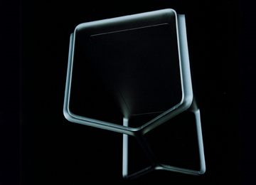
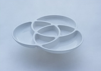
The grand prize went to Nao Asanuma for his Roots work table, which uses concave legs to create a sleek table that can peacefully coexist with computer cables.
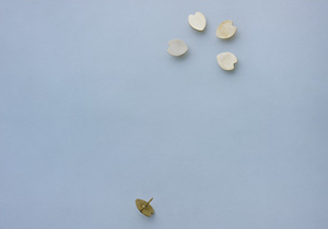
Here are some of the ideas that took home the silver. Below is Kazunari Kodama`s Flower Tack. It is a simple idea that gives an utterly mundane object some much-needed attention to detail.
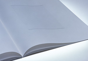
This is probably my favorite. The Margins notebook by Shohei Ono, a communication design student at the Kyoto University of Art and Design. The reimagining of margins of a standard notebook completely blew my mind! The expansion of white space gets the imaginative juices flowing. I can come up with any number of new uses and suddenly have the urge to take notes in class.
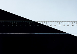
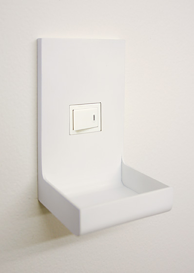
Black and White Graduation by Kaneko Hisahide is another great idea. By printing the numbers on a ruler in both black and white you eliminate the contrast problems encountered when working on multiple colored backgrounds.
I was also impressed by some of the honorable mentions, such as TO-GENKYO`s Eraser With a Core that fits around pencils. You may recall these designers as I profiled them a couple months ago with their Fresh Label.

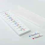
Lastly is Primary Colors by Liu Zhi-Qiang and Ye Ming-Jie of the design unit DOUBLE. The pait pallette is an ingenious yet simple way to help kids learn about mixing colors. It is truly one of those designs the prompts the obvious question, why didn`t someone think of this before?


December 23, 2009 at 11:19 am
I liked the flower tacks the best. I can’t make out the table, but the color mixing dish is 2nd on my list.
Keep up the good work Johnny. We love your site and come often.
Have a Happppy New Year!
December 23, 2009 at 7:19 am
I liked the flower tacks the best. I can’t make out the table, but the color mixing dish is 2nd on my list.
Keep up the good work Johnny. We love your site and come often.
Have a Happppy New Year!
December 24, 2009 at 2:14 pm
I like the color mixing dish the best! I’d also like to see that notebook with margins go into production. I think it’s odd they went with a table for first prize! And that picture is very confusing too!!
December 24, 2009 at 10:14 am
I like the color mixing dish the best! I’d also like to see that notebook with margins go into production. I think it’s odd they went with a table for first prize! And that picture is very confusing too!!
December 24, 2009 at 10:54 am
Claire, I agree. I wasn’t a huge fan of the table. I’ve seen similar concepts before.