To revise or not to revise. That has been the ongoing debate in Japan over the country’s constitution amid political movements to revise war-renouncing Article 9. But husband and wife design duo Takuya Hoda and Yuuri Mikami were more interested in revising the look and feel of the constitution, rather than its contents.
It all started in the Fall of 2016, just as a national debate had kicked off over revising the constitution. Hoda and Mikami, who met in art school and later got married, found that the debate began to seep into their conversations as well. Initially the two attempted to conduct online research but found that the majority of analysis was heavily biased towards one direction or the other. In an attempt to better inform themselves they began organizing unbiased workshops on the meaning of the constitution, sovereign rights, and the renunciation of war.
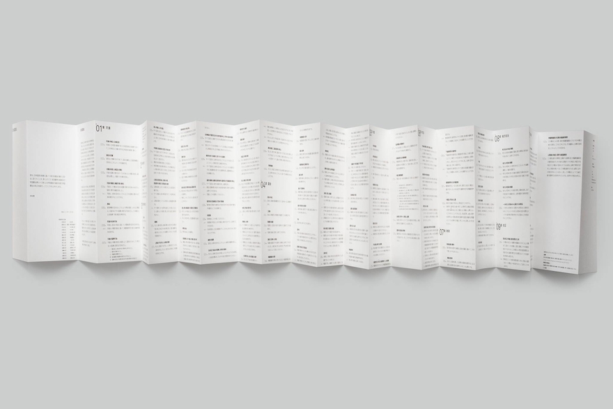
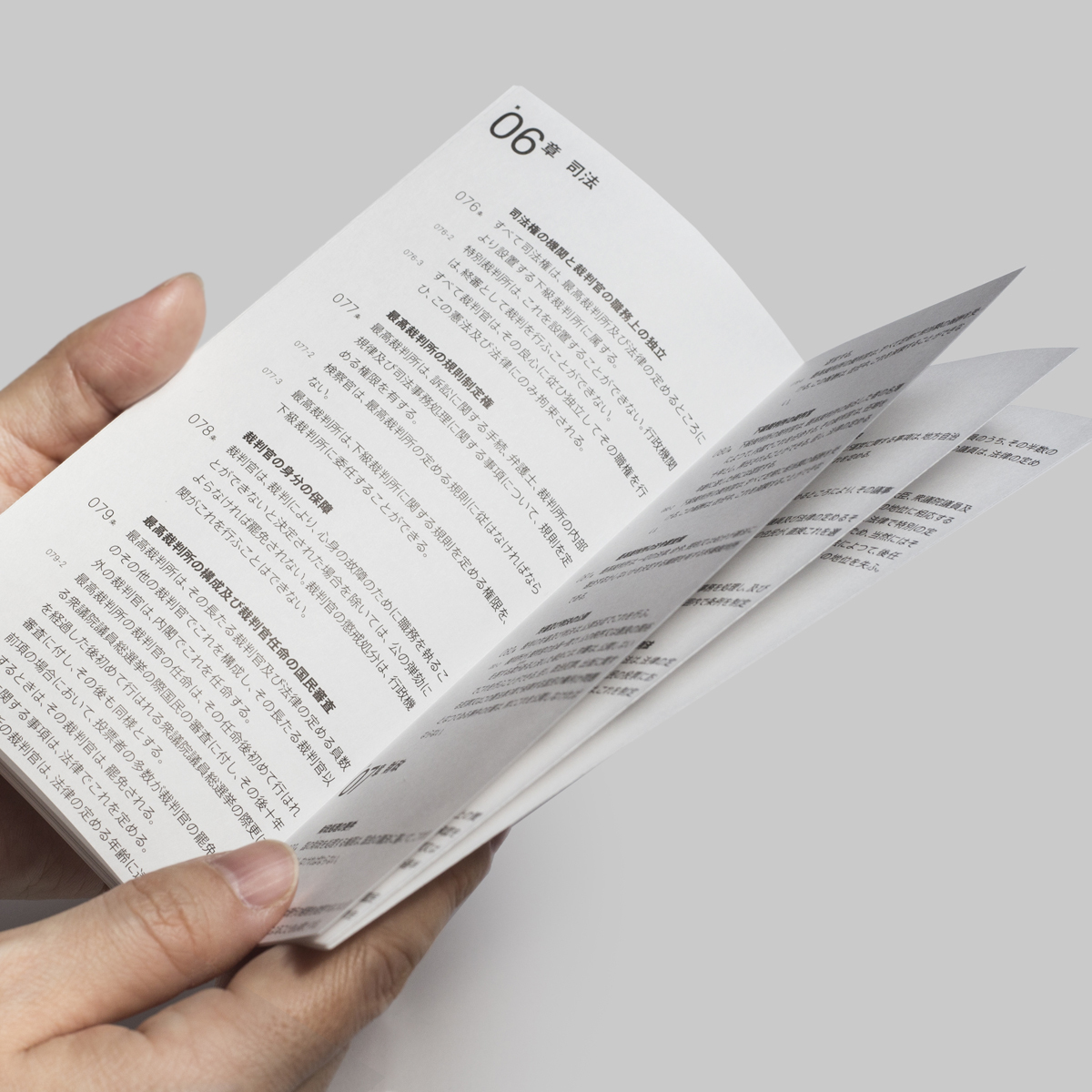
But when they went to actually find a copy of the Japanese constitution they found it to be, in a figurative sense, extremely heavy. Its layout and the way it was formatted made it feel distant. So they decided to redesign the constitution, and release it as a beautiful, lightweight and airy document that can easily be carried around, or even inserted in-between a book.
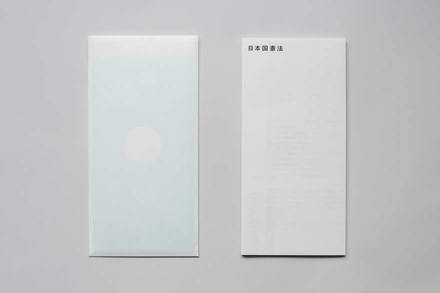
Even the cover is carefully considered: the base color is cyan, the complimentary color of red. And an visual illusion creates a subtle Japanese flag. Therein lies an allegory for the Japanese constitution. It’s there, but you must look closely.
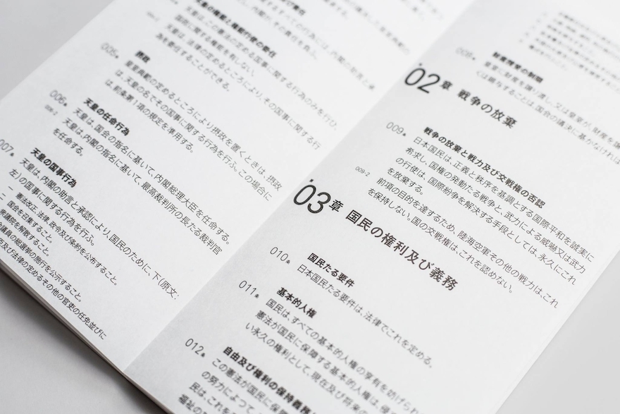
The document unfolds like a brochure. It’s just 3 mm thick and weighs 22 grams. Plenty of margins allows for space to write notes as well. Other small but important design changes include the decision to layout the text form left to right instead of top to bottom, which appeals more to younger generations. Western numbers were used to number the different articles rather than traditional kanji characters.
Hoda and Mikami’s efforts were recognized recently by one of Japan’s most well-known design awards, the Good Design Awards. If you consider the main purpose of graphic design to be the delivery of information in an attempt to aid in the formation of cognition and understanding, then the project is exemplary of graphic design at its purest form: unbiased and neutral.
The designers hope that their project inspires a younger generation of Japanese to read and understand the constitution, and the larger context of revising it.
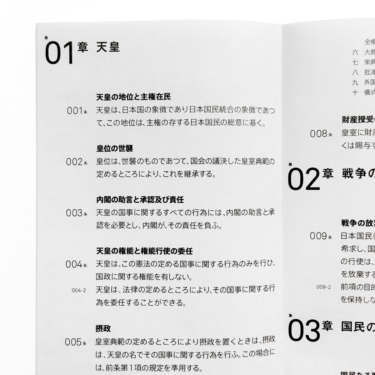
Western numbers were used to number the different articles rather than traditional kanji characters
light and airy, with room for margins