While Tokyo was busy with their festivities, the northern folk have also been partying it up at Sapporo Design Week, which ran parallel to its Honshu counterpart. Although I never cover it in much extent, I do love their logo, which may serve as an impetus to providing more coverage.
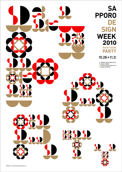
It was designed by Mr. Morikawa of Terashima Design, a grahic design firm headquartered in Sapporo. The theme of this year’s event was “party” and, using only semicircles, the designer has created a quilt-like pattern that spells out the word.
PS Both festivities have now ended. Yesterday was the last day but stay tuned as we have some exclusive coverage from the Tokyo side.
Related:








November 3, 2010 at 7:51 pm
it looks a lot like a daruma too!!!
November 3, 2010 at 9:41 pm
ha! you’re right! the black and white remind me of daruma.
November 14, 2010 at 1:09 pm
Here’s another poster I’d love to get but nothing on their site to even contact them… very nice design.