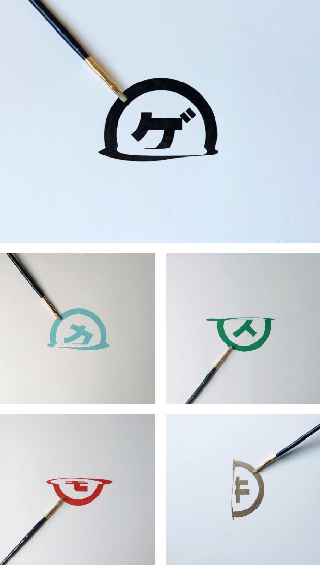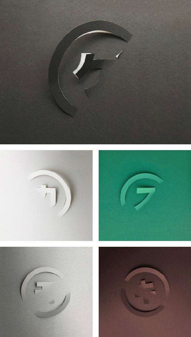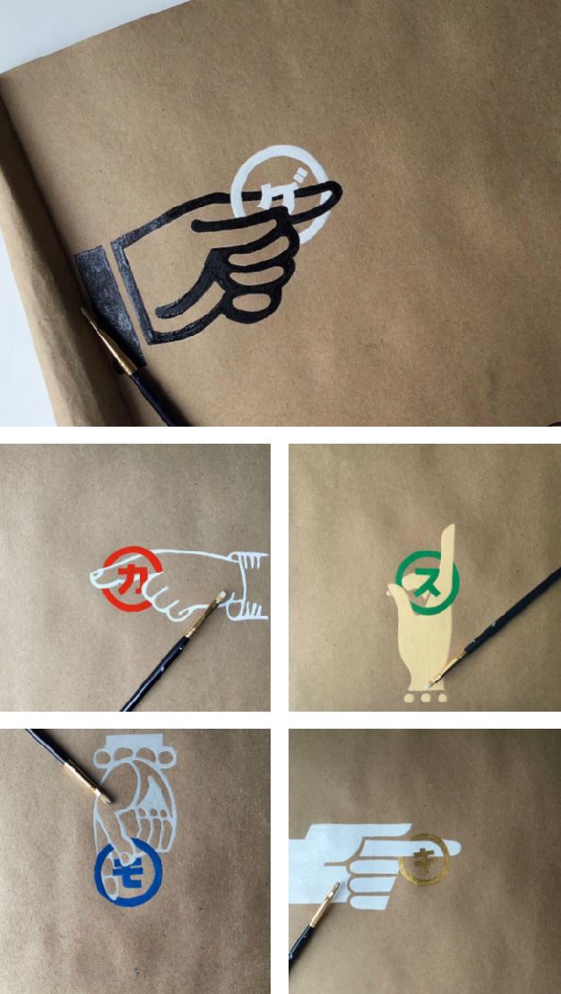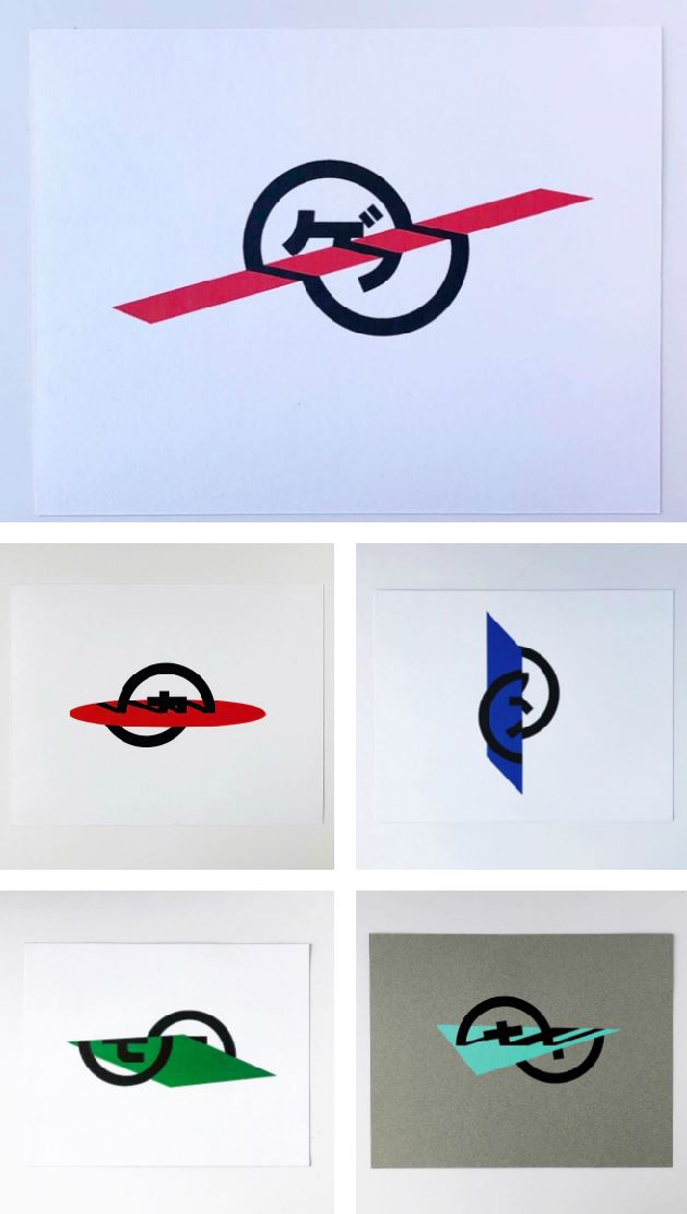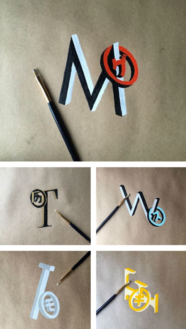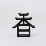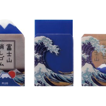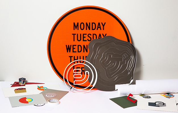
Back in 2015, the NY-based Japanese creative director Sho Shibuya began creating hand-lettered katakana for each day of the week. Ever since, his Instagram account has been such a joy to follow because, on a fairly consistent basis, he has been posting a weekly series of letters, each brimming with creativity and craftsmanship. Now, in what is Shibuya’s first solo exhibition, his work will be on display in New York later this month.
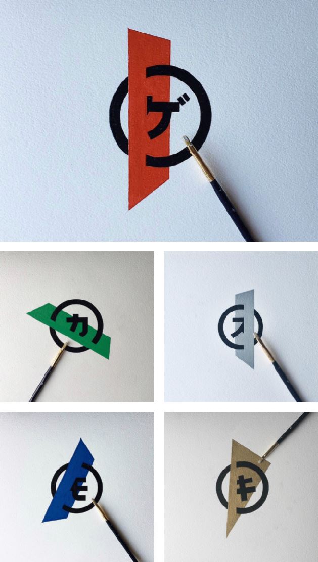
a typical weekly series for Shibuya begins with ゲ (for getsuyobi, or Monday) and continues with カ (for kayobi) ス (for suiyobi) モ (for mokuyobi) and ends with キ (for kinyobi, or Friday)
Shibuya began this hand-lettered series as a means of channeling his stress through painting katakana letters. He explains that he found peace through the exercise of identifying daily inspiration that would inform his exercise of using differnet styles, techniques and materials to create simply, typographic artworks.
Personally, I was never a fan of katakana. In my mind it was always the less-beautiful of Japan’s 3 lettering systems, the other 2 being hiragana and kanji. But observing Shibuya’s work over the years has certainly changed my mind about that.
Shibuya came to New York in 2011 by way of Tokyo and Fukuoka. He spent time working as creative director of the luggage brand AWAY before establishing his own studio called Placeholder. His first exhibition, aptly titled “WEEK,” will be held at New York’s +81 Gallery. New works on paper, wood, mirror and installation will be on display from September 27th – October 13th 2018.
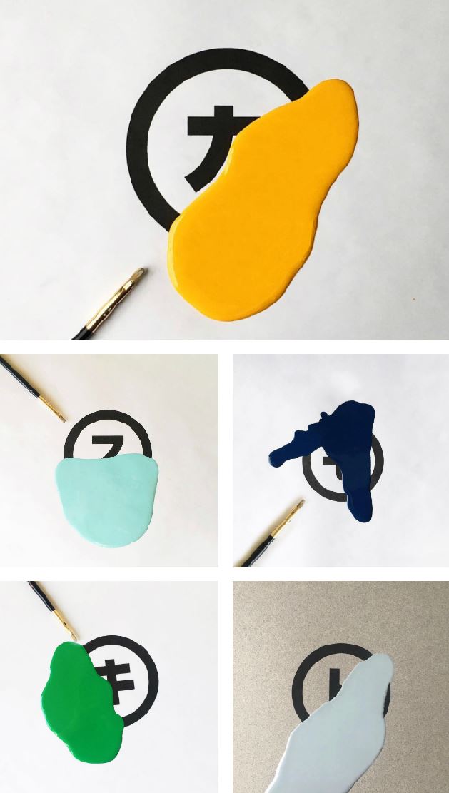
this series began with カ (tuesday) and ended with ド (saturday), presumably because we don’t always work M-F
