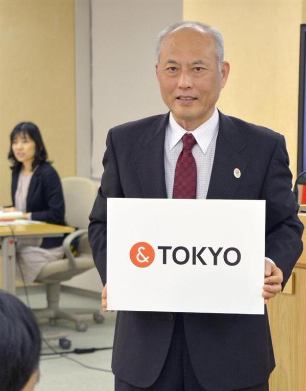
Tokyo Governor Yoichi Masuzoe announces the city’s new logo | image courtesy Sankei News
On October 9, Tokyo Governor Yoichi Masuzoe announced the city’s new logo and tagline: &TOKYO. The thinking behind the ampersand is that the city wants to encourage individuals and organizations to put their name in front of the logo, thereby increasing various associations people have with the city, and strengthening the brand of Japan’s capital ahead of the 2020 Olympics.
Beginning October 16, 2015 anyone will be able to download hi-res versions of the logo and use them for free.
 The city of Tokyo reportedly paid ad agency Hakuhodo 130 million yen (about $1 mm) to design the logo. Kazufumi Nagai, the CEO of Hakuhodo Design and son of legendary graphic designer Kazumasa Nagai, took responsibility for crafting Tokyo’s new image.
“I want to export our brand and establish Tokyo as the world’s greatest tourist destination,” said Masuzoe at the press conference.
However, perhaps because of the previous scandal involving the 2020 Olympics logo being all so fresh in the public memory, and also perhaps because netizens have too much time on their hands, people were quick to point out that Tokyo’s new logo bared resemblance to the logo of Plug & See, a French eye-wear brand.
Plug & See have already refuted the claim on Twitter, noting that it’s a different color, and that the ampersand is only part of their log.
 Another instance of similarity also popped up, this one from New Zealand. It was learned that law firm Jones & Co also used an almost identical logo.
We’ll have to wait and see whether Tokyo’s new logo is destined for the same fate as its Olympic brethren.














October 12, 2015 at 9:41 am
I hope it won’t cost a bunch of yens ! Any fresh news from Plug&See ?
October 13, 2015 at 5:04 pm
Smart, fun & fair reaction from Plug&See. Check their website !
October 13, 2015 at 5:10 pm
@Ghinseng – haha! very nice. Thanks for letting us know!