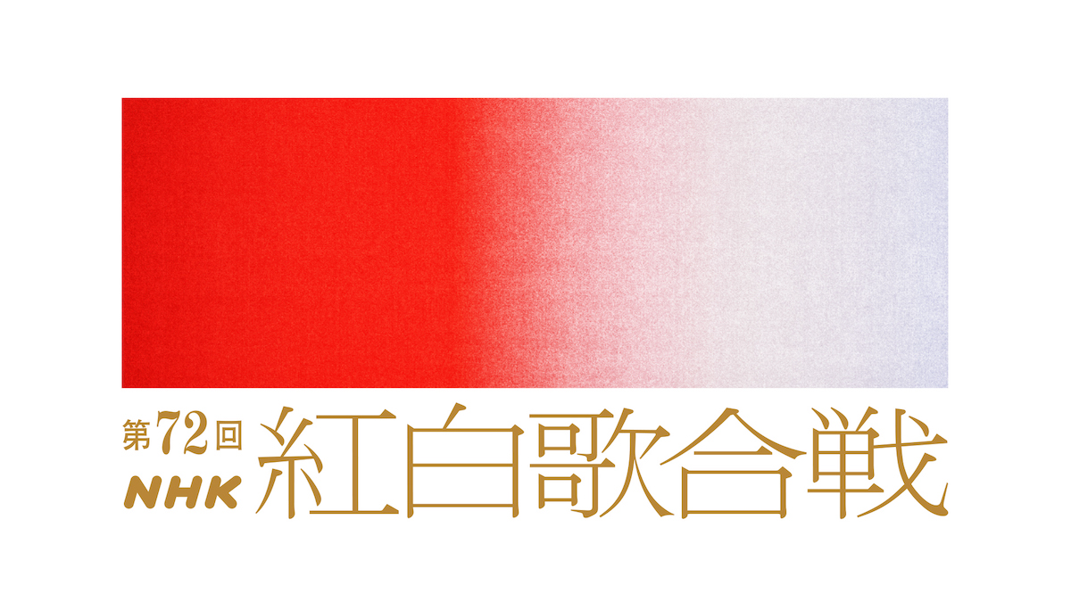
Kohaku Uta Gassen, commonly referred to simply as Kohaku, is a year-end music festival that has aired on Japanese television since 1951. Practically a national pastime, close to 40% of the population tune in as they reflect on the past year. This year, for the first time in almost 15 years, the program announced a new logo that signifies a small yet significant change.
The music festival has typically paired male acts, designated as white, against female acts, designated as red. And as the old logo made very clear, there was a delineation between the two. The new logo, designed by Shun Sasaki, quite literally blurs those lines.
The new logo is a beautiful gradient of red to white, with all sorts of hues in-between. And rather than a mechanical, inorganic gradient, it’s nuanced and rough, which gives it character and warmth. We think it’s a wonderful evolution!