I was reviewing this ongoing series on fine art and architecture/interior design, and I decided there were 2 more artists that I wanted to show you. So I plan to finish up either today or tomorrow!
Daniel Buren
“The Colored Screens” (2007)
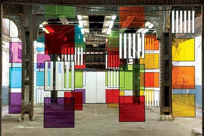
Image courtesy of Bortolami Dayan
It was quite a switch from the minimalist paintings that we had become accustomed to seeing from French artist Daniel Buren. Nonetheless, it was still in line with his site-specific installations, which he originally became known for. For his most recent show, Buren installed 48 plexiglass squares under New York’s high-line railway. More so than his other site-specific installations, “The Colored Screens” seemed more designy. I thought it was interesting that these kinds screens, an airy way of dividing a room into two, were displayed in way that seemingly has no functional purpose. Perhaps that obscurity was intentional?


November 28, 2009 at 4:40 pm
The calming of an otherwise comfortless location. Certainly an alluring distraction.
November 28, 2009 at 12:40 pm
The calming of an otherwise comfortless location. Certainly an alluring distraction.