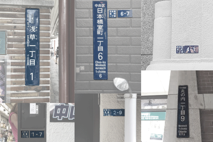
Tokyo’s various town block indicator plates | all images courtesy Type Project
Edo was renamed Tokyo in 1868, when it became the official capital of Japan. Since then the various districts within the city have evolved both culturally and typographically. Navigating the city can be a challange and town block indicator plates (as seen above) were Japan’s answer to street names.
But these primary identifiers of location lacked continuity in visual appearance and format. And while, admittedly, they do add local flavor to various neighborhoods, graphic designer Yoshiaki Irobe felt that Tokyo needed a signage system that would strengthen the city’s identity and also serve as a silent guide for the 20 million tourists the government is targeting by 2020.
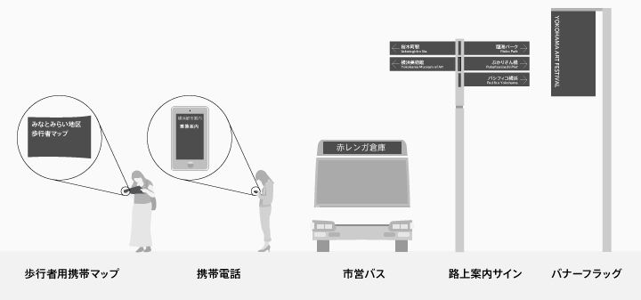
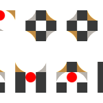
an example of the city font being implemented in various forms
Together with Type Project, Irobe developed “Tokyo CityFont,” a typeface that could be used not only on block indicator plates but throughout diverse platforms of information: everything from maps and buses to street signs and banners. “The development of a city font and the application of it in urban architecture and spaces, and signage, catalogs, business cards and all manner of other media give consistency to the overall image of the city,” says the designer. “Not only does this increase convenience for local residents, it contributes to making deeper impressions on visitors and to improving the long-term value of the city.”
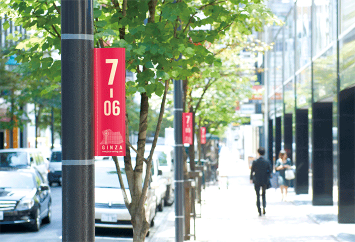
Ginza District Public Sign Trial Experiment (2012)
Irobe and his team underwent various phases and testing which eventually led to a public sign trial experiment in Ginza in 2012. In collaboration with the city, the team created marks, logos, leaflets and signage and installed them throughout Ginza.
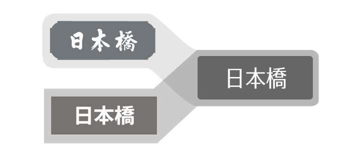
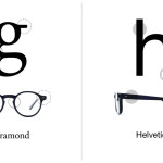
Unornamented sans-serif, delicate and lightweight strokes and a narrow, condensed typeface makes up the new Tokyo CityFont.
A lot of thought also went into the typeface itself and what “Tokyoness” means. “We sought a concept that would link Tokyo and Edo with ‘spiritedness and stylishness’ and we set our sights on a typeface that would be endowed with the continuity of history and the distinctiveness of the locality.”
Yoshiaki Irobe will be presenting his Tokyo CityFont project as part of his solo exhibition that is currently on view at Ginza Graphic Gallery (ggg) through September 28, 2015.
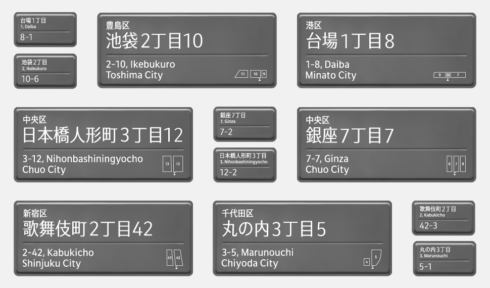
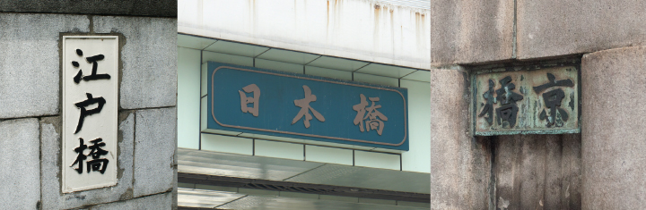
The final Tokyo CityFont and town block indicator plates