The immense and sprawling Tokyo subway system seems to be permanently under construction. It’s good to see a metropolis investing in what is already an excellent public transportation infrastructure system but for heavy users it can be frustrating to find your path blocked by temporary walls and detours.
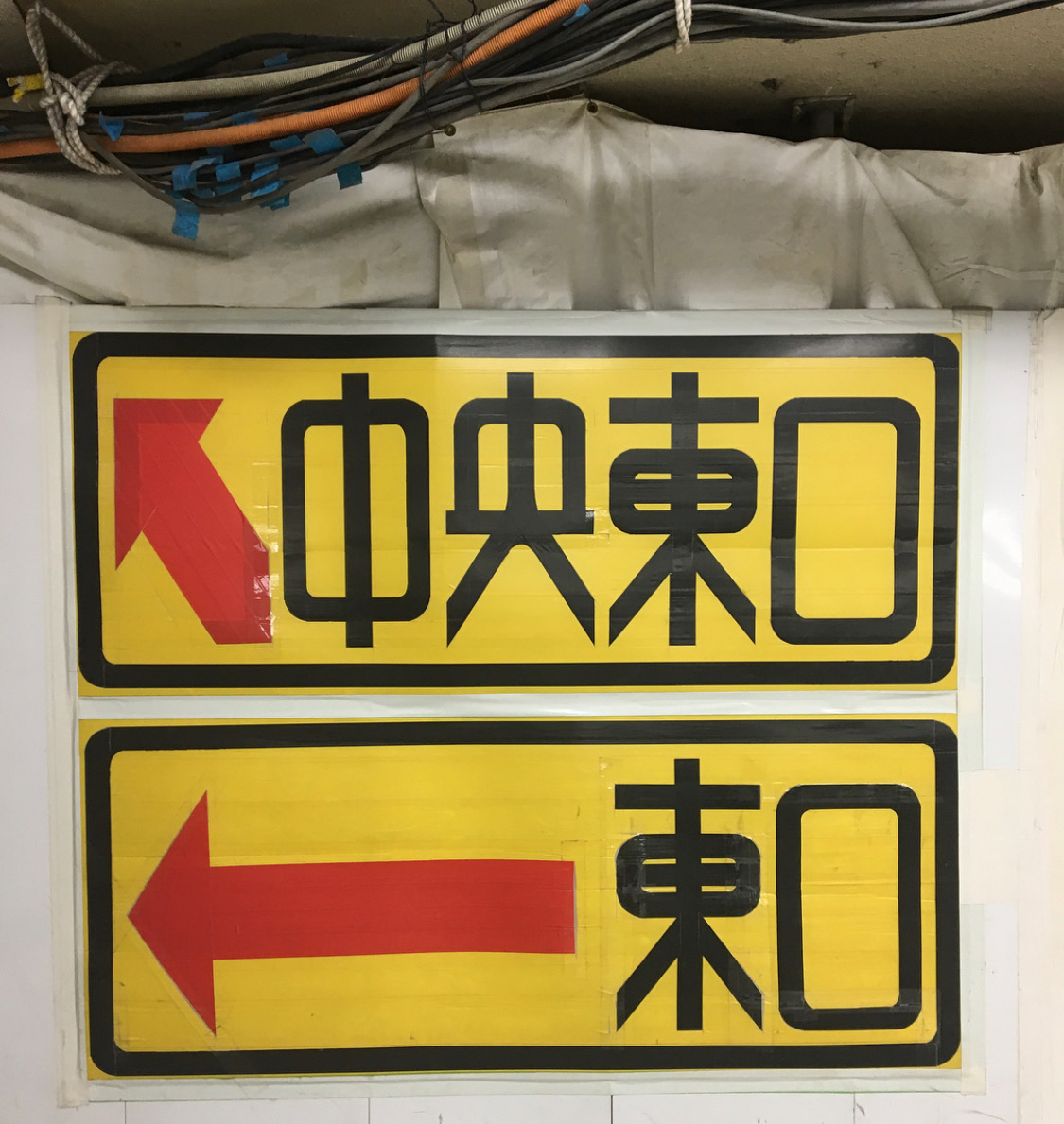
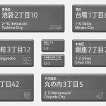
But several years ago, straphangers began noticing elegant typography crafted from duct tape, directing passengers to station exits and platforms.
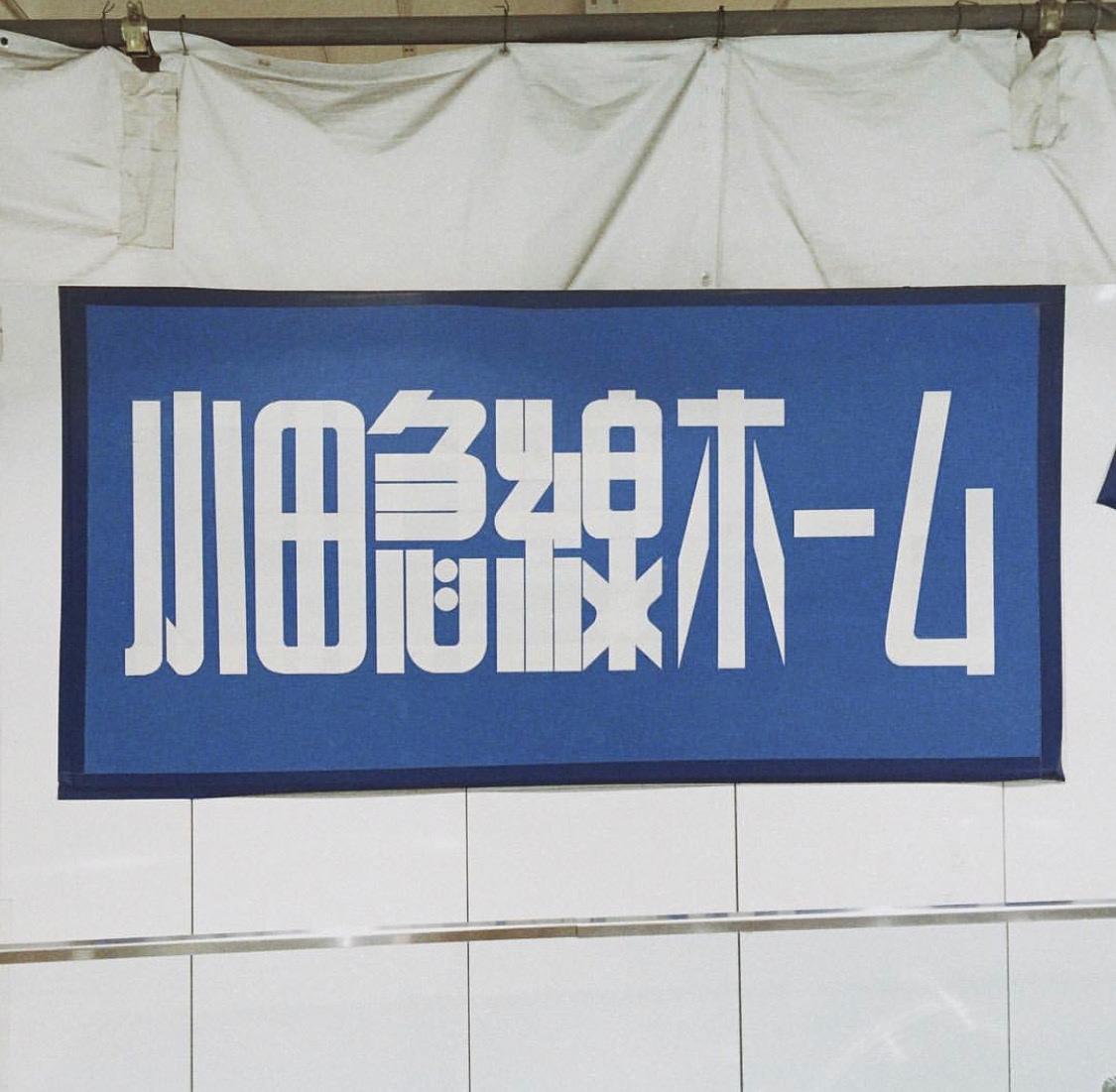
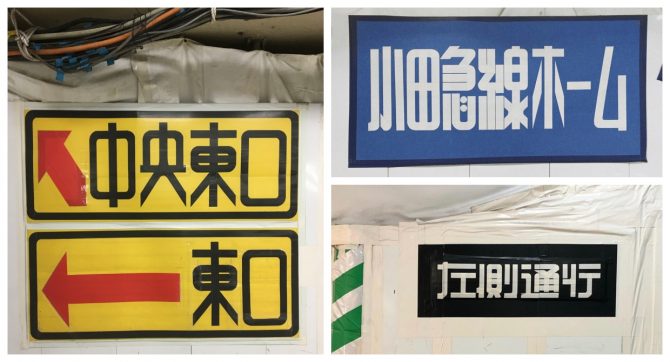
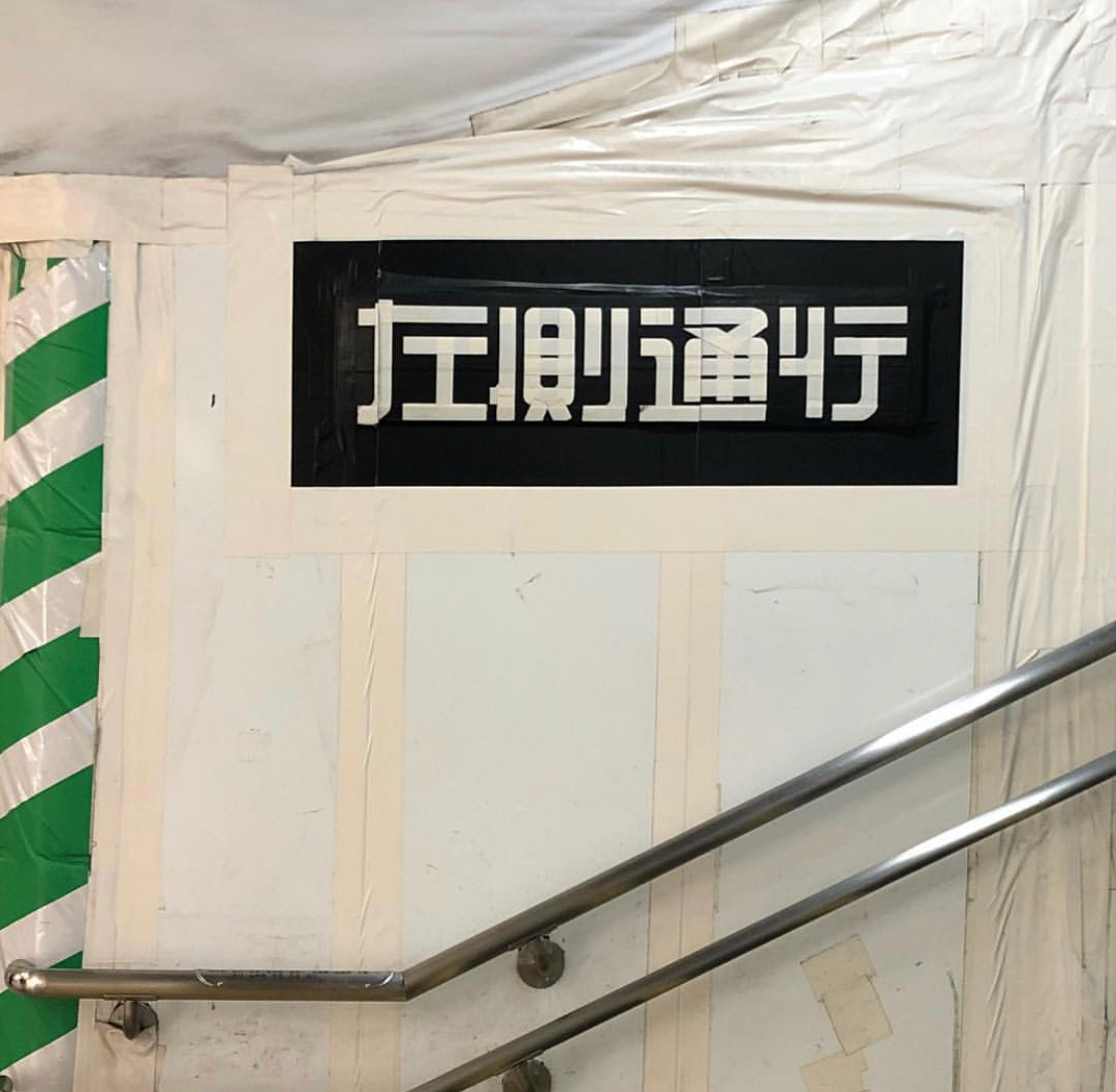
The beautiful duct tape signage turned out to be the work of Shuetsu Sato, a station security guard who began working in Shinjuku Station, the busiest station in the world, in 2002. In an interview, Sato explains that he was initially given a megaphone to direct crowds. However, he found it to be an ineffective tool that was ignored by most. So with a few rolls of duct tape and a craft knife he took it upon himself to create some eye-catching signage.
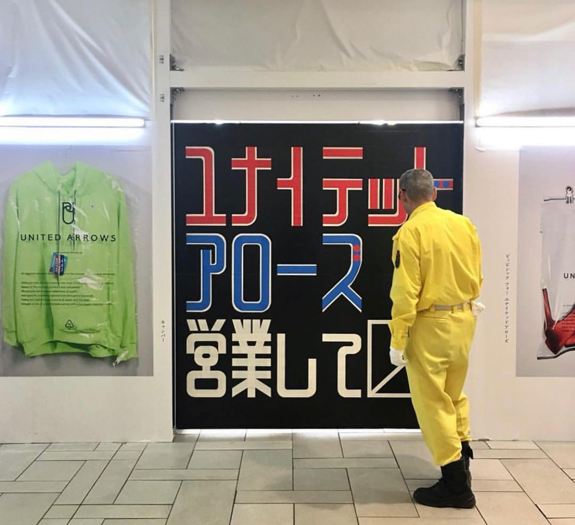
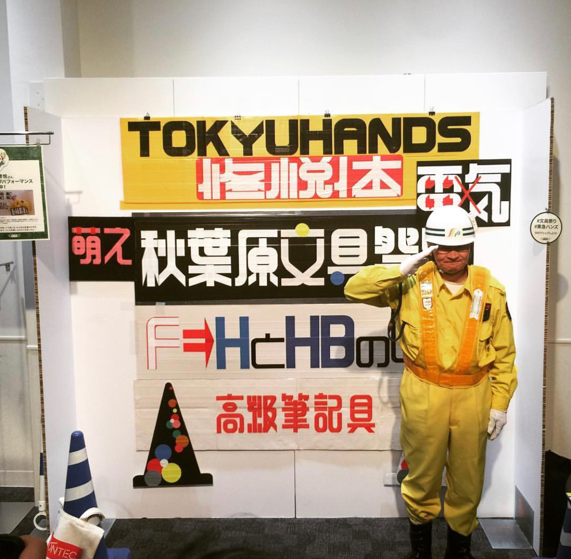
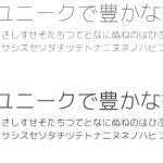
Over the years, a cultish appreciation has grown for Shuetsu Sato’s work with fans dubbing his typography as Shuetsu-tai (Shuetsu font). Fashion brands like United Arrows and WEGO have even commissioned the security guard to create custom typography for them.
You can read more about Shuetsu Sato in this piece by Chris Gaul.


August 14, 2019 at 10:42 am
This is incredibly cool! I’m glad his work is getting recognition.
August 16, 2019 at 1:02 am
Amazing. Tx for this article
August 18, 2019 at 5:30 pm
This is great. Thanks for putting it all in one place. He maintains the stroke width – the width of the tape – which does a lot to make it interesting. But why not cut the tape in half for the more complicated kanji? He’s cutting the curves on the edges cleanly so I’m sure the thinner strokes would be just as neat. Maybe he is enjoying how expressive it is.