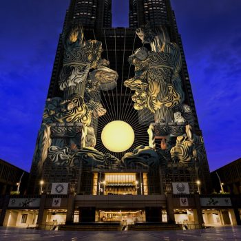
February 13, 2024 / Johnny / Comments Off on Kawazu Cherry Blossoms in Shizuoka Now in Full Bloom
The Kawazu-Zakura cherry blossoms
If you’re sick of winter and ready for spring, head to Shizuoka’s Kawazu City, the host of one of Japan’s earliest cherry blossom festivals. The Kawazu-zakura cherry blossoms are known for blossoming early and some trees are already beginning to bloom.
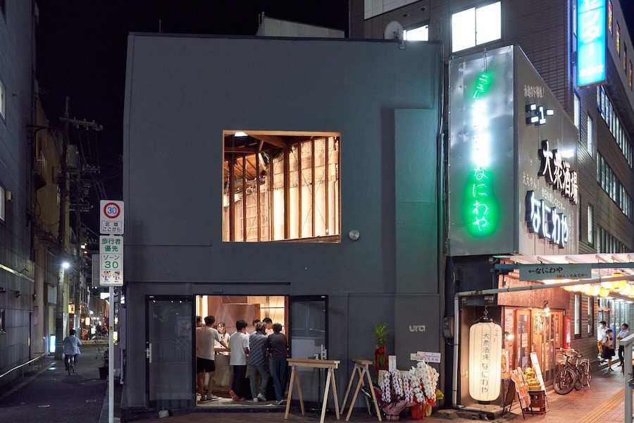
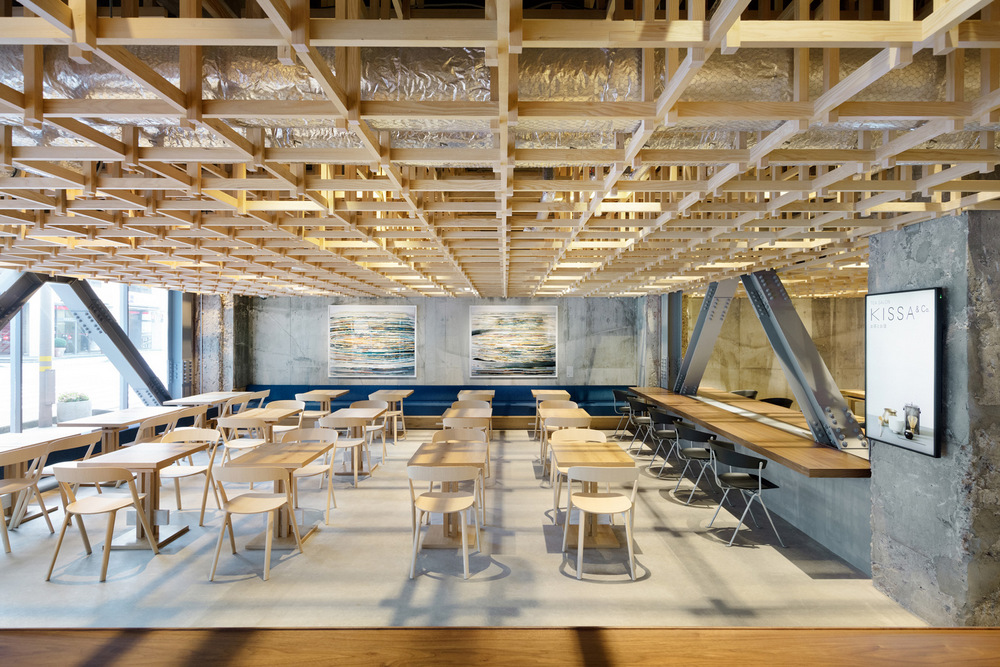
February 6, 2024 / Johnny / Comments Off on Tachinomi Ura is a Standing Eatery in Kurashiki Carrying on Local Sake and Cuisine Culture
unless otherwise noted, all photos by Go Itami courtesy Schemata Architects
Located steps from Kurashiki Station in Okayama is Tachinomi Ura, a new standing eatery that opened late last year. Ura emphasizes local ingredients and seafood sourced from the Setouchi region, stylishly paired with sake from smaller makers you typically wouldn’t find elsewhere. The late-night eatery offers locals and visitors a welcome respite from the conflicting powers of tradition and tourism that have put strain on the area.
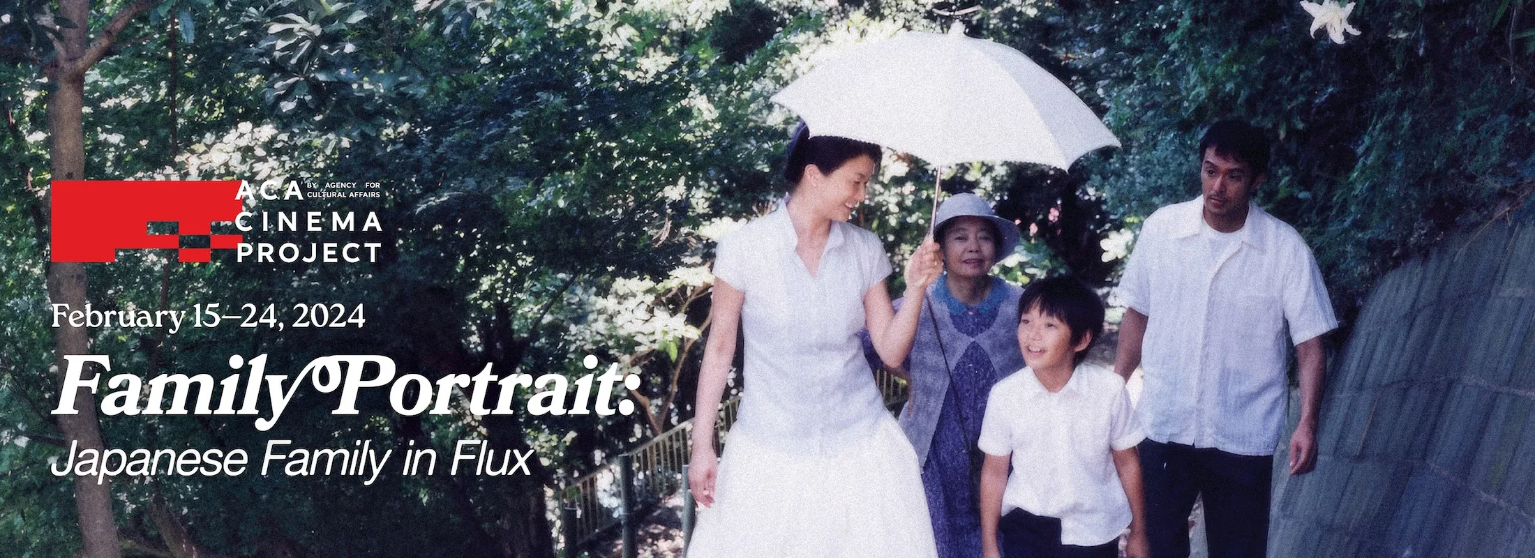
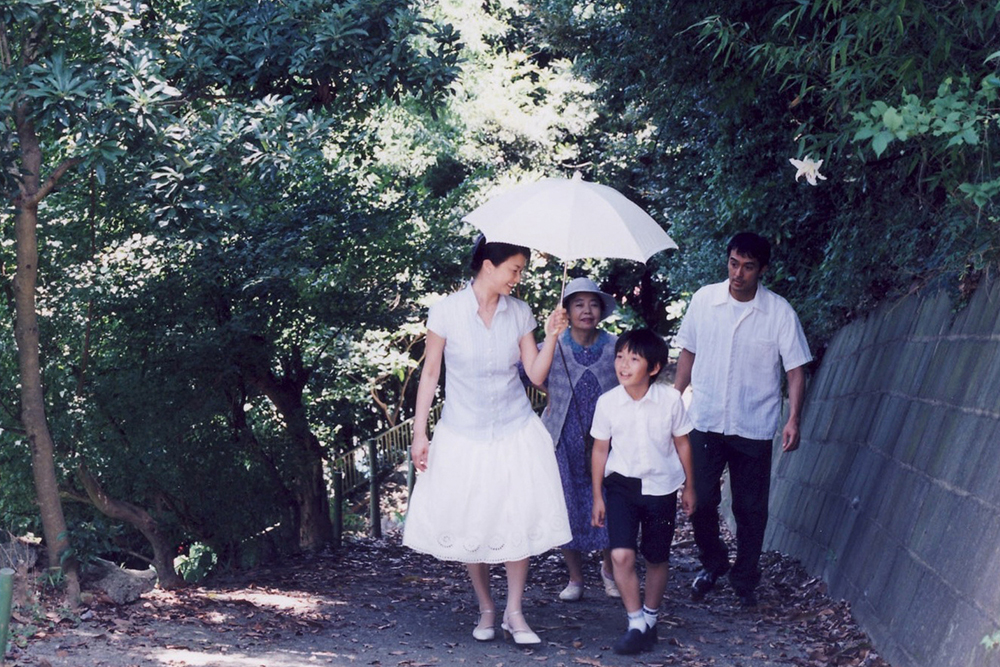
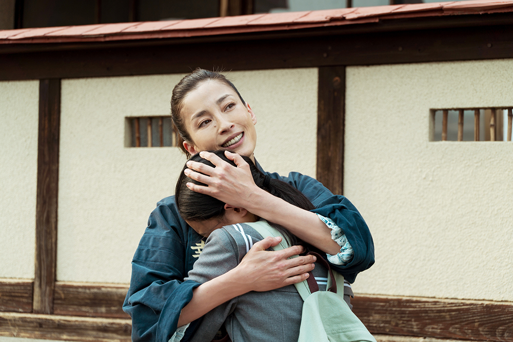
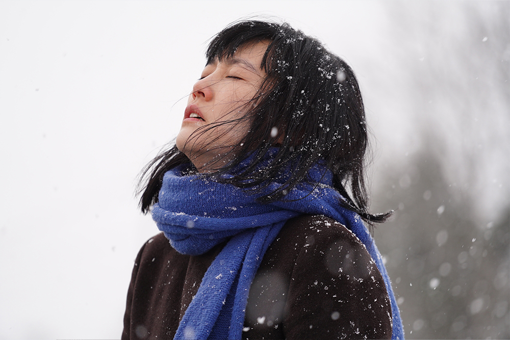
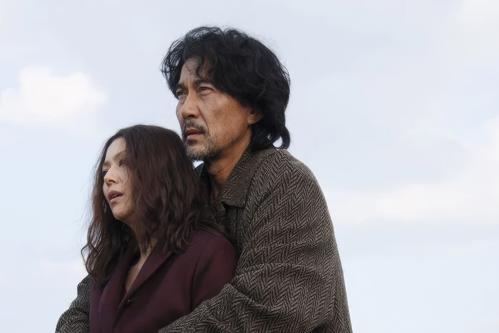
February 5, 2024 / sponsor / Comments Off on Japan Society Presents Family Portrait: Japanese Family in Flux
this post is sponsored by Japan Society
Agency for Cultural Affairs, Government of Japan and Japan Society are proud to announce the eighth installment of the ACA Cinema Project film series, Family Portrait: Japanese Family in Flux. The series examines the shifting dynamics and struggles of the Japanese household in contemporary cinema. Showcasing 10 features, including premieres and revivals, Family Portrait celebrates the complexities of familial bonds in the face of adversity—bringing to question what truly defines a family and its values in the modern world.
Series highlights include the U.S. Premiere of Kazuyoshi Kumakiri’s Yoko, with international star Rinko Kikuchi in a bravura performance as a woman hitchhiking over 400 miles to her father’s funeral; the U.S. Premiere of Keiko Tsuruoka’s Tsugaru Lacquer Girl, the story of a family lacquerware business on the brink of collapse run by Seishiro (Kaoru Kobayashi, Midnight Diner) and his daughter, who strives to carry on his legacy despite deeply held traditional gender beliefs; and a Classics slate featuring a rare 35mm presentation of Yasujiro Ozu’s Tokyo Twilight. A special spotlight will shine on director Ryota Nakano, whose latest film, The Asadas, centers on the power of family in the aftermath of the Fukushima tragedy and is presented along with his previous works A Long Goodbyeand Her Love Boils Bathwater. Nakano will be a guest speaker at select screenings in the Family Portrait series.
To learn more and purchase tickets, please visit japansociety.org.
Ito-Machi, launched in 2020, is an urban development in Ehime prefecture’s Saijo, featuring a master plan by the esteemed Kengo Kuma Laboratory at the University of Tokyo. The project encompasses a residential zone with detached houses and a commercial zone hosting hotels and markets. Its purpose is to infuse new vibrancy into Saijo through a unique blend of urban living and disaster-resilient infrastructure.
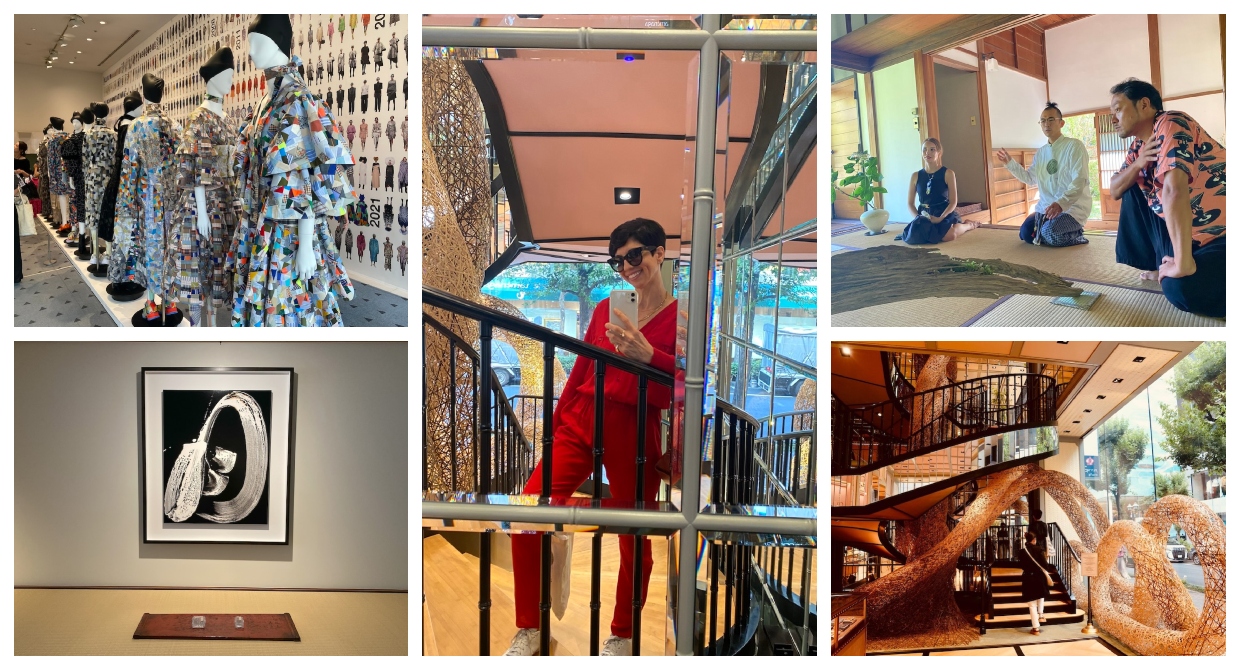
January 29, 2024 / sponsor / Comments Off on Tokyo Here & Now: Private Art and Design Tours by Mirit Weinstock
this post is sponsored by mirit weinstock
Mirit Weinstock is an artist and designer living in Tokyo, specializing in Japanese crafts and working in a variety of mediums. The creative director and founder of “Mirit Weinstock” jewelry brand, the artist is steeped in the Japanese crafts of ikebana floral arrangement, washi paper as well as ceramics. As a result of her love for Japanese arts, Mirit has been giving private daily art tours since Japan re-opened its borders in October 2022.
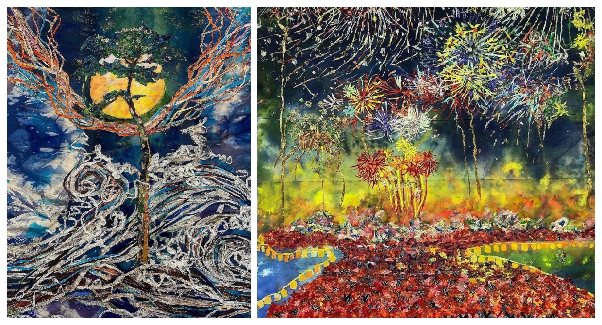
Noriko Sugiyama is a self-taught artist who works with discarded kimono and obi, which she masterfully upcylces to create landscapes brimming with energy and hope. But her path to artistry has been anything but conventional. Now at the age of 76, Sugiyama only began her creative journey 5 years ago after a chance encounter with marker pens she found discarded on the street.
The Japanese word kumu is a verb with many nuances. Depending on the context, kumu can mean “to join,” “to draw out,” or “to pour.” In that sense, it was the perfect name for a hotel that embodies connection and hospitality: connecting people with a place, drawing out a guests feelings and pouring them a drink.
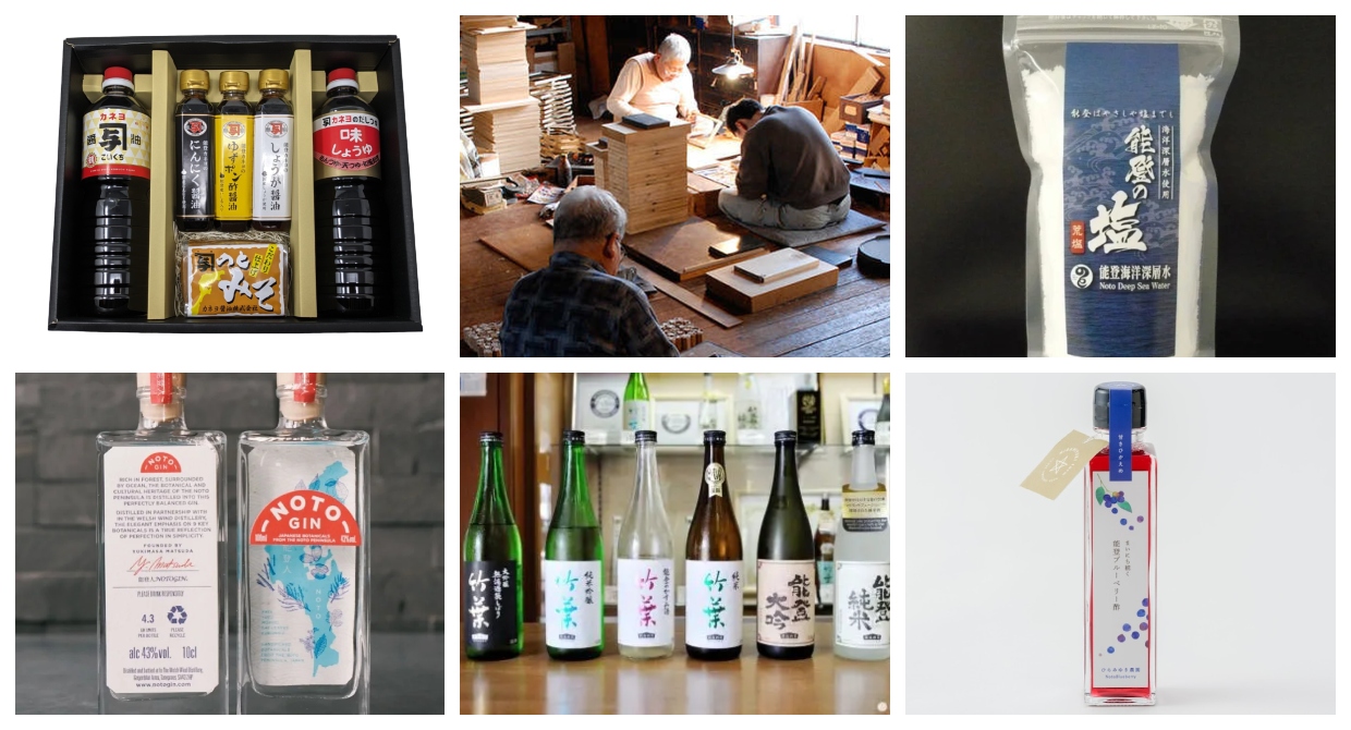
Roughly 6000 people remain in temporary evacuation shelters ever since the Noto Earthquake on January 1st upended life for so many. And while the recovery is long and arduous, many are doing what they can to return to normal and that includes the many local businesses in the Noto community. Authorities are still discouraging travel to the Noto region (but other cities like Kanazawa are open for business!) but in this day and age, many business have their online shops up and running. Below are a few that you can support.
Obviously this is not a complete list so if you know of any others, please leave them in the comments!
this post was sponsored by the Tokyo Convention & Visitors Bureau
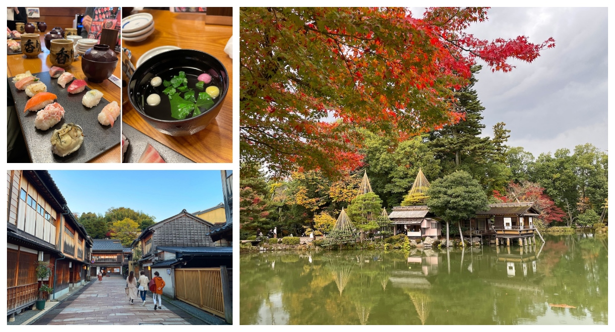
This travel guide originally appeared in February 2023 and ever since Covid restrictions were lifted, Ishikawa prefecture has seen a steady climb in tourism. However, the tragic Noto Earthquake at the beginning of 2024 changed that and many businesses have seen a precipitous drop in activity. Although roughly 6000 people in the city of Wajima continue to be living in evacuation centers, the mayor of Ishikawa has put out a cry for tourists to not change their plans and come visit. The city of Kanazawa is largely business-as-usual and now is a great time to visit as tourism will only help recovery efforts.
editor’s note
Just quick ride from Tokyo aboard a speedy Kagayaki 505 bullet train, Ishikawa Prefecture is a hidden gem among popular tourist destinations across Japan. Offering a host of ancient gardens, historic temples, delectable dining, and exposure to artisanal crafts, towns like Kanazawa, Kaga, and Komatsu offer a rare glimpse at uncompromising beauty and tradition that spans centuries. We chose to visit Ishikawa in the fall, just as the maple and cherry trees turned a fiery red that formed a sumptuous backdrop to our daily explorations.
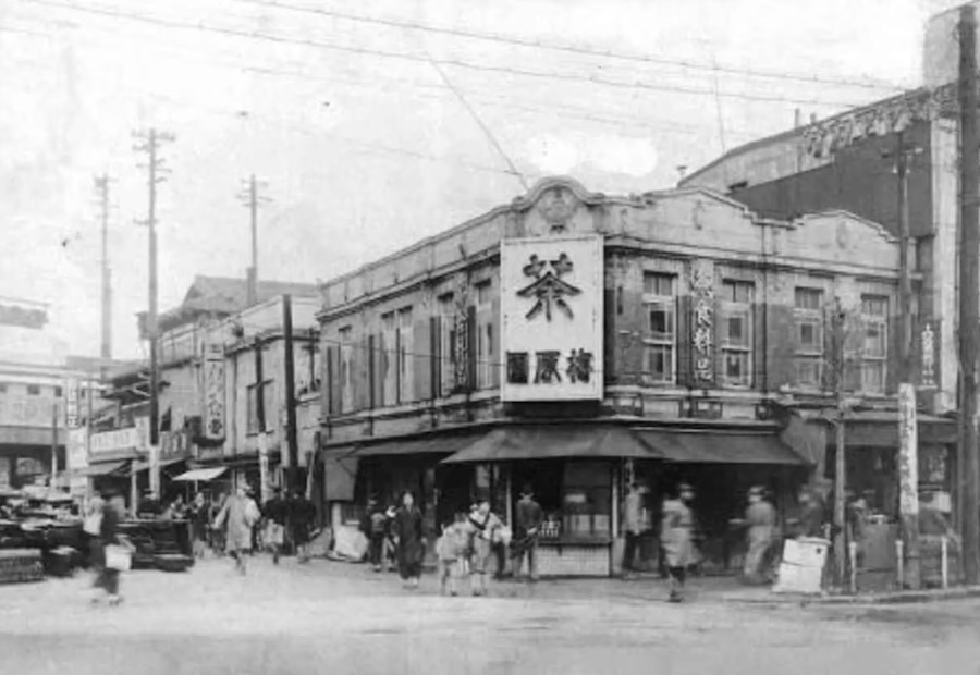
January 9, 2024 / Johnny / Comments Off on A Relic of the Past, Shibuya Green Tea is Leafing Out Once Again
Umeharaen, a green tea seller that once stood at the corner of Shibuya Crossing
Shibuya typically conjures images of tall skyscrapers, neon lights, and the world’s busiest pedestrian crossings. Not tranquil tea plantations. But 150 years ago in the early Meiji era, Shibuya, as well as Harajuku and Yoyogi, were dotted with fields growing green tea. In fact, the famous Shibuya Crossing was once home to Umeharaen, a purveyor of fine teas. A new initiative hopes to revive the once-forgotten Shibuya-cha and bring it back to local cafes and bars.