Happy New Year!!
I introduced the work of art director Yuji Tokuda late last month but thought I would take a deeper dive because I feel like he is operating under the radar and his work definitely warrants more attention.
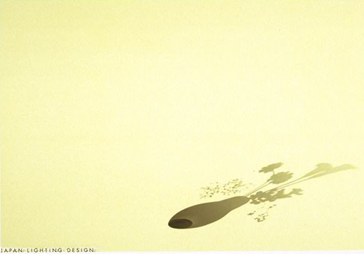
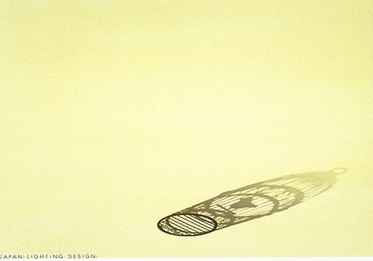
These are a series of advertisements done for Japan Lighting Design, a company specializing in interior lighting. Instead of displaying the product, Tokuda chose to communicate the warmth and atmosphere created by the company’s products.
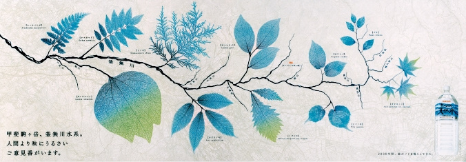
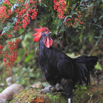
I actually remember seeing this ad on a train once for Suntory bottled water. Tokuda incorporates actual vegetation that grows around where the water is bottled. The ad reads, “there are others out there, pickier about their water than us.”
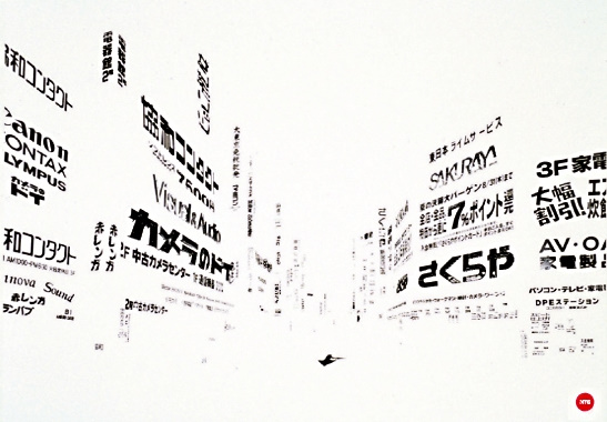
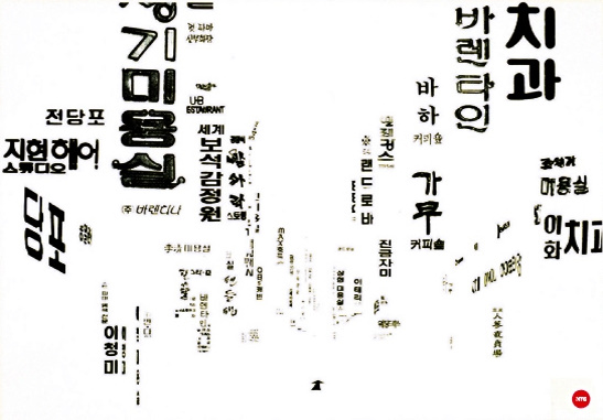
These are a set of ads for the Japan Typography Association. Back in the day, when typography still relied on phototypesetting, the JTA was the only company in Japan that had records of every language in the world. To commemorate the old technique Tokuda created these fascinating landscapes using black & white typography of street ads.
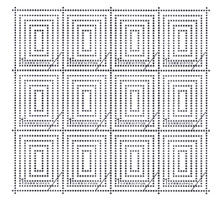
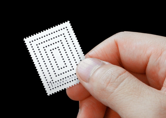
Finally, I am crazy about this stamp, titled “Hooooooooooles,” which was part of a POST Stamp Exhibition in ’07. I love the idea of how the background color of the envelope would show through, essentially altering the stamp depending on your choice of envelope.








December 3, 2009 at 8:55 pm
those ads would make great desktop wallpapers!
December 3, 2009 at 4:55 pm
those ads would make great desktop wallpapers!