


 Myaku-Myaku Footwear, Inspired by the Googly-Eyed Mascot for the Osaka Expo
 Demographics Professor Warns that by 2531, Everyone in Japan Will be Named Sato
 Japan Quietly Shines at Milan Design Week
 Japan’s Stationery Award Offers a Return to the Primitive
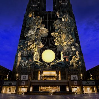
 Kenji Yanobe’s BIG CAT BANG is Now on Display at Ginza Six