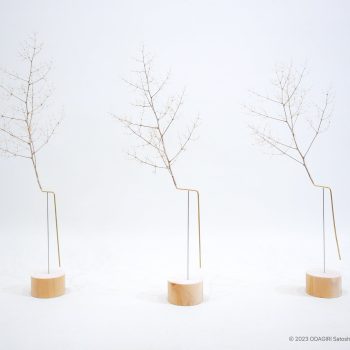

 ‘Puddle’ Are a Series of Flower Vessels Inspired by Puddles of Water
 Myaku-Myaku Footwear, Inspired by the Googly-Eyed Mascot for the Osaka Expo
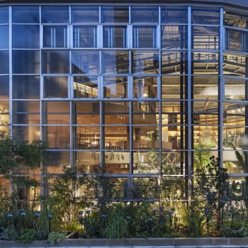
 Five Unique Experiences at Harajuku’s Latest Development Harakado
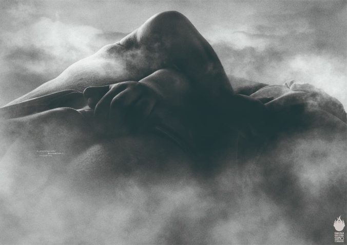
 Shunga: Japanese Erotic Art from the 1600s – 1800s
 Japan’s Stationery Award Offers a Return to the Primitive